Mirinda was launching a new limited edition flavor with a major twist: it tastes like Cantaloupe and Watermelon at the same time! The brand who has always been surprising the world with new flavors was now taking a risk, leaving it to its audience to decide which of the two fruits they were tasting.
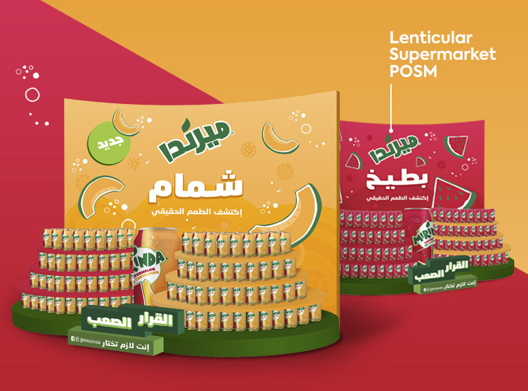
They approached us with the task to create the design of their can as well as its POS presence and we could not have been more excited for the challenge, working with a star brand with fun and playfulness at its core.
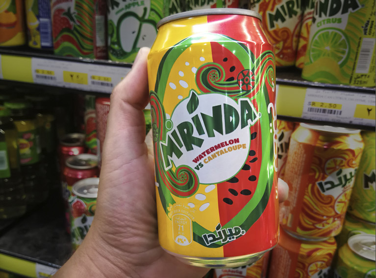
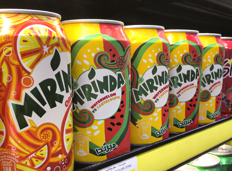
We took the confusion of the flavor into the design bottle by cutting it in half to amplify the idea: if you see if from the right side you think it is cantaloupe. If you see it from the other side you think it is watermelon. The design respected the graphical style of Mirinda in terms of fruit representation and color codes, then made the 2 flavors stand out with oversized typography treatment.


