
Digital Branding Strategies
Best Practices for Choosing Attractive Color Palettes for UAE Restaurant Websites
Overview
Choosing attractive color palettes for UAE restaurant websites is essential for establishing a robust brand identity and enhancing customer engagement. By evoking specific emotions and catering to cultural preferences, effective color selection can significantly influence consumer behavior. This is evidenced by case studies of successful restaurants that align their hue choices with their target audience’s expectations and the local cultural context. Such strategic decisions not only reflect an understanding of consumer psychology but also position the brand favorably within a competitive market. Brand Managers must recognize the profound impact that color can have on their branding efforts.
Introduction
In the dynamic realm of restaurant branding, color transcends mere design choice; it is an essential component that shapes customer perceptions and influences dining experiences. In a culturally rich environment like the UAE, where culinary traditions are intricately linked to social interactions, the selection of color palettes can significantly elevate a restaurant’s allure.
- Warm hues can stimulate appetite,
- while cool tones evoke sophistication;
- the psychological impact of color can either attract patrons or deter them.
As restaurants navigate this vibrant landscape, grasping the nuances of color psychology, cultural meanings, and practical strategies is vital for crafting a memorable dining atmosphere that resonates with a diverse clientele.
This exploration into the importance of color in restaurant branding uncovers not only aesthetic decisions but also a strategic framework for success in a competitive industry.
The Significance of Color in Restaurant Branding
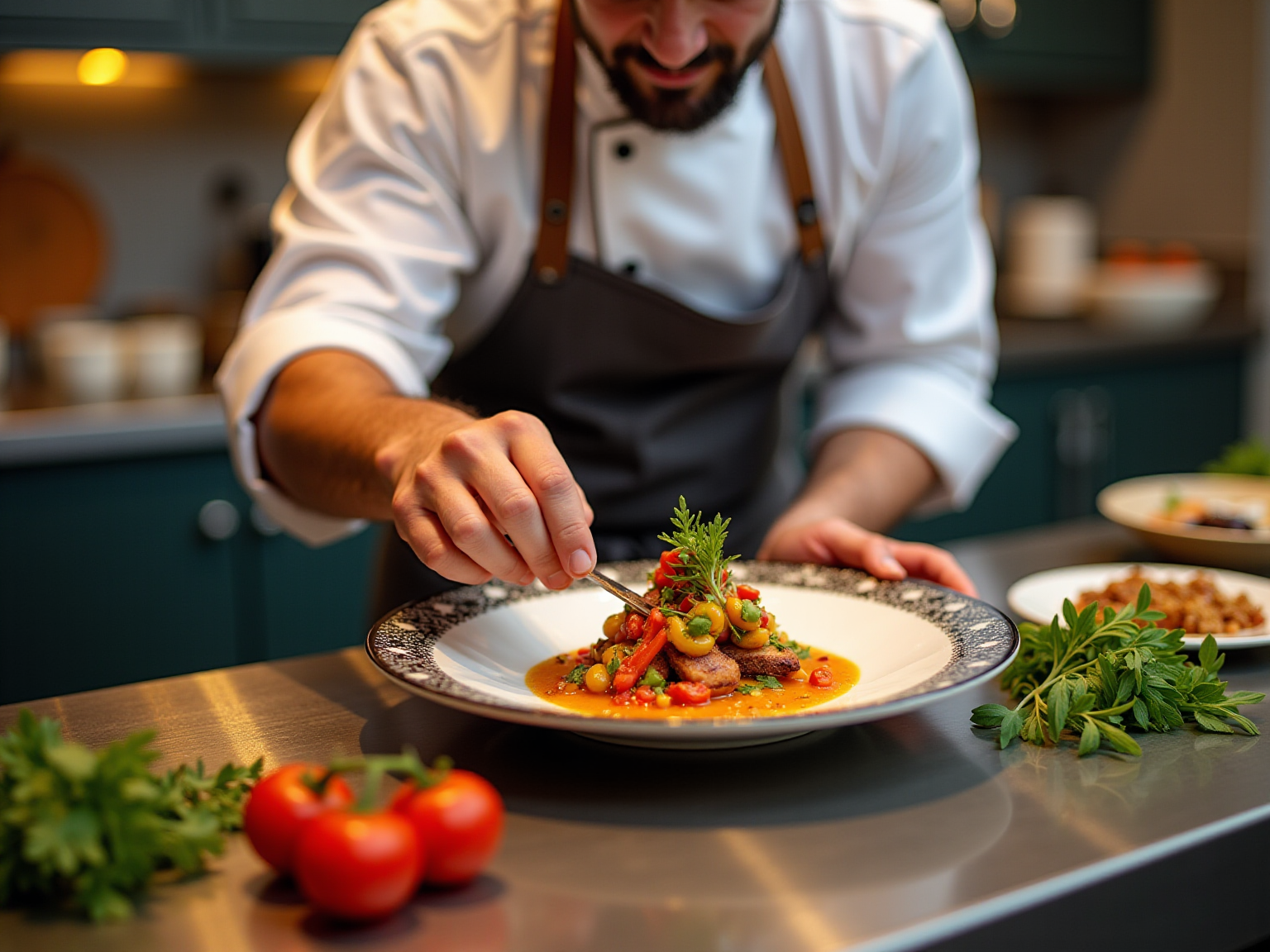
Color plays a pivotal role in branding for dining establishments, serving not only as a visual identifier but also as a powerful means to evoke emotions and establish the desired atmosphere. In the UAE, where dining experiences are intricately linked to cultural and social interactions, the use of attractive color palettes for UAE restaurant websites can dramatically enhance a restaurant’s allure. Warm hues like red and orange are recognized for their ability to enhance appetite and create a welcoming environment, making them ideal for informal dining spaces.
Conversely, cooler shades such as blue can convey tranquility and elegance, appealing to high-end venues that seek a more sophisticated atmosphere.
Research indicates that the impact of hues extends beyond mere visuals; it significantly influences consumer feelings and behaviors in dining settings. A study highlighted that hue priming is most effective when aligned with the product category, underscoring the importance of congruence in hue selection. In the UAE’s diverse culinary landscape, it is particularly crucial for eateries to differentiate themselves by employing attractive color palettes for UAE restaurant websites while also resonating with local cultural preferences.
Notably, the study conducted by Lauren Labrecque and George Milne reveals that while hue differentiation can enhance brand performance, it may also pose risks in certain product categories, emphasizing the need for thoughtful consideration in hue selections.
Case studies further illustrate the significance of hue in establishing dining identities. For instance, the use of cool hues in menu design has proven effective in attracting health-conscious patrons, with vibrant greens symbolizing wellness and longevity. In contrast, blue hues are frequently avoided in menus due to their potential to suppress appetite.
This understanding is vital for establishments aiming to refine their marketing strategies. By explicitly acknowledging the implications of using cool colors, dining establishments can make informed decisions that align with their target audience’s preferences. Furthermore, adapting color schemes to reflect seasonal themes or promotional events can foster a dynamic atmosphere that engages customers and promotes limited-time offers.
This strategic approach not only enhances the overall marketing strategy but also cultivates a memorable dining experience that resonates with clientele, ultimately fostering customer loyalty and satisfaction.
, and colors differentiate each theme.")
Understanding Color Psychology and Consumer Behavior
Color psychology plays a pivotal role in shaping consumer perceptions and behaviors, especially within the food service sector. Colors evoke specific emotions and can significantly influence dining choices. For instance, red is often associated with excitement and can stimulate appetite, making it a preferred choice for fast-food establishments.
Conversely, blue is linked to tranquility and can reduce appetite, which explains its infrequent use in food marketing. Understanding hue associations empowers eatery owners to select appealing color palettes for UAE restaurant websites, effectively drawing in patrons while enhancing their overall dining experience.
Research underscores the importance of hue in consumer decision-making, revealing that up to 90% of consumer evaluations regarding products are based solely on color. This statistic reinforces the necessity for strategic hue selection in restaurant branding. Notably, blue, despite its rarity in food contexts, ranks as the most favored hue among both men and women, associated with reliability and dependability.
Recent findings indicate that blue is regarded as the most influential hue for companies, holding a 30% preference, closely followed by red at 26%. It is crucial to recognize that hue perception can vary across demographics. As Kay La Belle notes, 7% of men struggle to perceive certain hues, in contrast to just 0.4% of women.
Such variations can impact how different audiences interpret hue selections in marketing, making it essential for restaurant proprietors to consider their target demographics.
Case studies further illustrate the impact of hue selections on identity and consumer behavior. For example, Men’s Wearhouse effectively employs a deep blue as its primary hue, complemented by achromatic tones such as gray, white, and black. This strategic palette not only enhances identity recognition but also fosters a clean, elegant website design that resonates with their target audience.
Similar strategies can be applied in the dining environment, where a thoughtfully considered hue scheme can create a welcoming ambiance and reinforce brand identity.
In the competitive landscape of UAE hospitality and dining websites, it is vital to understand how appealing color palettes influence consumer behavior. By leveraging hue psychology, establishment owners can craft inviting environments that promote patronage and cultivate memorable dining experiences.

Cultural Influences on Color Preferences in the UAE
Cultural influences significantly shape hue preferences in the UAE, making it imperative for eateries to consider these associations when crafting their branding strategies. For instance, green is frequently associated with prosperity and nature, making it an attractive option for establishments that emphasize health and freshness in their offerings. Conversely, colors like black and red evoke strong emotions; black signifies elegance and sophistication, whereas red embodies passion and energy.
Understanding these cultural significances is crucial for establishments seeking to forge a deeper connection with their audience. By aligning their color palettes with local cultural values, restaurants can create appealing color schemes for UAE restaurant websites, fostering a more inviting and relatable brand image. This strategy not only enhances aesthetic appeal through attractive color palettes for UAE restaurant websites but also resonates with the emotional and cultural sensibilities of their clientele, ultimately driving customer engagement and loyalty.
To provide a quantitative perspective on hue preferences, it is noteworthy that the average score for achromatic shades in group A was 2.78, while in group B it was 2.60. This data highlights the differing perceptions of color among various demographics in the UAE. Moreover, as Daksh Sharma, co-founder of Iffort, states, “For over ten years, I have observed the significant impact of Artificial Intelligence (AI) across different sectors, including marketing,” underscoring the evolving nature of promotional strategies in response to cultural insights.
A pertinent case study involves the comprehensive campaign for Quaker Oats, where WonderEight devised a robust marketing strategy that prioritized effective brand identity and innovative content delivery. This campaign not only resulted in heightened awareness of the brand and a positive consumer response but also showcased WonderEight’s expertise in leveraging cultural insights to enhance marketing strategies. By drawing on its diverse client portfolio, WonderEight exemplifies the importance of attractive color palettes for UAE restaurant websites in dining branding, ultimately solidifying its position as a leader in creative marketing solutions.

Practical Tips for Selecting Color Palettes
Choosing attractive color palettes for UAE restaurant websites is essential for creating a solid brand identity and eliciting the intended feelings in patrons. To guide your selection process, consider these practical tips:
- Define Your Brand Personality: Begin by pinpointing the feelings you want to evoke through your hue selections. For instance, a family-oriented restaurant may benefit from warm, welcoming hues that create a sense of comfort, while a fine dining venue might opt for muted, sophisticated shades that convey elegance and exclusivity. As Conway observes, “For us, hue is a potent model system that uncovers insights into how the mind and brain function,” highlighting the psychological influence of hue in marketing.
- Limit Your Palette: To maintain visual coherence and enhance your brand identity, restrict your palette to two to four primary hues. This approach prevents overwhelming customers and ensures that your branding remains focused and recognizable.
- Test Combinations: Utilize tools such as Adobe Color or Coolors to experiment with various hue combinations. These platforms allow you to see how different hues interact, assisting you in discovering the ideal combination for your brand’s aesthetic.
- Consider Your Audience: Tailor your hue selections to resonate with your target demographic. For example, vivid hues may attract a younger crowd seeking excitement, while more muted shades might appeal to an older clientele desiring elegance and tranquility.
- Seek Feedback: Before finalizing your hue selection, gather feedback from potential customers or conduct A/B testing. This process can reveal which hues resonate best with your audience, ensuring that your final choice aligns with their preferences.
Integrating these strategies not only enhances the visual attractiveness of your establishment’s website but also aligns with best practices in marketing. Remember, the contrast ratio between background and foreground should be at least 2.5 for large text and 4 for small text to ensure readability, further enhancing user experience on your site.
WonderEight provides professional identity design and digital marketing solutions that can assist you in selecting attractive color palettes for UAE restaurant websites, tailored to your restaurant’s character. A successful instance of effective hue palette selection can be observed in WonderEight’s comprehensive campaign for Quaker Oats, where strategic choices significantly enhanced awareness and consumer connection. This demonstrates how careful hue choice can lead to significant marketing outcomes.

Case Studies: Successful Color Implementations in UAE Restaurants
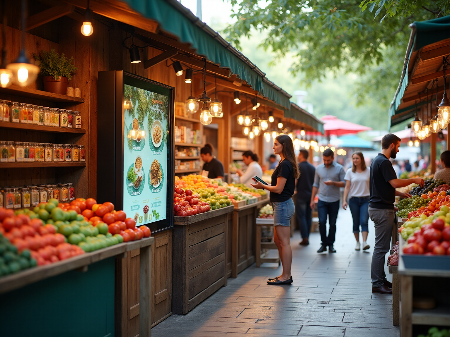
In the competitive landscape of UAE dining establishments, the strategic application of attractive color palettes for restaurant websites has proven to be an effective tool for enhancing customer interaction and establishing a robust brand identity. For instance, Farzi Cafe employs a vibrant array of hues, including warm reds and yellows, fostering an energetic ambiance that resonates with a younger demographic. This choice not only reflects the establishment’s innovative fusion cuisine but also conveys excitement and modernity, effectively drawing in patrons seeking a lively dining experience.
Conversely, Zahrat Al Mandi opts for earthy tones such as browns and greens, evoking a sense of tradition and authenticity. This color scheme appeals to customers who prioritize a genuine dining experience, reinforcing the restaurant’s commitment to cultural heritage and quality.
Understanding the target audience is crucial for tailoring effective marketing strategies. A notable example is Coca-Cola’s ‘Share a Coke’ campaign, where the brand replaced its logo with popular names, demonstrating how personalization in marketing can significantly enhance customer engagement. This illustrates that aligning hue selections with customer preferences can create memorable experiences when utilizing attractive color palettes for UAE restaurant websites.
Furthermore, the case study from GO-Globe underscores the importance of continuous improvement in marketing efforts. By analyzing user behavior and employing A/B testing, dining establishments can refine their color strategies over time, ensuring they remain relevant and appealing to their audience.
As Colin Kaepernick wisely stated, “Believe in something. Even if it means sacrificing everything.” This sentiment aligns with the necessity for dining establishments to trust in the power of strong branding tactics, including deliberate hue choices that foster closer relationships with patrons.
By aligning color selections with the venue’s theme and target clientele, establishments can craft attractive color palettes for UAE restaurant websites that create unforgettable experiences and set themselves apart in the vibrant market.

Common Mistakes to Avoid in Color Selection
When selecting color palettes for your restaurant, it is crucial to avoid these common mistakes:
- Ignoring Color Psychology: Colors evoke emotions and can significantly influence customer behavior. For example, blue is often associated with calmness but can suppress appetite, making it an unsuitable choice for fast-food establishments. Grasping the psychological influence of hues is essential for aligning your branding with customer expectations.
- Overcomplicating the Palette: A cluttered hue scheme can lead to visual chaos, detracting from your company message. Aim for a limited palette that creates a cohesive and inviting atmosphere. Research indicates that using attractive color palettes for UAE restaurant websites enhances brand recognition and customer experience. The qualitative hue palette created by Okabe and Ito offers eight distinct shades that can act as a practical reference for designing an effective scheme.
- Neglecting Cultural Context: Colors carry different meanings across cultures, which is particularly important in a diverse market like the UAE. For instance, while white symbolizes purity in some cultures, it may represent mourning in others. Ensure your hue selections resonate with the cultural backgrounds of your target audience to create attractive color palettes for UAE restaurant websites that foster connection and relevance.
- Neglecting Accessibility: Accessibility should be a priority in your hue selections. Strong contrast between text and background shades is essential for readability, particularly for individuals with visual impairments. Implementing accessible design principles not only broadens your audience but also enhances the overall dining experience.
- Not Testing Colors in Context: Colors can appear differently under various lighting conditions. It is crucial to evaluate your selected hues in the real dining setting to guarantee they communicate the intended impact. This practice helps avoid surprises and ensures that your branding remains consistent and appealing.
As Krista Nye Nicholas emphasizes, crafting a hue narrative that goes beyond wall shades can create a layered and engaging environment, enhancing the overall atmosphere of your eatery. Moreover, as Mahmoud Abdelnaby, Marketing Manager, suggests, “Steer clear of combinations that appear as if they were put together in the dark unless you aim for the ‘clashing chic’ style.” By being aware of these frequent traps and integrating professional advice, you can develop attractive color palettes for UAE restaurant websites that enhance your establishment’s identity and connect with your clientele.
Keep in mind, clarity in your hue selections is crucial; misrepresenting information in visual identity can result in flawed conclusions and diminished trust, as demonstrated in the case study titled ‘Consequences of Misrepresenting Data.

Key Takeaways for Effective Color Palette Selection
Effective selection of attractive color palettes for UAE restaurant websites is essential for establishing a strong brand identity and enhancing customer engagement. Understanding the significance of hues in branding is the first step; shades evoke emotions and affect perceptions, making them powerful tools in marketing. By utilizing visual psychology, you can create a welcoming environment that resonates with your target audience.
For instance, warm hues such as red and orange can stimulate appetite, while cooler shades like blue can evoke a sense of calm.
Cultural influences also play a crucial role in selecting attractive color palettes for UAE restaurant websites. In the UAE, where diverse cultures converge, it is vital to consider local preferences and associations linked to color choices. For example, green is often associated with freshness and health, making it a popular choice for restaurants focusing on organic or healthy cuisine.
To avoid common pitfalls, clearly define your identity and limit your color selection to a few attractive palettes. This approach not only simplifies the design process but also ensures a cohesive visual identity across all platforms. Testing various combinations can yield insights into what resonates best with your audience, enabling adjustments based on feedback.
Successful case studies, such as the comprehensive campaigns for Mirinda and Quaker Oats, illustrate the impact of effective hue strategies. These campaigns enhanced visibility and consumer engagement, demonstrating how intentional color selections can influence business outcomes. Specifically, the use of bright hues in these campaigns effectively captured attention and conveyed the brands’ messages.
Integrating expert insights into your color strategy is also beneficial. For instance, recognizing that around four percent of the population suffers from some form of color blindness—predominantly males—can inform your decisions to ensure accessibility and inclusiveness in your designs. As Jon Olav Eikenes noted, “Some of our users look at our charts for hours. Thus, it was one of our initial thoughts that our hues should be gentle on the eyes.”
Furthermore, client success stories for companies like Castania and Motorola further demonstrate the impact of strategic color selections in marketing and promotional efforts. By embracing these best practices, you can create visually appealing and impactful brand identities that leverage attractive color palettes for UAE restaurant websites to attract and retain customers. Ultimately, continually seeking feedback and adapting your color strategies is essential to remain relevant in the dynamic restaurant industry.

Conclusion
Color transcends mere aesthetics in restaurant branding; it is a crucial element that shapes customer perceptions and experiences. In examining the significance of color within the UAE’s vibrant dining landscape, it becomes evident that a deep understanding of color psychology, cultural implications, and practical strategies is vital for crafting an inviting atmosphere that resonates with a diverse clientele.
The strategic selection of colors can elicit specific emotions and behaviors, effectively attracting patrons and enhancing their dining experience. Warm hues stimulate appetite and cultivate a welcoming environment, making them ideal for casual settings, whereas cooler tones convey sophistication, appealing to upscale establishments. Furthermore, cultural influences significantly shape color preferences, necessitating a thoughtful alignment between branding choices and local sensibilities.
By applying practical strategies—such as defining brand personality, limiting color palettes, and considering audience demographics—restaurant owners can forge a cohesive visual identity that bolsters brand recognition and fosters customer loyalty. Success stories from various UAE restaurants underscore the tangible impact of effective color strategies, demonstrating that deliberate and strategic color choices can substantially enhance customer engagement and drive success in a competitive market.
Ultimately, the power of color in restaurant branding resides in its capacity to connect with customers on a profound level. By embracing the insights presented in this exploration, restaurant owners can harness the potential of color to not only create memorable dining experiences but also to solidify their brand identity in the minds of their patrons.
Frequently Asked Questions
How does color influence branding for dining establishments?
Color serves as a visual identifier and evokes emotions, helping to establish the desired atmosphere for dining establishments.
What role do warm hues play in restaurant branding?
Warm hues like red and orange enhance appetite and create a welcoming environment, making them ideal for informal dining spaces.
How do cooler shades affect the atmosphere of high-end venues?
Cooler shades such as blue convey tranquility and elegance, appealing to high-end venues seeking a more sophisticated atmosphere.
What does research say about the impact of color on consumer behavior in dining settings?
Research indicates that color significantly influences consumer feelings and behaviors, with hue priming being most effective when aligned with the product category.
Why is it important for UAE restaurants to use attractive color palettes on their websites?
Attractive color palettes can enhance a restaurant’s allure and help differentiate eateries in the diverse culinary landscape of the UAE while resonating with local cultural preferences.
What risks are associated with hue differentiation in branding?
While hue differentiation can enhance brand performance, it may pose risks in certain product categories, necessitating thoughtful consideration in hue selections.
How can color choices in menu design impact consumer attraction?
Using cool hues in menu design can attract health-conscious patrons, while vibrant greens symbolize wellness, whereas blue hues are often avoided due to their potential to suppress appetite.
How can establishments adapt color schemes for marketing strategies?
Establishments can adapt color schemes to reflect seasonal themes or promotional events, fostering a dynamic atmosphere that engages customers and promotes limited-time offers.
What is the significance of understanding hue associations in the food service sector?
Understanding hue associations helps eatery owners select appealing color palettes, drawing in patrons and enhancing their overall dining experience.
What demographic variations exist in hue perception?
Hue perception can vary across demographics, with some individuals, particularly men, struggling to perceive certain hues, which impacts how different audiences interpret marketing colors.
Tag
Share:
5 Best Practices for Web Design in the Food Industry in the Emirates
9 Best Practices for Web Design in the UAE Food and Beverage Sector

Best Practices for Visual Hierarchy in UAE Food Marketing