
Digital Branding Strategies
How to Choose Attractive Website Color Schemes for the UAE Food and Beverage Sector: A Step-by-Step Guide
Overview
Selecting appealing website color schemes for the UAE food and beverage sector necessitates a comprehensive understanding of the psychological and cultural implications of colors, along with their influence on consumer behavior.
It is crucial to recognize that warm colors, such as red and orange, are known to stimulate appetite, whereas cooler shades like blue and green evoke feelings of freshness and health.
Brands must align their color selections with the preferences of their target audience to foster engagement and cultivate brand loyalty.
Introduction
Color transcends mere visual appeal; it serves as a formidable instrument that shapes perceptions and influences consumer behavior, particularly within the fast-paced food and beverage sector. In the UAE’s competitive landscape, characterized by diverse cultural nuances and consumer preferences, the strategic employment of color can decisively impact a brand’s identity. By utilizing warm hues to stimulate appetite and cooler tones to convey trust, brands can evoke emotions and forge meaningful connections with their audience. This article explores the critical role of color in branding, examining its psychological implications, cultural significance, and practical applications. Furthermore, it offers insights into how brands can adeptly select and implement color schemes to bolster their market presence and cultivate consumer loyalty.
Understanding the Role of Color in Food and Beverage Branding
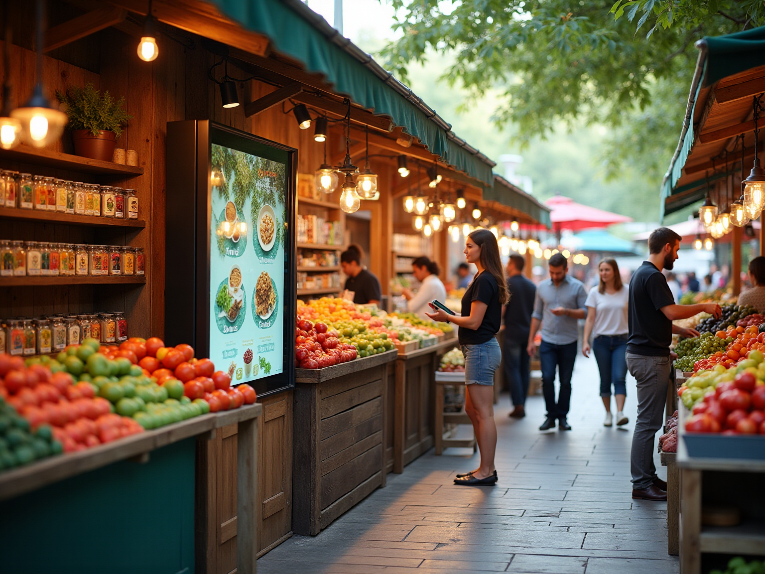
Color is a fundamental element in food and beverage branding, serving as a powerful visual cue that evokes emotions and significantly influences consumer behavior. In the competitive landscape of the UAE’s food and beverage market, utilizing attractive website color schemes is essential for distinguishing a brand and enhancing its appeal. Warm hues like red and orange are often linked to appetite enhancement, making them favored selections for dining establishments and food items.
Conversely, cooler shades such as blue convey trust and tranquility, which can be particularly effective for beverage brands. Research indicates that hue affects emotional reactions and perceptions of taste, with various tints evoking distinct feelings—warmth, freshness, or even nostalgia. This is especially relevant in the UAE, where the market’s diversity necessitates attractive website color schemes. Experts emphasize that understanding cultural context and consumer preferences is crucial for creating a compelling brand identity that resonates with the target audience.
Moreover, the overconsumption of high-sugar, high-calorie indulgent foods presents health hazards, highlighting the importance of marketing in promoting healthier options within the market. Hoadley’s 1990 study underscored the advantages of hue in documents, stressing the need to differentiate fact from fiction in hue-related decisions. Case studies further demonstrate the influence of hue on branding effectiveness.
For instance, creative director Hillary Weiss advocates for innovative color combinations that challenge traditional associations, employing vibrant palettes to forge unique brand identities. Such strategies can create unforgettable experiences for consumers and nurture emotional connections with the brand. Additionally, the impact of shapes on food selections cannot be overlooked.
Recent discussions highlight that various shapes can influence public perception and emotional connection, underscoring the significance of a comprehensive design approach. Statistics reveal that individuals often associate specific shades with particular tastes and attributes, which is vital for designing attractive website color schemes in the UAE food and beverage sector. By leveraging these insights, companies can craft palettes that not only attract interest but also enhance the overall customer experience, ultimately boosting engagement and loyalty.

The Psychology of Color: How Colors Influence Consumer Choices
The psychology of hues plays a crucial role in marketing, particularly in crafting attractive website color schemes for the UAE food and beverage sector. These color schemes can evoke emotions and shape perceptions, significantly influencing purchasing decisions. For instance, red is often associated with excitement and hunger, making it a favored choice among fast food chains.
Conversely, yellow evokes feelings of happiness and warmth, while green is commonly linked to health and freshness. These associations enable brands in the UAE food and beverage sector to design appealing website color schemes that resonate profoundly with their target audience, ultimately driving sales.
Research underscores the impact of color responses. A study revealed that 84.7% of shoppers chose to purchase a product primarily due to its hue, underscoring the importance of color in branding strategies. Additionally, findings suggest that more saturated packaging colors can enhance perceptions of freshness and healthiness, particularly relevant for food items.
However, when enjoyment-related text is combined with colored packaging, it can diminish health perceptions, thereby influencing buyer evaluations.
Practical Applications:
- Fast Food Brands: Leverage red and yellow to stimulate appetite and instill a sense of urgency.
- Health-Focused Brands: Integrate green to convey freshness and highlight health benefits.
- Testing Color Combinations: Experiment with various hues to identify which combinations yield the most favorable responses from consumers. Notably, companies should recognize that more vibrant colors can enhance perceptions of freshness, aligning well with attractive website color schemes for the UAE food and beverage sector.
- Caution with Enjoyment-Related Text: Be aware that enjoyment-related text in conjunction with colored packaging may reduce health perceptions, potentially affecting buyer evaluations.
Remarkable case studies, such as the comprehensive campaigns developed for Miranda and Quaker Oats, illustrate how effective color strategies can resonate with audiences and enhance experiences. By understanding the psychology of hues, brands can forge compelling visual identities that not only attract attention but also cultivate consumer loyalty.

Cultural Significance of Colors in the UAE Market
In the UAE, hues are imbued with profound cultural meanings that significantly influence branding strategies. The colors of the UAE flag—red, green, white, and black—each carry substantial symbolism:
- Red represents bravery and courage
- Green is linked to prosperity and growth
- White signifies peace and purity
- Black embodies strength
Companies that effectively integrate these colors into their visual identity can forge a deeper connection with local customers, thereby enhancing loyalty and recognition.
Understanding the cultural significance of colors is essential for companies to avoid potential missteps. For example, while white is typically associated with purity and peace, it can also convey connotations of mourning in specific contexts. This duality underscores the importance of conducting thorough research to ensure that color selections align positively with cultural norms and sentiments.
Successful examples abound in the UAE market, where companies have adeptly employed these cultural colors to refine their marketing strategies. Notably, WonderEight’s collaboration with Quaker Oats illustrates how a strategic marketing approach that emphasizes cultural relevance, including the entity’s health benefits and product versatility, can lead to increased public awareness and a stronger market position. Such initiatives not only drive sales growth but also cultivate a deeper emotional connection with the target audience.
Moreover, statistics indicate that a product gaining a family’s trust often triggers a ripple effect within the community, highlighting the impact of word-of-mouth in consumer behavior. This phenomenon is particularly pronounced in the Middle East, where customer loyalty is closely intertwined with social spheres. Therefore, companies that thoughtfully incorporate appealing website color schemes for the UAE food and beverage sector into their marketing strategies are more likely to achieve measurable results and resonate with their audience. Additionally, client success stories, such as the identity enhancement for Castania and the digital campaign for Motorola, further demonstrate WonderEight’s effectiveness in delivering impactful results through culturally relevant branding strategies.
Furthermore, at WonderEight, we prioritize user experience on our website, utilizing cookies to enhance our services. By continuing to engage with our site, we assume that users are satisfied with our cookie policy, reflecting our commitment to providing the best possible experience.

Choosing the Right Color Palette: Tips for Food and Beverage Brands
Choosing attractive website color schemes for the UAE food and beverage sector is crucial for companies striving to establish a captivating visual identity. To guide your selection process, consider the following key strategies:
-
Define Your Identity Personality: Begin by identifying the emotions and values that your brand seeks to convey. A playful brand may benefit from bright, vibrant hues, while a premium brand might opt for muted, sophisticated shades to reflect its exclusivity.
-
Understand Your Target Audience: Gain insights into the hue preferences of your target demographic. Conducting surveys or focus groups can provide valuable feedback on which shades resonate most with potential customers.
-
Utilize Color Principles: Familiarize yourself with hue theory principles, such as complementary and analogous palettes. Understanding these concepts will enable you to create visually appealing combinations that enhance your brand’s message.
-
Test Your Palette: Create mockups of your promotional materials using various hues. Gather feedback from potential customers to determine which palette resonates best and aligns with their expectations.
-
Maintain Uniformity: Ensure that your selected hue palette is consistently applied across all promotional materials, including your website, packaging, and social media platforms. Consistency promotes recognition of your identity and strengthens your image.
Example Color Palettes:
- Fresh and Healthy: Green, white, and light brown evoke a sense of natural freshness.
- Bold and Exciting: Red, yellow, and black create a dynamic and energetic feel.
- Elegant and Premium: Gold, navy blue, and cream convey sophistication and luxury.
The impact of hues in branding cannot be overstated; studies show that colors enhance recognition by up to 80% compared to monochrome. Furthermore, 52% of shoppers have reported choosing not to revisit a website due to its unappealing appearance. Effective packaging design also plays a vital role in how buyers perceive products, with 53% of individuals willing to pay more for sustainably packaged foods.
By carefully selecting your color palette and considering packaging design, you can significantly improve your company’s appeal and consumer interaction within the competitive food and beverage industry. This sector, which encompasses segments such as confectionery and snacks, reached $1,592,215 million in 2022, underscoring the importance of utilizing attractive website color schemes tailored for the UAE food and beverage market.

Implementing Color Schemes: Best Practices for Website Design
Implementing color schemes effectively on your website is not just an aesthetic choice; it is a strategic decision that can significantly enhance user experience and brand perception.
- Follow the 60-30-10 Rule: Allocate 60% of your design to a dominant hue, 30% to a secondary shade, and 10% for accent tones. This approach creates a visually appealing layout and ensures a harmonious balance that draws users’ attention to key elements.
- Ensure Accessibility: Prioritize combinations that provide sufficient contrast to enhance readability for all users, including those with visual impairments. Notably, statistics indicate that 16% of individuals associate security with the hue black, underscoring the psychological impact of hue selections on user perception.
- Utilize Hues to Direct Navigation: Employ hues strategically to emphasize significant buttons and calls to action. This not only improves navigation but also directs users’ focus to critical areas of your site, enhancing overall usability.
- Test Across Devices: Recognize that colors can appear differently on various devices and screen sizes. It is crucial to ensure that your hue scheme maintains its integrity and attractiveness across all platforms, providing a consistent user experience.
- Maintain Consistency: Your website’s hue arrangement should correspond with your overall identity and messaging. This cohesion strengthens recognition and fosters trust among your audience. As Kaspar Manz, Graphics team lead at the Swiss newspaper Neue Zurcher Zeitung, states, “Level 1 hues are specific shades that should remain precisely as they are,” emphasizing the importance of maintaining consistency in usage.
Tools for Implementation:
- Utilize design tools like Adobe Color or Coolors to create and test color palettes that resonate with your brand and audience.
- Conduct A/B testing to evaluate user responses to different hue schemes, allowing you to refine your approach based on real user data.
- Consider using tools like Viz Palette, which enables designers to test palettes in context and under simulated perception deficiencies, ensuring that choices are effective and accessible.
By adhering to these best practices and aligning your hues with your identity, positioning, and target audience, you can develop attractive website color schemes for the UAE food and beverage sector that efficiently convey your message in this competitive industry. Thoughtful hue selections not only enhance the effectiveness of data visualizations but also improve message delivery, making your site more impactful.

Avoiding Pitfalls: Common Mistakes in Color Scheme Selection
When selecting color palettes, companies often encounter various challenges that can diminish their effectiveness. Here are key traps to avoid:
-
Using Too Many Colors: A cluttered palette can confuse consumers and weaken corporate identity. Studies show that a unified palette enhances identity recognition, so it’s advisable to limit your selection to a few complementary hues that interact harmoniously. Remember, 68% of US adults prefer brands that reflect their personal values, making it crucial to choose colors that align with your brand’s identity. Neglecting cultural context when designing appealing website color schemes for the UAE food and beverage sector can lead to misinterpretations and negative perceptions, as colors carry different meanings across cultures. For instance, while white symbolizes purity in some cultures, it may represent mourning in others. Conduct thorough research on the cultural significance of colors in your target market to ensure that your branding resonates positively. Understanding this context is essential, as colors can evoke emotions and hold different meanings.
-
Neglecting Accessibility: Poor contrast between text and background colors can hinder readability, alienating potential customers. Prioritizing accessibility in your color choices not only broadens your audience but also demonstrates a commitment to inclusivity. Statistics indicate that companies prioritizing accessibility can enhance customer loyalty and trust. A significant 46% of consumers are willing to pay more for brands they trust, underscoring the importance of building credibility through thoughtful design choices.
-
Following Trends Blindly: While current trends may be visually appealing, they might not align with your identity or values. It’s crucial to select colors that genuinely represent your brand’s character rather than merely adopting what is trendy. This approach fosters a stronger connection with your audience. As Jason Moyer, Creative Director at Create Element, notes, Mint’s branding is centered around simplicity and clarity, resulting in a clean and user-friendly website and app design.
-
Overlooking Testing: Skipping user testing can lead to missed opportunities for improvement. Collecting feedback on your color selections is essential to ensure they resonate with your audience. Establishing trust through transparency, reliability, and consistent fulfillment of commitments can enhance customer loyalty and willingness to pay premium prices.
Summary of Mistakes:
- An excess of colors can overwhelm.
- Cultural context is crucial.
- Accessibility should never be overlooked.
- Trends should align with brand identity.
- User testing is essential for resonance.

Testing and Refining Your Color Choices: Ensuring Effectiveness
Testing and refining your hue selections is crucial for maximizing their effectiveness in creating attractive website color schemes for the UAE food and beverage sector branding. Follow these steps to ensure your color schemes resonate with your audience:
-
Conduct A/B Testing: Create two separate versions of your website or marketing materials showcasing different design schemes. To determine which attractive website color schemes for the UAE food and beverage sector perform better, measure key metrics such as user engagement and conversion rates. Research indicates that utilizing attractive website color schemes for the UAE food and beverage sector can increase brand recognition by up to 80%, making this step essential.
-
Gather User Feedback: Implement surveys or focus groups to collect qualitative data on hue preferences and perceptions. This feedback can uncover insights into how your audience relates to different hues, which is crucial for creating attractive website color schemes for the UAE food and beverage sector.
-
Analyze Analytics: Utilize website analytics tools to monitor how alterations in design schemes affect user behavior. Pay attention to metrics like time spent on the site and bounce rates, as these can indicate the effectiveness of your attractive website color schemes for the UAE food and beverage sector. For instance, a study discovered that attractive website color schemes for the UAE food and beverage sector can affect conversion rates by as much as 24%.
-
Iterate Based on Findings: Utilize the data gathered to make informed modifications to your palette. Ensure that your final selections of attractive website color schemes for the UAE food and beverage sector align with user preferences and enhance overall reputation. As Kelly Camp states, “By relying on data rather than assumptions, marketers can fine-tune their ads, ensuring better results without increasing expenses.”
-
Stay Informed: Continuously track hue trends and changes in consumer preferences to keep your selections fresh and attractive. Staying informed about attractive website color schemes for the UAE food and beverage sector will help you adapt to changing market dynamics.
Tools for Testing:
- Use Google Optimize for effective A/B testing.
- Employ survey tools like SurveyMonkey to gather user feedback efficiently.
Additionally, consider the broader application of A/B testing through multipage testing, which compares the performance of different versions of a website across multiple pages to improve user experience and achieve business goals. By applying these techniques, companies can enhance their hue strategies based on user feedback and data-informed insights, ultimately improving their visual identity and marketing effectiveness with attractive website color schemes for the UAE food and beverage sector. A relevant case study is the email subject line testing, where a marketing team improved their open rates by A/B testing various subject lines, demonstrating the power of testing in achieving better engagement.

Conclusion: Taking Action on Your Color Strategy
Choosing attractive website color schemes for the UAE food and beverage sector is a nuanced endeavor that necessitates a thorough understanding of psychological, cultural, and practical elements. Color plays a pivotal role in branding, influencing buyer perceptions and engagement. Notably, studies indicate that altering the button shade to red can enhance conversions by 21%, underscoring the significant impact of hue selections on buyer behavior.
To improve market visibility, leveraging hue psychology is crucial. Colors evoke emotions and can forge strong connections with buyers. For instance, warm hues like red and orange can stimulate appetite and excitement, making them ideal for food brands.
Conversely, cooler tones such as blue and green convey freshness and health, appealing to health-conscious consumers. Furthermore, incorporating storytelling and tailored experiences into branding can further strengthen emotional connections with your audience, amplifying the impact of your selections.
Numerous companies have effectively enhanced their market visibility through strategic hue choices. A notable example is a renowned beverage company that updated its packaging to feature vivid hues representing its dynamic identity, resulting in a substantial increase in sales and visibility.
Case studies within the food and beverage industry demonstrate that successful hue strategies can yield outstanding outcomes. For instance, a recent study of a well-known snack label revealed that aligning packaging hues with consumer preferences not only improved product visibility but also fostered a stronger emotional bond with the target audience. However, it is essential to accurately represent statistics related to hue recognition; the frequently cited assertion that hue enhances brand awareness by 80% should be contextualized as relating to information processing rather than branding alone, as clarified in the case study titled ‘The Myth of the 80% Statistic.’
To implement a successful color strategy, consider the following actionable steps:
- Conduct thorough research on hue psychology and its cultural implications in the UAE.
- Test various hue combinations to identify which resonate best with your audience.
- Ensure consistency across all marketing materials, including your website, packaging, and promotional content.
- Regularly assess client feedback and engagement metrics to refine your hue selections.
Specialist insights underscore the importance of hue strategy in brand identity. As highlighted by industry experts, 73% of shoppers make purchasing decisions influenced by a product’s visual appeal, emphasizing the need for companies to focus on their color palettes. Moreover, branding encompasses several elements, including logos and voice, which collectively shape perceptions and awareness of the product.
In conclusion, an effective hue strategy is essential for food companies aiming to implement attractive website color schemes in the UAE food and beverage sector, thereby establishing a strong identity in a competitive market. By understanding the psychological effects of color, leveraging cultural significance, and adhering to best practices, brands can create compelling visual identities that resonate with consumers and drive engagement.

Conclusion
Selecting the right color palette is paramount for food and beverage brands operating in the UAE, as it significantly influences consumer perceptions and behaviors. The strategic use of color not only enhances brand identity but also fosters emotional connections with consumers. Warm colors stimulate appetite, while cooler shades convey trust and health—allowing brands to craft messages that resonate deeply with their target audience. Research underscores the importance of color in driving purchasing decisions, with a notable percentage of consumers choosing products based on their visual appeal.
Moreover, understanding the cultural significance of colors in the UAE market is essential for avoiding missteps and ensuring that branding efforts resonate positively with local consumers. Successful case studies reveal that brands can effectively enhance their market presence by aligning their color strategies with consumer preferences and cultural contexts. By conducting thorough research, testing different combinations, and maintaining consistency across branding materials, businesses can refine their color choices to maximize engagement and loyalty.
Ultimately, a well-executed color strategy is indispensable for food and beverage brands looking to thrive in a competitive landscape. Expert insights indicate that a significant portion of consumer decisions is influenced by visual appeal; thus, prioritizing color as a critical component of branding can lead to lasting success. By leveraging the psychological and cultural dimensions of color, brands can create compelling identities that not only attract attention but also foster meaningful connections with their audience.
Frequently Asked Questions
Why is color important in food and beverage branding?
Color serves as a powerful visual cue that evokes emotions and significantly influences consumer behavior, making it essential for distinguishing a brand and enhancing its appeal in the competitive food and beverage market.
What types of colors are effective for food establishments?
Warm hues like red and orange are often linked to appetite enhancement, making them favored selections for dining establishments and food items.
How do cooler shades like blue affect branding?
Cooler shades such as blue convey trust and tranquility, which can be particularly effective for beverage brands.
What impact does color have on emotional reactions and perceptions of taste?
Different hues can evoke distinct feelings such as warmth, freshness, or nostalgia, influencing how consumers perceive taste and emotional connections to the product.
What is the significance of understanding cultural context in branding?
Understanding cultural context and consumer preferences is crucial for creating a compelling brand identity that resonates with the target audience, especially in diverse markets like the UAE.
How does the overconsumption of indulgent foods relate to marketing?
The overconsumption of high-sugar, high-calorie foods presents health hazards, highlighting the importance of marketing in promoting healthier options within the market.
What role do innovative color combinations play in branding?
Innovative color combinations can challenge traditional associations and help forge unique brand identities, creating unforgettable experiences for consumers and nurturing emotional connections.
How do shapes influence food selections?
Various shapes can influence public perception and emotional connection, underscoring the significance of a comprehensive design approach in food branding.
What are practical applications of color psychology in food branding?
Fast food brands can leverage red and yellow to stimulate appetite, while health-focused brands can use green to convey freshness. Testing various color combinations can help identify the most favorable responses from consumers.
What caution should brands take when using enjoyment-related text with colored packaging?
Brands should be aware that combining enjoyment-related text with colored packaging may diminish health perceptions, potentially affecting buyer evaluations.
What evidence supports the importance of color in consumer purchasing decisions?
Research indicates that 84.7% of shoppers chose to purchase a product primarily due to its hue, underscoring the impact of color on branding strategies and consumer behavior.
Tag
Share:

5 Best Practices for Web Design in the Food Industry in the Emirates
9 Best Practices for Web Design in the UAE Food and Beverage Sector

Best Practices for Visual Hierarchy in UAE Food Marketing