Opinion Piece
Of Boxes, Bottles, Cans and Packs – 6 Packaging We Loved Developing!
Thinking outside the box is pretty much what has given us the oomph to stay agile across decades, markets and industries, catering to some of the biggest clients & love brands on both the regional and international levels.
One of our key interventions? Thinking of the “box” itself. Because wherever and whatever you’re buying, that purchase is surely coming inside a container! And truth be told, there’s more to it than stamping your logo on a bag, tin, wrap, bottle, or can and calling it a day.
Read on as we highlight some of the projects we’ve worked on over the past years and tell you more about what makes them stand out.

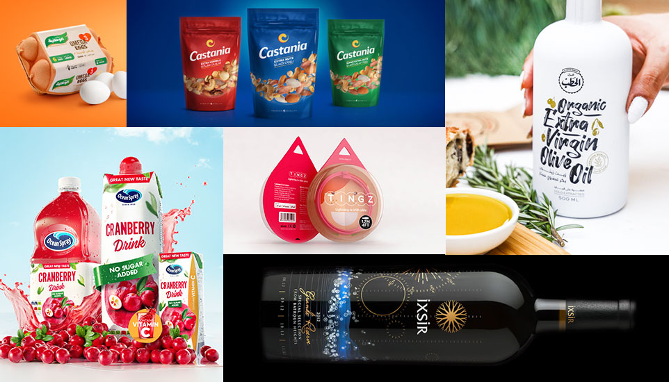
- CASTANIA: A full line rebranding does not only mean reworking a brand’s wordmark and color palette. For Castania, it would entail a thorough exercise: we went for sophisticated product CGI and a dynamic curve seamlessly replicated across 90 SKUs, shedding light on the iconic blue brand’s main asset: its roasted nuts and kernels.
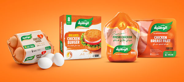
- AL WATANIA: Overcrowded supermarket shelves don’t spare anyone, not even industry leaders. When Al Watania got overshadowed by fresh faces, we designed for them a modern package and went for a more vibrant shade of orange, making the brand’s products more attractive and immediately recognizable.

- OCEAN SPRAY: When the brand that made cranberries famous wanted to expand in the GCC, we went on a full-fledge journey to have their entire SKU line look as awesome online as it would on shelves. We opted for a fresh and modern bilingual identity, rethinking and reworking every bottle and can, from its hierarchy of information to overall legibility.
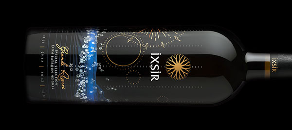
- IXSIR: Who said creatives aren’t good with numbers? This data-driven design for IXSIR would prove them wrong! We gathered thousands of numbers on the 3 main elements that shape the taste of wine and gave the numbers voice, letting the bottle tell its own story.
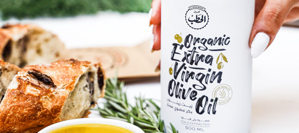
- AL HATAB: We got inspired by the bakery’s name (which translates into “wood”) and its connotation of authenticity to craft these hamper boxes using handmade bamboo sticks and leather detailing. Our objective was to elevate the bakery experience and place their exclusive selection of baked goods and international flavors in a league of its own.
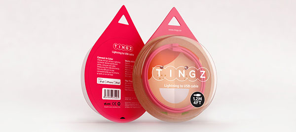
- TINGS: This collection of 3D little boxes filled with all sorts of, well, tings, puts the fun back inside packaging. We went for different shapes, personas, and colors, injecting them all with the same dose of fun and creativity. To each their own preferred version, but one thing is sure: the box does matter.
So you see, it’s not just about the product that is underneath, but also about the brand that lies behind the packaging and the customer experience that transported this specific product from the virtual world of advertising to people’s daily lives. Also, packaging exercises offer plenty of room for product innovation, which is probably why we like them so much.

