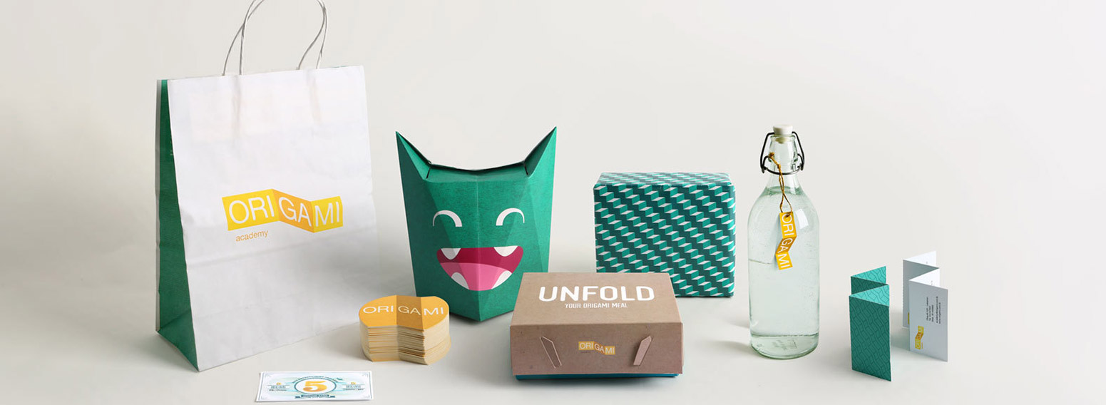
A new concept was hitting the streets of Beirut combining playgrounds and academies with different classes for kids. We were set to create an identity that clearly communicates the contrast and consistency of the place, bringing out the fun in learning!
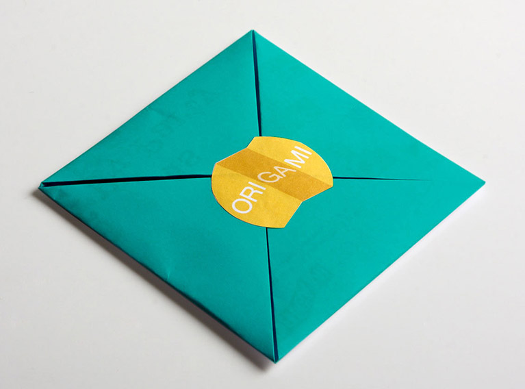
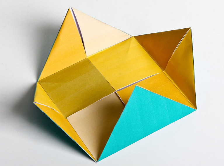
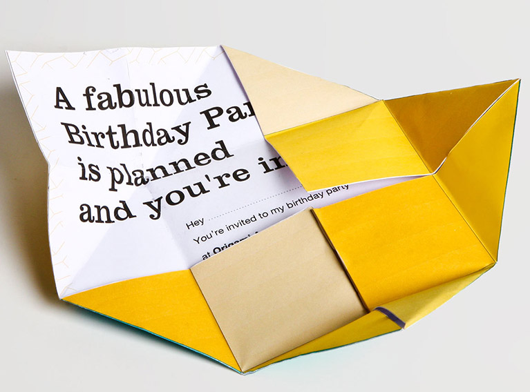
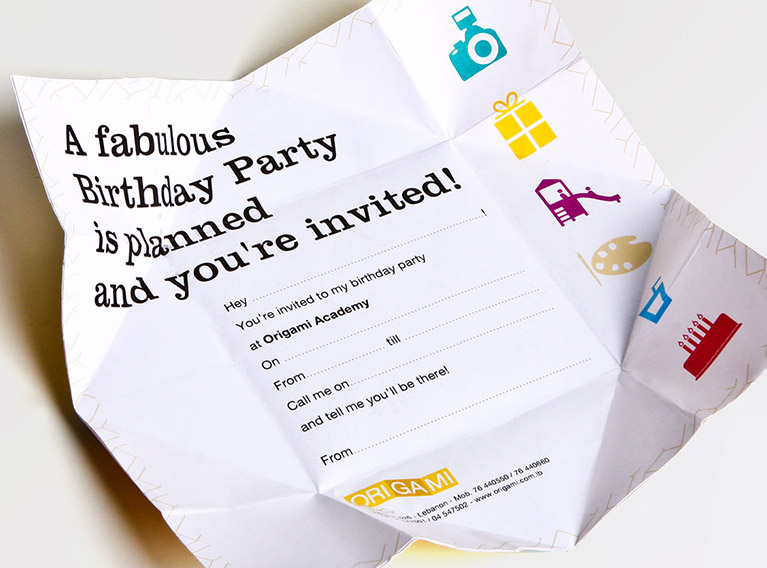
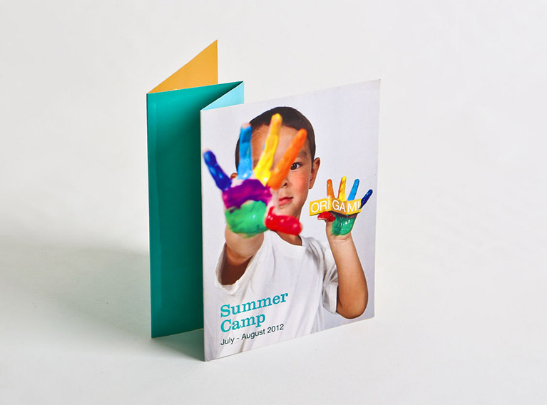
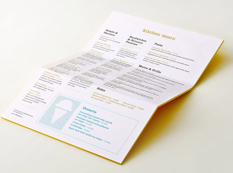
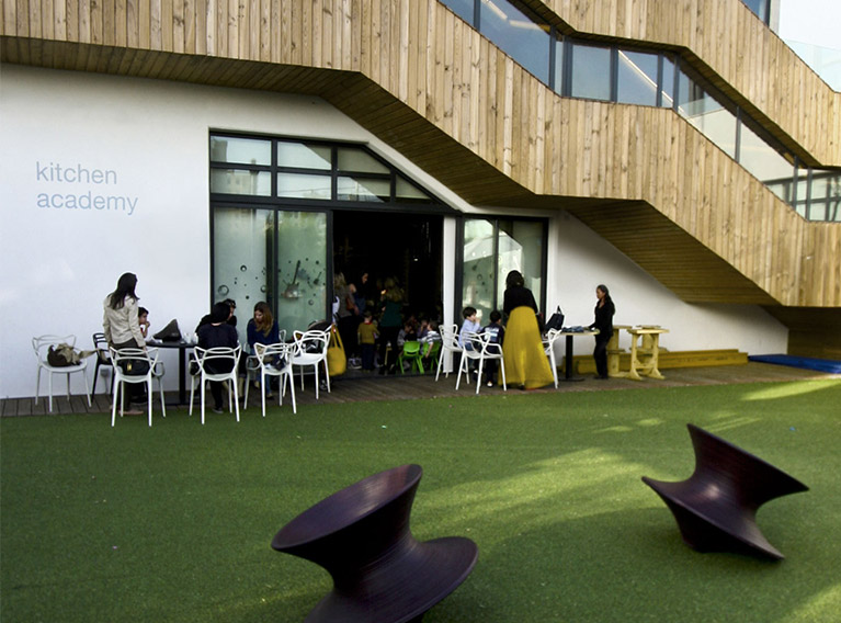
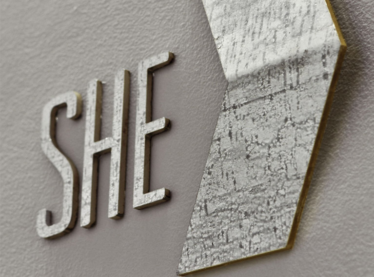
The name and logo were inspired by the architecture of the place – sharp cuts, woodworks and unconventional stairs that looked like paper folds. The branding roll out took origami to the next level, as literally everything was made of folded papers. The kids’ meal boxes were an origami Batman, placemats a folded origami with an “unfold me” message, business cards were detachable perforated papers and kids’ birthday invitations a folded pretend-money bill that can be redeemed during the activities.
All elements of the branding helped build on the brand’s essence positioning it as fun, lively and sophisticated. A place equally attractive to curious children and their sophisticated parents!
Origami’s major success created a buzz in its neighborhood, motivating other F&B concepts to open nearby, bringing footfall to the whole area! As for us, we got shortlisted at the 2012 Restaurants & Bars Design Awards in London!