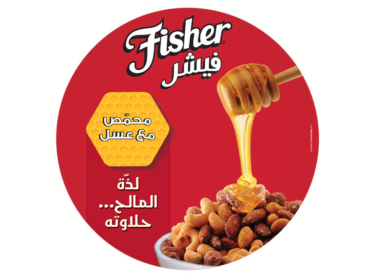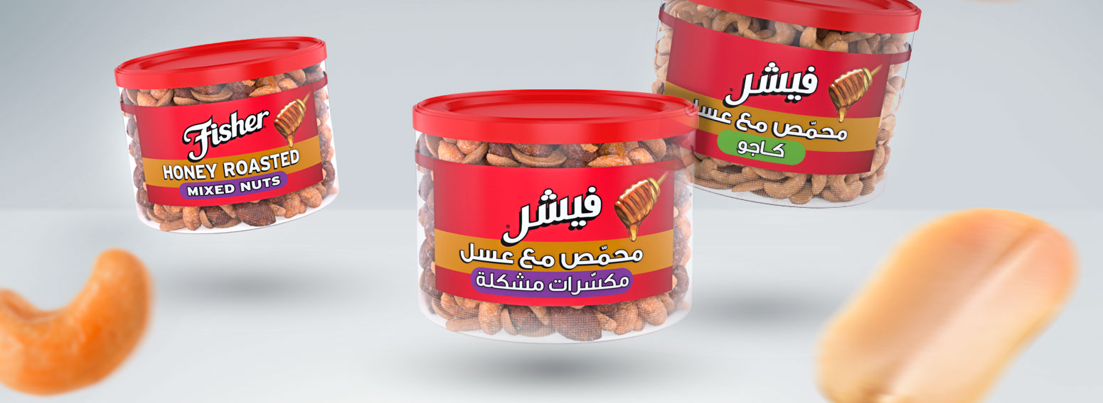
Fisher, a leading American brand, was launching its products in the Middle East and needed brand localization for Arab markets. They were on the look for a local partner with a thorough understanding of local and regional culture (ME and GCC).
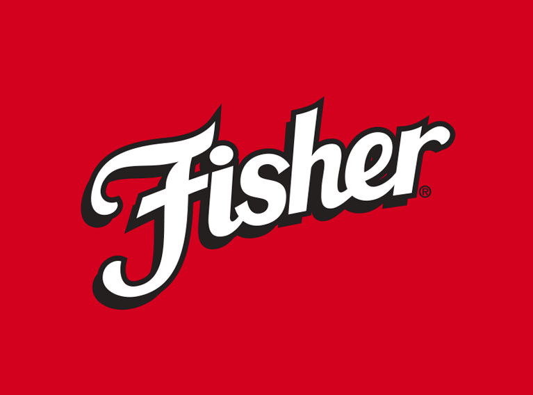
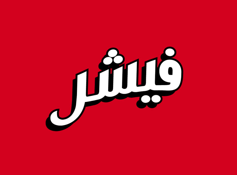
The challenge laid in creating an Arabic version of the logo that retained the look and feel of the original, this also meant that we needed to rethink the packaging so that the bilingual information wouldn’t look cluttered. Using our extensive experience in branding, design, corporate identity, logos and packaging as a springboard, we used Fisher’s Latin characters as a base to build the Arabic typeface, thus maintaining the same visual impact as the original logo. This customized font was conceptualized and designed to work across all applications. We ensured the packaging featured all the information neatly with good use of space. A 360 agency, we made the brand come to life in Arabic.
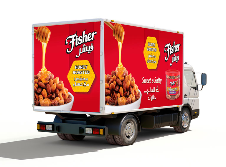
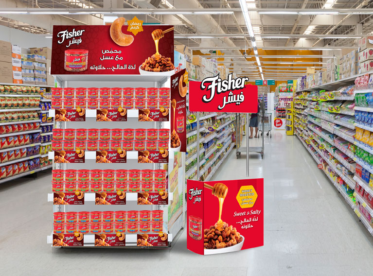
Fisher achieved more brand recognition throughout the GCC and Arabic speaking countries thanks to the effective Arabization whilst succeeded in keeping its brand image and visual identity intact.

