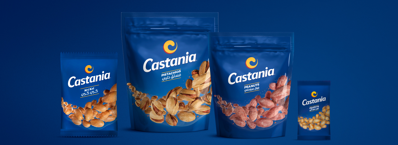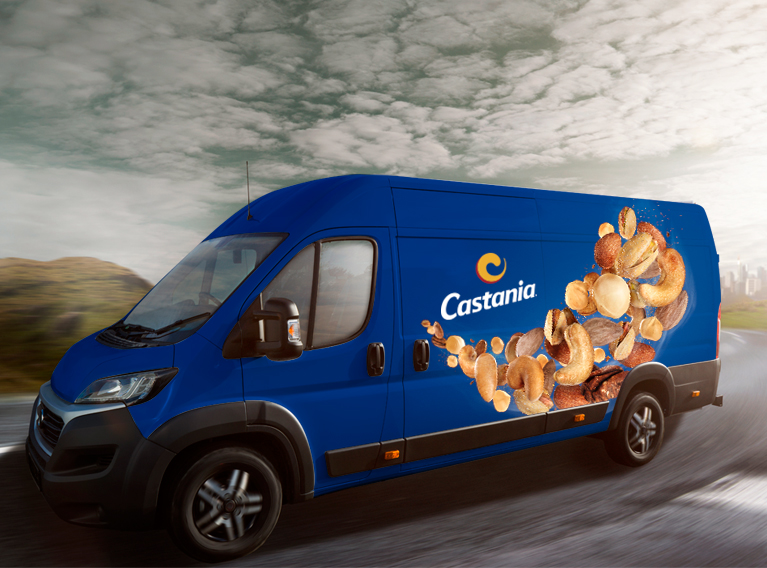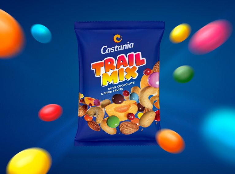
Since 1983, Castania has been at the heart of every gathering, with its premium kernels and nuts. Embracing the change happening in the local and international scenes, Castania opted to revamp its iconic blue brand and launch a new identity featuring a new mark and full line rebranding.
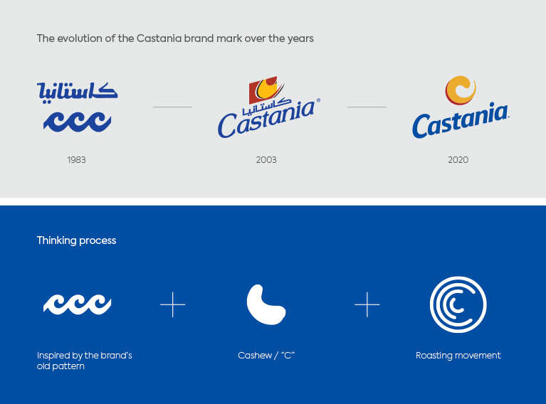

Starting off with the research phase, we looked back into the brand’s visual history and used a pattern from the eighties which featured interlocking circular structure as a base for the rebrand. We then developed the new brand mark to be a distinctive lowercase “c”, evoking a roasting machine’s constant movement. Our custom-made Latin and Arabic wordmarks were designed to have easy-on-the-eyes curves while preserving the slant of the previous version.
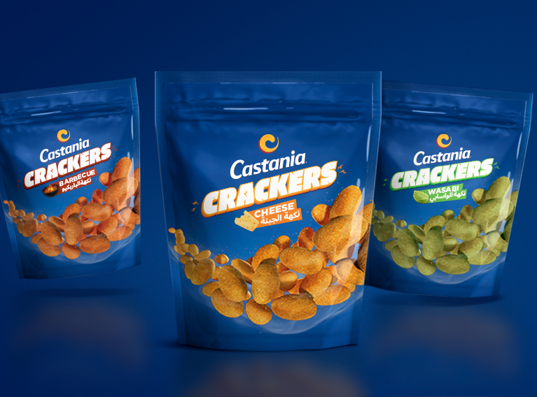
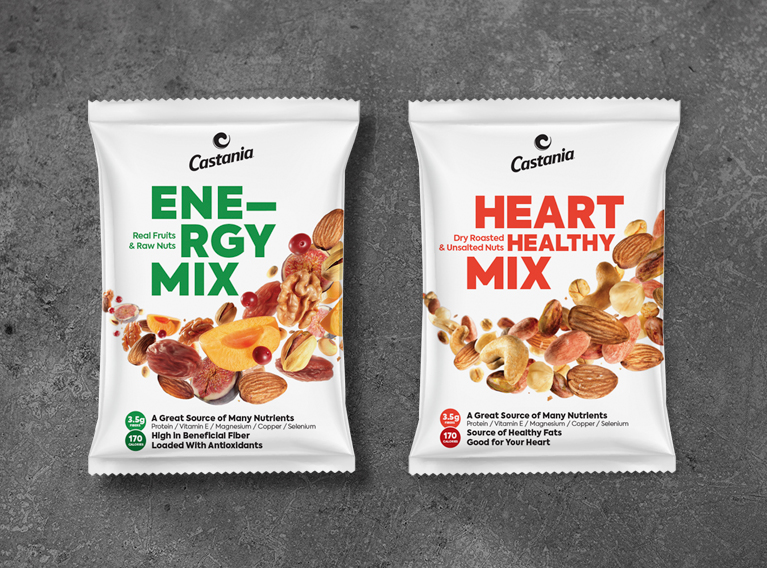
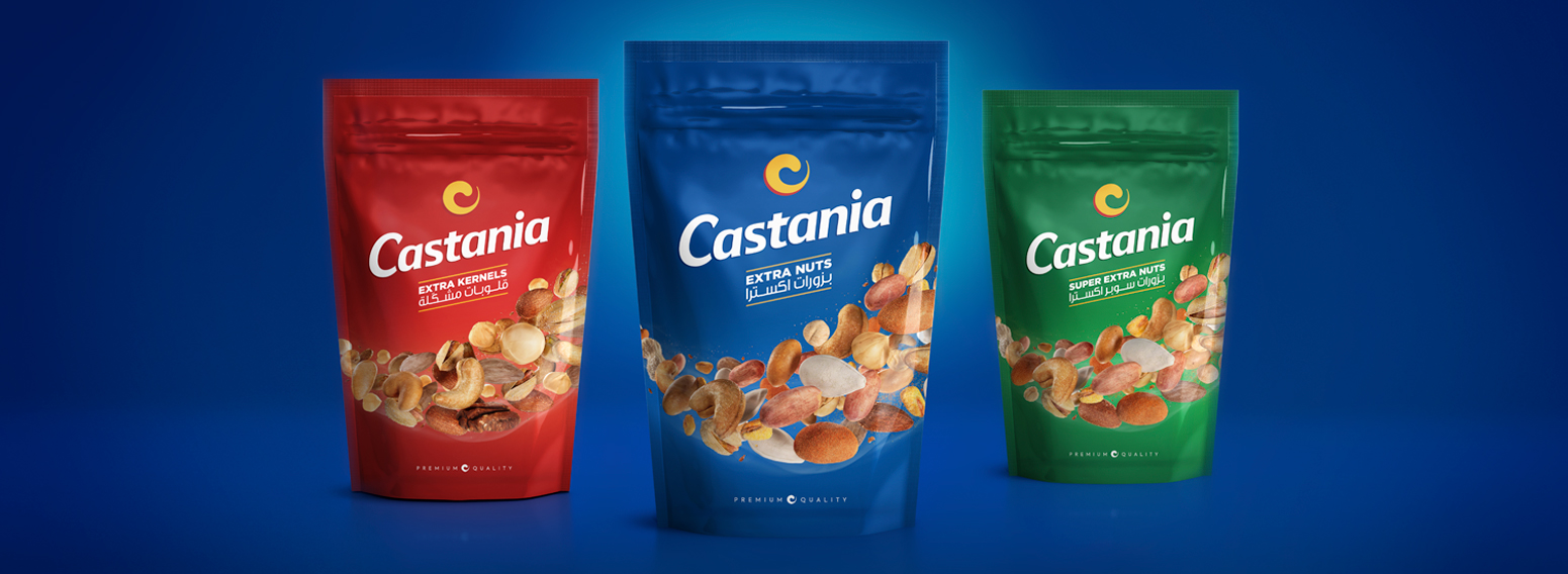
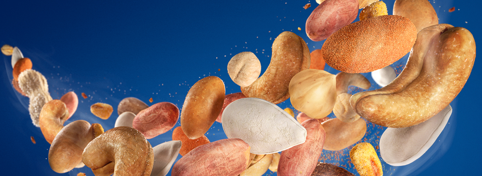
We designed the packs to highlight Castania’s most valuable asset: the goodness of its nuts and kernels. The visual interpretation is mouth-watering and a high-contrast imagery of the ingredients which were placed on dynamic curves to give a feeling that the product is freshly roasted and packed. This curve was perfectly interpreted across more than ninety different SKUs.
All the design and production elements, including the sophisticated product CGI, neat typography, and the slightly tweaked color palette were developed to reinforce the message that Castania provides the best quality products in the market.
In conclusion, the new identity was designed to be simple and modern while preserving the company’s heritage and brand equity.
