Al Hatab Bakery had been serving deliciousness from Al Qassim for 10 years. It was now time to rebuild the brand with an international look & feel, suited for expansion and franchising. This included revamping their brand identity and redefining their market positioning to create effective branding and communication guidelines.
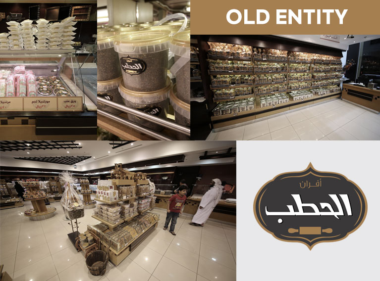
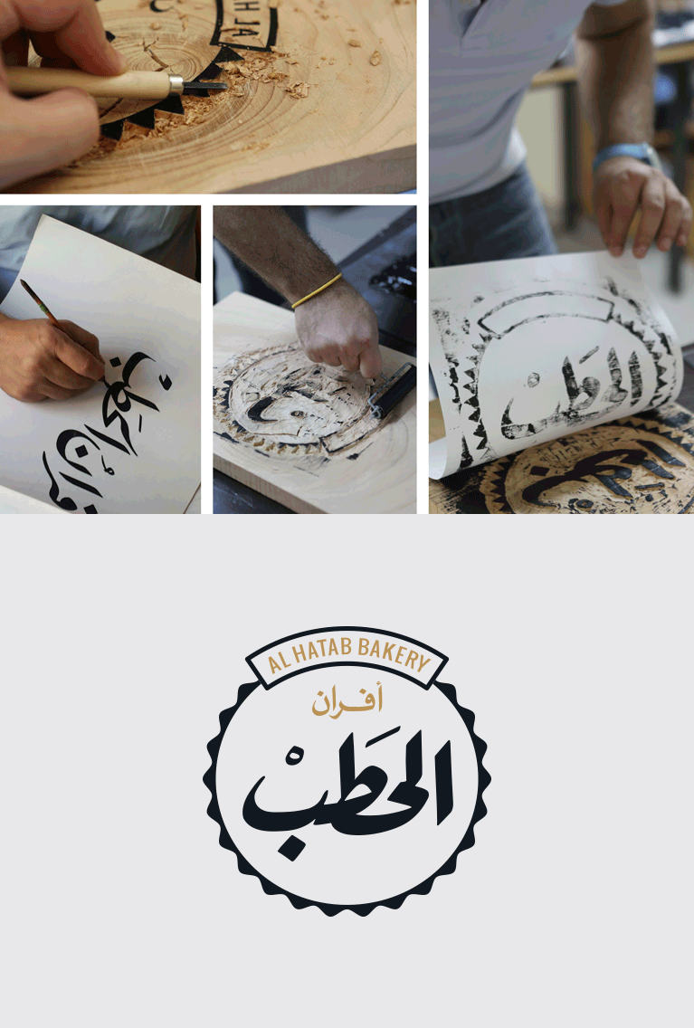
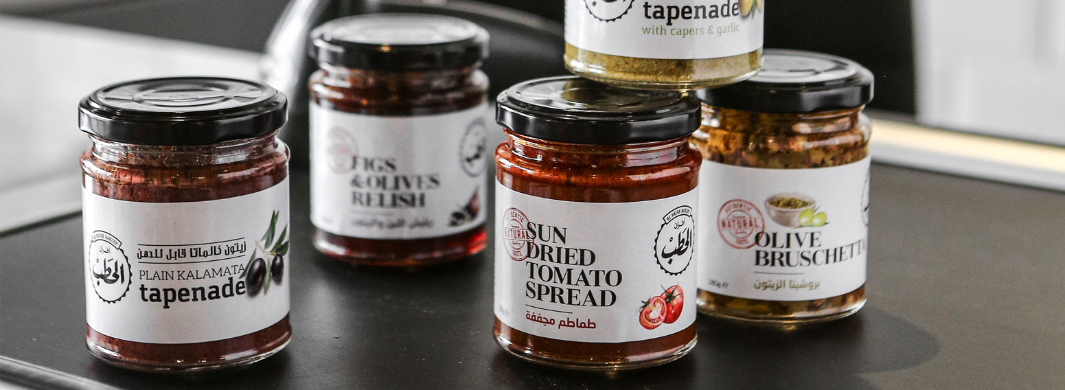
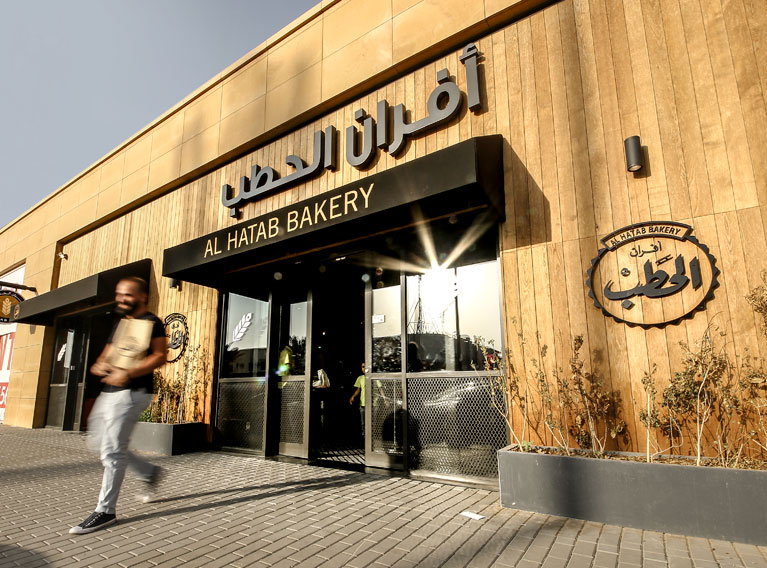
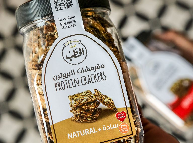
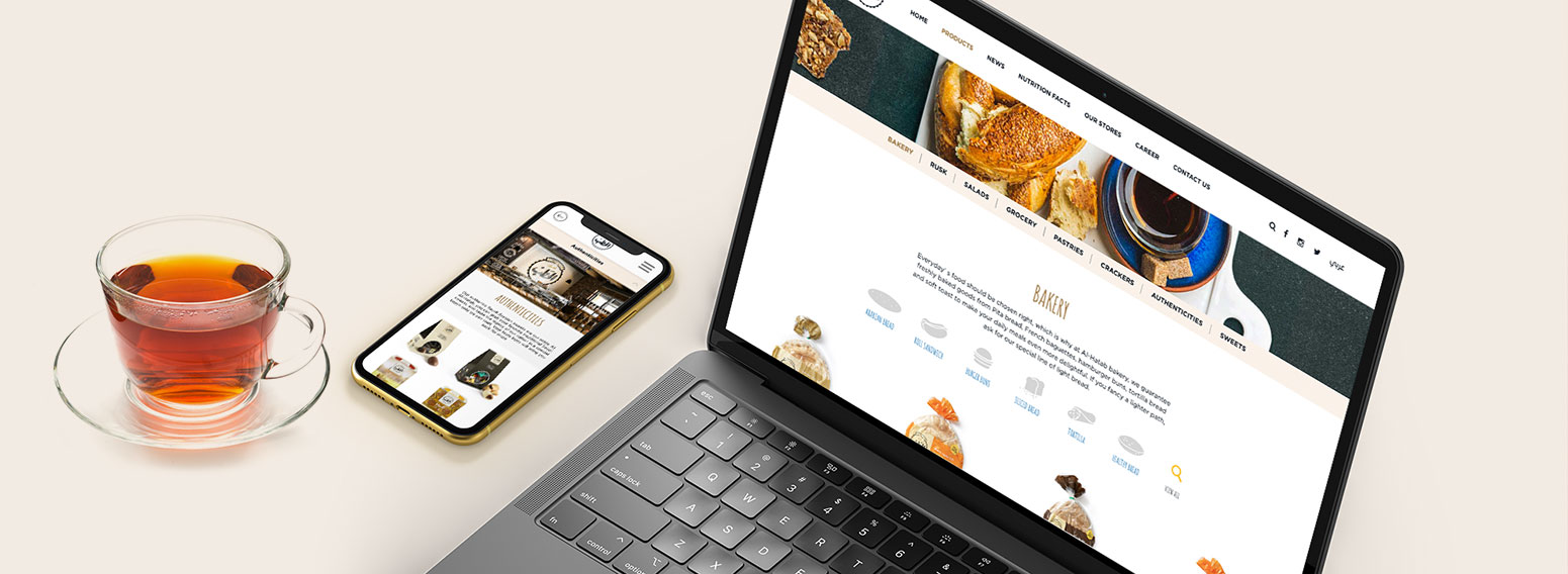
We started our work with extensive market research to understand what elements of their brand had equity we needed to leverage. The brand, photography, corporate identity, website, logo, menu design, and other key ingredients started to bake. Pinpointing the brand essence, we created the identity using a customized calligraphic typeface and an iconic wooden shape to reflect authenticity, uniqueness and history, mirroring the actual meaning of the brand name (Al Hatab means wood). The brand’s color scheme was devised based on earth tones to showcase the freshness and natural goodness. The bakery’s interior established a strong synergy between the visual identity and the brand’s environment. The new brand look and feel was rolled out to every single facet: uniforms, fleet, facades, website, and more.
(more on Al Hatab’s new website here)
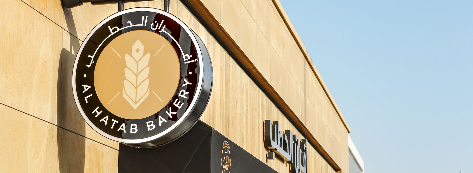
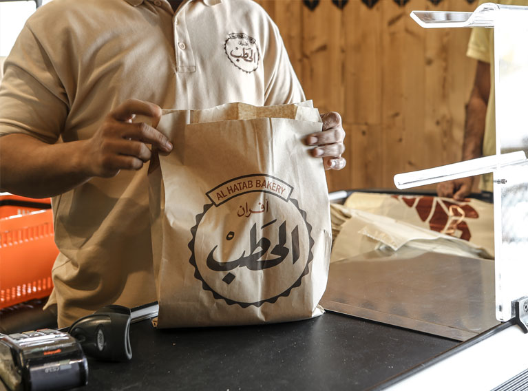
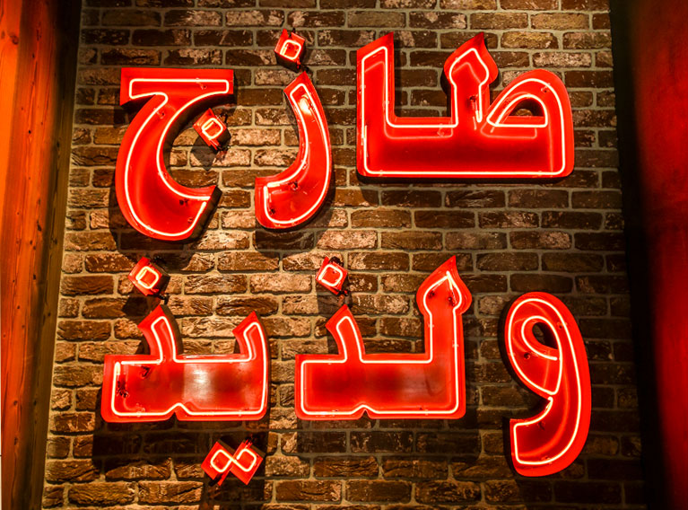
An iconic brand was born that aptly met all the objectives. As soon as the first location with the full rebranding opened in Riyadh it directly became the best performing branch, boasting 40% higher sales figures than the old locations.
