
Digital Branding Strategies
Best Practices for Visual Hierarchy in Web Design for UAE Restaurants
Overview
Best practices for establishing visual hierarchy in web design for UAE restaurants encompass critical principles such as:
- Size and scale
- Contrast
- Alignment
- Proximity
- Whitespace
These elements collectively enhance user engagement and navigation. Effective design not only elevates aesthetic appeal but also significantly influences conversion rates and customer satisfaction. This underscores the necessity of a well-structured visual hierarchy in attracting and retaining patrons. Brand Managers must recognize that implementing these principles is not merely a design choice but a strategic imperative that can drive business success.
Introduction
In the competitive landscape of restaurant websites, visual hierarchy is not just important; it is pivotal in capturing and retaining customer attention. By strategically arranging elements, restaurants can effectively guide visitors through their offerings, ensuring that key information stands out prominently. Leveraging size, contrast, and whitespace mastery enhances aesthetic appeal while significantly improving user engagement and conversion rates. As the digital dining experience continues to evolve, understanding and applying these visual hierarchy strategies becomes essential for any restaurant aiming to thrive online.
Understand Visual Hierarchy Principles in Web Design
The best practices for visual hierarchy in web design for UAE restaurants play a pivotal role, as they dictate the arrangement of elements to effectively convey their significance. The key principles are as follows:
- Size and Scale: Larger elements naturally command more attention. For instance, prominently displaying a restaurant’s logo not only enhances brand recognition but also establishes a formidable visual presence.
- Contrast: Employing contrasting colors effectively highlights crucial elements. A bright call-to-action button against a neutral background can significantly elevate engagement levels.
- Alignment: Proper arrangement of text and images fosters a clean layout, guiding individuals seamlessly through the content and enhancing readability.
- Proximity: Grouping related items together clarifies their relationships; for example, placing menu items adjacent to their descriptions aids in understanding.
- Whitespace: Adequate spacing around elements minimizes clutter, allowing individuals to focus on essential information without distractions.
Mastering the best practices for visual hierarchy in web design for UAE restaurants can lead to a more intuitive and engaging experience for customers on restaurant platforms. This is particularly crucial considering that 80.8% of redesign projects arise from low conversion rates. Furthermore, sites that incorporate video content boast an average conversion rate of 4.8%, compared to 2.9% for those that do not, underscoring the impact of imagery organization on user engagement.
For instance, WonderEight’s collaboration with Quaker Oats to develop a robust brand strategy exemplifies how effective design structure can enhance market presence and foster customer loyalty. By applying best practices for visual hierarchy in web design for UAE restaurants, they can bolster their online visibility and increase conversion rates.
However, brand managers must also be vigilant about common pitfalls in layout, such as overcrowding elements or overlooking the importance of mobile responsiveness. As Elizabeth Romanski, Consumer Marketing & Analytics Manager, aptly states, “You don’t need a development background to make VWO work for you. The VWO support team is amazing.” This highlights the availability of effective online design methods, emphasizing the importance of graphical organization in creating successful restaurant platforms.

Apply Visual Hierarchy Strategies for UAE Restaurant Websites
To effectively implement the best practices for visual hierarchy in web design for UAE restaurants, consider these strategies that not only enhance aesthetics but also improve functionality, resulting in greater engagement and satisfaction.
-
Highlight Key Offerings: Utilize larger images and bold typography for signature dishes or promotions. This approach draws attention to what the restaurant aims to sell most, effectively capturing the interest of potential customers.
-
Simplify Navigation: Ensure that the menu is easy to find and read. By employing clear headings and subheadings to classify items, you simplify navigation, making it more user-friendly for individuals.
-
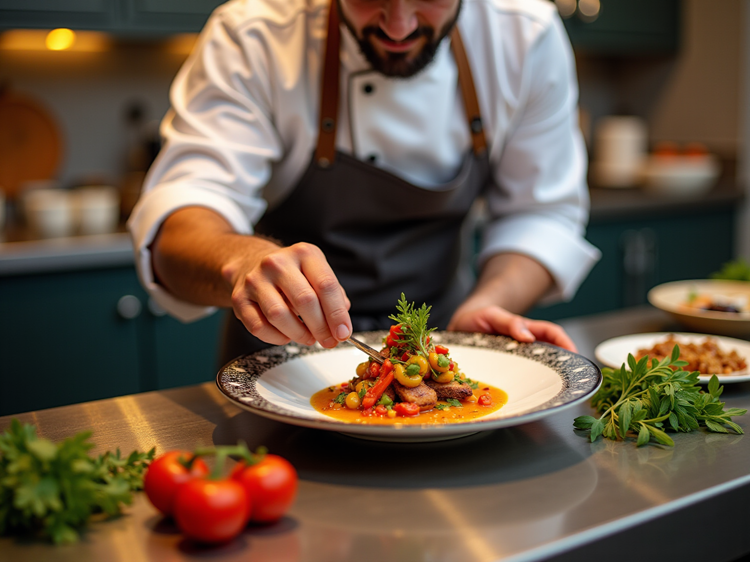
Utilize High-Quality Imagery: Invest in professional photography to showcase dishes. High-quality images create an emotional connection, enticing customers and generating desire for the offerings.
-
Incorporate User-Friendly CTAs: Position call-to-action buttons (e.g., ‘Order Now’, ‘Reserve a Table’) prominently on the homepage and throughout the site. Ensure they are visually distinct and easy to locate to prompt immediate action.
-
Responsive Design: Confirm that the website is mobile-friendly, as many individuals will access it via smartphones. An adaptive design that follows the best practices for visual hierarchy in web design for UAE restaurants preserves layout order across devices, significantly improving the user experience.
Implementing these strategies will not only enhance the visual appeal of your restaurant’s website but also foster a more engaging and satisfying experience for your customers.

Test and Optimize Visual Hierarchy for Enhanced User Experience
To establish an effective visual hierarchy, it is imperative to engage in regular testing and optimization of the website.
Participant Testing: Conduct usability assessments with real users to observe their interactions with the online platform. Focus on where their attention is directed and whether they can effortlessly locate key information.
A/B Testing: Experiment with different layouts, colors, and sizes for essential elements. For example, testing two versions of a homepage can reveal which design drives more reservations or orders.
Analytics Review: Leverage tools like Google Analytics to monitor visitor behavior on the site. Identifying navigation patterns and drop-off points can illuminate areas that require improvement.
Feedback Mechanisms: Implement feedback forms or surveys to collect opinions on the platform’s usability. This direct input provides valuable insights for enhancements.
Iterative Design: Based on testing outcomes, make necessary adjustments to the design. This may involve repositioning CTAs, modifying font sizes, or reworking the layout to enhance navigation for users.
Ongoing testing and enhancement empower dining establishments to adopt a customer-focused strategy, ensuring that the visual hierarchy is effective and aligned with client expectations by incorporating best practices for visual hierarchy in web design for UAE restaurants. Notably, implementing best practices for visual hierarchy in web design for UAE restaurants by just 5% can lead to a 25% increase in profits, underscoring the importance of these practices in the competitive food and beverage industry. Furthermore, a mere 5% improvement in customer retention can also translate into significant profit growth, highlighting the financial advantages of investing in UX design. For instance, KoMarketing’s B2B Web Usability Report indicates that 65% of website visitors are deterred from submitting forms due to excessive personal information requirements, suggesting that simplifying form fields could enhance engagement and increase form submission rates. As Annemarie Bufe, Content Manager, asserts, “Investing in UX design can yield numerous benefits for a company and is well worth the investment.” Additionally, ESPN reported a 35% revenue increase after incorporating user feedback into their homepage redesign, illustrating the tangible impact of user testing on financial performance.

Conclusion
Effective visual hierarchy is fundamental for restaurant websites aiming to capture and maintain customer interest. By applying principles such as size, contrast, alignment, proximity, and whitespace, restaurants can create engaging and intuitive online experiences. Highlighting key offerings and simplifying navigation not only improves aesthetics but also enhances user functionality, making it easier for potential customers to interact with the website.
Moreover, regular testing and optimization are essential for maintaining an effective visual hierarchy. Techniques like user testing, A/B testing, and analytics reviews provide valuable insights into user behavior, allowing restaurant owners to make informed adjustments that enhance the overall user experience. The financial benefits of investing in these strategies are evident, as even minor improvements in user experience can lead to substantial increases in engagement and profitability.
In the competitive landscape of the restaurant industry, mastering visual hierarchy is not just a design choice but a strategic necessity. As the digital dining experience evolves, restaurants that prioritize these practices will not only stand out but also build lasting connections with their customers, ultimately driving higher conversion rates and fostering brand loyalty.
Frequently Asked Questions
What is visual hierarchy in web design for UAE restaurants?
Visual hierarchy in web design refers to the arrangement of elements to effectively convey their significance, guiding users through content and enhancing their experience.
What are the key principles of visual hierarchy?
The key principles include size and scale, contrast, alignment, proximity, and whitespace.
How does size and scale impact visual hierarchy?
Larger elements command more attention, such as prominently displaying a restaurant’s logo to enhance brand recognition and establish a strong visual presence.
Why is contrast important in web design?
Contrast helps highlight crucial elements, such as using a bright call-to-action button against a neutral background to elevate engagement levels.
What role does alignment play in web design?
Proper alignment of text and images fosters a clean layout, guiding users seamlessly through the content and improving readability.
How does proximity affect user understanding?
Grouping related items together clarifies their relationships, making it easier for users to understand information, such as placing menu items next to their descriptions.
What is the significance of whitespace in web design?
Adequate whitespace around elements minimizes clutter, allowing users to focus on essential information without distractions.
How can effective visual hierarchy improve conversion rates for restaurants?
Mastering visual hierarchy can lead to a more intuitive and engaging experience, which is crucial for improving conversion rates, as evidenced by statistics showing that 80.8% of redesign projects arise from low conversion rates.
What is the impact of video content on conversion rates?
Websites that incorporate video content have an average conversion rate of 4.8%, compared to 2.9% for those that do not, highlighting the importance of imagery organization.
What common pitfalls should brand managers avoid in web design?
Brand managers should avoid overcrowding elements and ensure mobile responsiveness to create effective layouts.
Tag
Share:
5 Best Practices for Web Design in the Food Industry in the Emirates
9 Best Practices for Web Design in the UAE Food and Beverage Sector

Best Practices for Visual Hierarchy in UAE Food Marketing