General
Best Practices for Choosing Color Schemes for Websites: Expert Tips for Effective Design
Overview
Choosing color schemes for websites demands a deep understanding of the psychological impact of colors. Implementing the 60-30-10 rule is essential for achieving visual balance. Moreover, ensuring accessibility through adequate contrast cannot be overlooked.
Strategically selected color palettes are not merely aesthetic choices; they significantly enhance user engagement and reinforce brand identity. Furthermore, they improve overall usability, as evidenced by the profound influence of color on user behavior and perception.
Brand Managers must recognize that these elements are critical in creating effective digital experiences.
Introduction
In the realm of web design, color schemes serve as the silent architects of user experience, shaping perceptions and guiding interactions with every hue and shade. The strategic selection of colors transcends mere aesthetics; it is vital for brand recognition, emotional resonance, and overall usability. Designers must navigate the intricate relationship between color and user engagement, making it paramount to understand the psychological impacts of specific hues.
Consider the calming blues that inspire trust and the vibrant reds that evoke urgency; the choices made in color application can significantly influence user behavior and satisfaction. As the digital landscape evolves, so too does the importance of crafting color palettes that not only reflect brand identity but also enhance accessibility and inclusivity.
This exploration delves into the multifaceted world of color in web design, offering insights into its significance, practical tips for selection, and the latest trends shaping the future of digital aesthetics.
Understanding Website Color Schemes: Importance and Impact
Color schemes for websites are a pivotal element of web design, significantly influencing both the visual appeal and functionality of a website. A carefully chosen palette in color schemes for websites not only enhances recognition of the identity but also directs user actions and evokes particular feelings. For instance, lively hues can draw in a younger audience, while more muted shades may connect with a professional group.
In fact, statistics reveal that 39% of consumers value hues, underscoring their significance in capturing attention and conveying brand identity.
The influence of color schemes goes beyond appearance; they play a vital role in the experience of individuals. A study on minimalism in website aesthetics indicates that 84.6% of users prefer clean and uncluttered layouts, which enhance usability and direct focus to essential content. This trend towards simplicity mirrors a wider change in philosophy, where clarity and ease of navigation hold great importance.
The strong preference for minimalism emphasizes the importance for creators to prioritize simplicity in their hue selections and overall aesthetic approach.
As we enter 2025, the importance of color schemes for websites continues to increase. Contemporary devices can display millions of hues, offering designers unparalleled flexibility beyond the conventional 216 ‘web safe’ shades. This evolution enables more nuanced and customized color schemes for websites that can better align with brand messaging and meet user expectations.
Specialist views highlight that although particular hues are frequently linked to certain emotions, their interpretation can differ depending on context and pairing with other visual elements. As Cameron Chapman, Design Blog Editor, observes, “Just because a hue is generally linked to a specific feeling or mood doesn’t mean it can’t be perceived in other ways by combining it with different shades, altering the exact tone, or varying how it is utilized among other design elements.” This adaptability is essential for establishing a unified experience that connects with diverse audiences.
Ultimately, comprehending the complex connection between hue patterns, audience experience, and recognition of a label is vital for designers and label managers aiming to establish significant online presences by effectively utilizing color schemes for websites.
The Psychology of Color: How Colors Influence User Experience
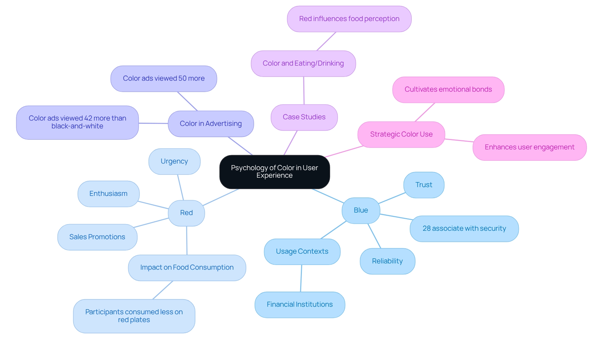
Colors wield significant psychological influence, profoundly affecting visitor experience and engagement on websites. Blue, for example, is frequently linked to trust and reliability, making it a favored choice among financial institutions aiming to instill confidence in their clients. According to Joe Hallock, 28% of people associate blue with security, reinforcing its effectiveness in this context.
Conversely, red is recognized for triggering emotions of enthusiasm and urgency, which explains its frequent use in sales promotions to encourage prompt action.
Understanding these hue associations is essential for designers. It enables them to choose shades that not only represent their brand identity but also resonate with the feelings of their audience. This strategic alignment can enhance user engagement and satisfaction, ultimately leading to improved conversion rates.
Research indicates that colored advertisements are viewed nearly 50% more than their black-and-white counterparts, with studies showing that colored advertisements are viewed 42% more. This emphasizes the significance of hue in attracting attention. Moreover, a case study on the effect of hue in food consumption revealed that participants ate less when food was displayed on red plates, underscoring how hue can affect behavior and perceptions in different contexts.
This discovery is applicable to web design, where the selection of color schemes can influence user engagement and interaction.
By harnessing the psychological impacts of shades, designers can develop color schemes for websites that not only draw in users but also cultivate a stronger emotional bond, thereby enhancing the overall user experience.

Practical Tips for Selecting the Right Color Scheme
When selecting a color scheme for a website, it is imperative to consider practical tips that ensure an effective design:
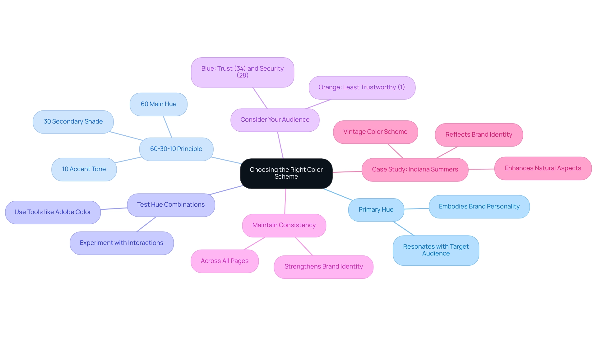
- Start with a Primary Hue: Choose a primary hue that embodies your brand’s personality and values. This foundational hue sets the tone for your entire palette and should resonate with your target audience.
- Apply the 60-30-10 Principle: This recognized guideline recommends dedicating 60% of your design to the main hue, 30% to a secondary shade, and 10% to an accent tone. This strategic distribution creates visual harmony and effectively directs attention throughout the site.
- Test Hue Combinations: Utilize tools like Adobe Color or Colors to experiment with different hue combinations. Examining how hues interact can uncover which combinations enhance user experience and engagement.
- Consider Your Audience: Tailor your hue selections to align with the preferences and expectations of your target audience. For instance, blue is frequently linked to trust (34%) and security (28%), making it a popular option for companies aiming to convey reliability. In contrast, orange is seen as the least reliable hue (1%), which may not be appropriate for all companies.
- Maintain Consistency: Ensure that your color scheme remains consistent across all pages and marketing materials. This consistency strengthens identity and aids in forming a cohesive user experience.
In practice, companies like Indiana Summers have successfully applied the 60-30-10 rule in their web design. Their eCommerce platform for organic hemp products employs a retro palette that represents the company’s identity, highlighting the natural elements of their offerings. The warm hues resonate with their product line and create an inviting atmosphere for users, leading to increased engagement and sales.
Such case studies demonstrate the effectiveness of careful hue selection in establishing a strong identity online.
As Alec Hanak, Head of Design, states, “Over the past 15 years, I have worked with a wide variety of clients across industries, guiding teams and building new procedures to bring award-winning ideas to life.” This underscores the significance of strategic hue selection in web design. Ultimately, selecting the right color schemes for websites is essential for effectively representing your identity and conveying its message.

Exploring Popular Color Combinations: Trends and Inspirations
Investigating popular color schemes for websites provides web designers with a wealth of inspiration. Here are some of the most effective trending schemes:
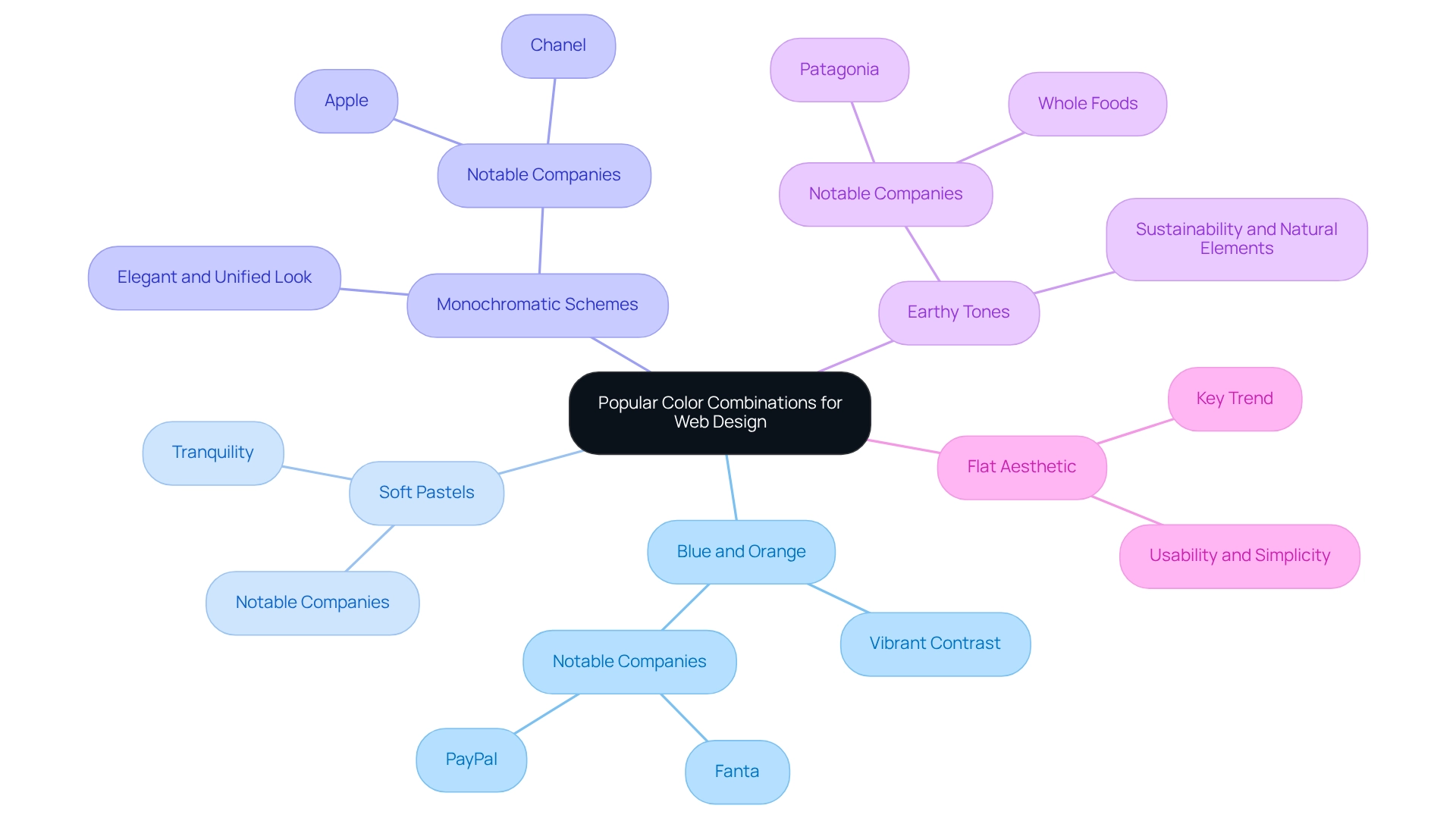
- Blue and Orange: This complementary pairing generates a vibrant contrast that is both visually striking and energetic, making it particularly suitable for tech and creative industries. Companies like Fanta and PayPal have successfully utilized this combination to enhance recognition and engagement.
- Soft Pastels: Light shades of pinks, blues, and greens evoke tranquility and are frequently employed by wellness and lifestyle companies. This palette not only attracts attention but also promotes a feeling of tranquility, which is vital for companies seeking to establish a calming user experience.
- Monochromatic Schemes: Employing different tones of one hue can produce an elegant and unified look, perfect for upscale businesses. This method facilitates a strong identity while preserving visual harmony, as observed in names like Apple and Chanel.
- Earthy Tones: Combinations of greens, browns, and muted yellows resonate with eco-friendly companies, reflecting sustainability and natural elements. Businesses such as Whole Foods and Patagonia effectively utilize these hues to convey their dedication to environmental responsibility.
- Flat Aesthetic: As the leading trend among website creators, flat aesthetics emphasize usability and simplicity. This method frequently includes vibrant palettes that improve experience and involvement, matching the overall aim of successful web design.
These combinations not only boost visual attractiveness but also correspond with the emotional reactions brands seek to inspire in their audiences. Significantly, research shows that while merely 8% of users actively observe white space on websites, its inclusion can greatly enhance navigation and overall effectiveness. This highlights the significance of careful hue selection and layout in crafting engaging web experiences, especially when considering color schemes for websites.
For example, the extensive campaign for Quaker Oats by WonderEight demonstrated how effective design patterns can improve brand visibility and recognition, further highlighting the influence of strategic design decisions.

Technical Considerations: Accessibility and Contrast in Color Schemes
When designing hue arrangements, it is essential to prioritize accessibility and contrast to create inclusive web experiences. Consider the following critical aspects:
- Contrast Ratios: Achieving sufficient contrast between text and background colors is vital for enhancing readability. The Web Content Accessibility Guidelines (WCAG) recommend a minimum contrast ratio of 4.5:1 for normal text. For form elements, a contrast ratio of at least 3:1 against background hues is necessary to ensure usability for all individuals. Furthermore, hues of grade 50 produce Section 508 AA contrast with both pure white and pure black, underscoring the significance of selecting suitable combinations of shades.
- Hue Blindness: Designers must be aware of combinations that may pose challenges for hue-blind users. Tools like Color Oracle can simulate how designs appear to individuals with vision deficiencies, enabling modifications that enhance accessibility.
- Avoid Over-reliance on Hue: Incorporating text labels and patterns alongside hue is crucial for effectively conveying information. This method ensures that individuals who cannot perceive color can still access and understand the content.
- Accessibility Statistics: Investing in web accessibility mitigates legal risks and taps into a significant market opportunity. Individuals with disabilities control approximately $1.2 trillion in annual disposable income, highlighting the importance of inclusive design. Furthermore, 55% of U.K. consumers have reported abandoning purchases due to accessibility issues, emphasizing the necessity for effective contrast and accessibility measures. As David Gevorkian, Founder of Be Accessible, states, “Creating aesthetic and accessible products usable by all people across the world is essential.”
- Testing Insights: Evaluating experiences with assistive technologies and individuals using screen readers offers valuable perspectives on potential obstacles, enabling designers to make informed modifications that enhance accessibility.
By integrating these principles, designers can create websites that utilize effective color schemes, making them not only visually appealing but also accessible to a broader audience. This approach ultimately enhances user experience and satisfaction.
Aligning Color Schemes with Brand Identity: A Strategic Approach
Aligning your color schemes for websites with your identity is essential for creating a unified and recognizable presence in the digital environment. To effectively achieve this alignment, consider the following strategies:
- Define Your Company Personality: Begin by identifying the core traits that encapsulate your organization, such as being playful, professional, or innovative. Choosing color schemes for websites that embody these characteristics significantly enhances your brand’s visual identity. For instance, vibrant hues convey energy and creativity, while muted shades evoke sophistication and reliability. Genuineness and openness in these selections are crucial for establishing significant connections with clients.
- Investigate Rivals: Conduct a comprehensive examination of your competitors’ palettes to identify gaps and opportunities for distinction. This research assists in choosing distinctive hues that not only stand out but also resonate with your target audience. Companies that effectively distinguish themselves through unique hues frequently experience a notable rise in recognition and loyalty.
- Create a Style Guide: Develop a thorough style guide that documents your hue selections, including primary, secondary, and accent shades, along with specific usage instructions. This ensures uniformity across all marketing resources and platforms, which is vital for your identity, particularly when utilizing color schemes for websites. Regular application of hue can enhance consumer perception of design quality by 45%, which is essential for effective sales and marketing materials.
- Leverage Data-Driven Insights: Utilize data to guide your hue selections, especially regarding elements like the shade of review stars, which should represent your identity and attract your audience. This method not only improves visual attractiveness but also fosters trust; studies indicate that 46% of consumers are willing to spend more for companies they trust. By aligning your hue selections with data-informed insights, you create a more significant experience for your identity.
By strategically aligning your color schemes for websites with your identity, you enhance recognition and foster a deeper connection with your audience. A compelling example of this is WonderEight’s comprehensive campaign for Quaker Oats, which successfully reinforced the company’s market position through thoughtful color choices. The campaign resulted in heightened loyalty and recognition for the company and demonstrated WonderEight’s effectiveness in strategic branding and digital marketing solutions, including Brand Audits and Digital Marketing Strategies.
Additionally, incorporating elements of Games & Marketing Gamification can further engage your audience and improve interaction with your company. Such case studies emphasize the effectiveness of aligning color schemes for websites with brand identity in achieving measurable outcomes.
Key Takeaways: Best Practices for Effective Color Scheme Selection
Effective color schemes for websites are essential for developing sites that not only capture attention but also enhance visitor engagement. Consider the following key practices:
-
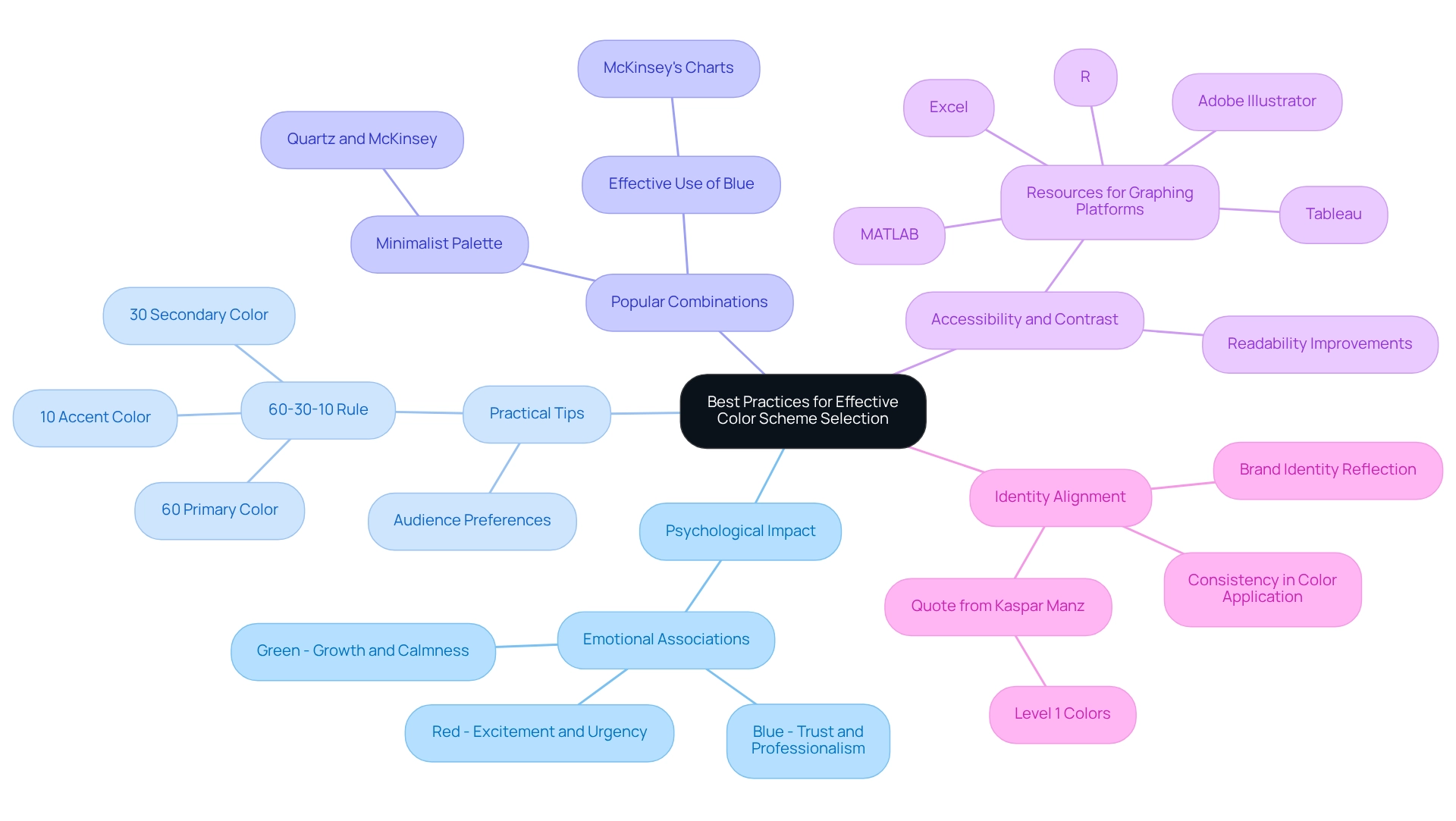
Psychological Impact: Colors evoke emotions and influence user behavior. Understanding the psychology of shades enables designers to select tones that align with the desired user experience. For instance, blue is frequently associated with trust and professionalism, making it a favored choice in corporate branding.
-
Practical Tips: Applying the 60-30-10 rule can foster a balanced and visually appealing design. This guideline suggests using 60% of a primary hue, 30% of a secondary hue, and 10% of an accent hue. Moreover, considering the preferences of the target audience can lead to choices that resonate more effectively.
-
Popular Combinations: Investigating successful hue combinations can serve as a source of inspiration. Notably, Quartz and McKinsey employ a minimalist palette, predominantly utilizing blue and adjacent hues, which streamlines their visualizations and enhances clarity. McKinsey & Company’s exclusive use of these hues in their charts exemplifies effective palette selection.
-
Accessibility and Contrast: Prioritizing accessibility is crucial. Ensuring adequate contrast between text and background hues improves readability for all users, including those with visual impairments. Resources are available for applying hue principles across various graphing platforms, such as Adobe Illustrator and Tableau.
-
Identity Alignment: Color choices should reflect and reinforce brand identity. As Kaspar Manz, Graphics team lead at the Swiss newspaper Neue Zurcher Zeitung, remarks, “Level 1 hues are specific shades that should remain precisely as they are.” Consistency in hue application across digital platforms strengthens identity recognition and messaging.
By adhering to these best practices, designers can craft visually compelling websites that leverage effective color schemes, attracting visitors and fostering meaningful interactions. Noteworthy success stories, such as the brand identity uplift for Castania and the digital campaign for Motorola, illustrate how strategic color selection directly contributes to measurable outcomes in user interaction and brand perception.

Conclusion
The role of color schemes in web design is undeniably significant, influencing everything from user engagement to brand recognition. The psychological impact of color cannot be overstated; specific hues evoke emotions and guide user behavior, making strategic color selection essential for effective design. Aligning color choices with brand identity reinforces the necessity for designers to grasp not only aesthetic appeal but also the deeper connections colors can forge with audiences.
Practical tips such as the 60-30-10 rule and testing color combinations provide valuable frameworks for designers seeking to create harmonious and engaging web experiences. Additionally, considering accessibility and contrast ensures that websites are inclusive and usable by a diverse audience, underscoring the ethical responsibility designers uphold in their work. By embracing these best practices, designers can craft websites that not only attract attention but also foster meaningful interactions and enhance overall user satisfaction.
Ultimately, as the digital landscape continues to evolve, the thoughtful application of color schemes will remain a cornerstone of successful web design. Understanding the intricate relationship between color, psychology, and user experience empowers designers to create compelling online environments that resonate with users and strengthen brand loyalty. The future of web design lies in harnessing the power of color to create impactful, memorable experiences that reflect both brand values and user needs.
Frequently Asked Questions
Why are color schemes important for websites?
Color schemes are crucial as they significantly influence a website’s visual appeal and functionality, enhance brand recognition, direct user actions, and evoke specific feelings.
How do different colors affect audience perception?
Lively hues can attract a younger audience, while muted shades may appeal to a more professional group. The choice of colors can also convey different emotions and messages.
What statistics highlight the importance of color in web design?
Statistics show that 39% of consumers value colors, indicating their importance in capturing attention and conveying brand identity.
What is the trend regarding minimalism in web design?
A study indicates that 84.6% of users prefer clean and uncluttered layouts, which enhance usability and focus on essential content, reflecting a shift towards simplicity in design.
How has the evolution of technology affected color choices in web design?
As we approach 2025, contemporary devices can display millions of hues, allowing designers greater flexibility and the ability to create more nuanced and customized color schemes.
Can the interpretation of colors vary?
Yes, while certain hues are often linked to specific emotions, their interpretation can differ based on context and how they are paired with other visual elements.
How do colors influence user experience and engagement?
Colors have a psychological impact; for example, blue is associated with trust, while red triggers enthusiasm and urgency. This understanding helps designers choose shades that resonate with their audience’s feelings.
What is the effect of colored advertisements compared to black-and-white ones?
Research indicates that colored advertisements are viewed nearly 50% more than black-and-white ones, emphasizing the significance of color in attracting attention.
How can color schemes affect behavior in different contexts?
A case study showed that participants ate less when food was served on red plates, illustrating how color can influence behavior and perceptions, which is also applicable to web design.
What is the overall goal for designers when utilizing color schemes?
Designers aim to create color schemes that not only attract users but also foster a stronger emotional connection, thereby enhancing the overall user experience.


