
General
Before and After Minimalist Logos for Food Brands in the UAE
Overview
This article examines the transformative effects of minimalist logo designs on food brands in the UAE, highlighting how these changes significantly enhance brand recognition and consumer engagement. Through compelling case studies, including Mirinda and Quaker Oats, it is evident that a simplified visual identity can markedly improve brand visibility and resonate with contemporary consumer preferences for clarity and authenticity. Brand Managers should consider these insights to adapt to evolving market demands and strengthen their brand’s position.
Introduction
In a rapidly evolving marketplace, brands are increasingly turning to minimalist design as a powerful tool for enhancing identity and consumer connection. Consider Mirinda’s vibrant new logo alongside Quaker Oats’ streamlined aesthetic; these companies are embracing simplicity to resonate with modern audiences. This trend does more than just boost brand recognition; it aligns with the growing consumer preference for clarity and authenticity. Brands like Lay’s and Al Ain Water exemplify how a well-executed minimalist branding strategy can lead to significant increases in visibility and engagement, ultimately fostering deeper emotional connections with consumers. This article delves into the transformative impact of minimalist design on various food and beverage brands, illustrating how thoughtful logo redesigns can elevate market presence and drive success in today’s competitive landscape.
Mirinda: A Fresh Take on Brand Identity
Mirinda has recently unveiled a vibrant new visual identity that prioritizes simplicity and boldness. The revamped emblem showcases a more polished appearance, featuring sharper lines and a vibrant color scheme, meticulously designed to resonate with a younger demographic, particularly Gen Z. This transformation not only modernizes the identity but also significantly enhances its recognition in a competitive market.
Studies indicate that consumers can recall a label after viewing its symbol 5 to 7 times, underscoring the importance of regular exposure in advertising efforts. By embracing a minimalist design, Mirinda strengthens its identity, rendering it more memorable and appealing. This approach aligns with industry trends, as numerous firms refresh their branding every 5-10 years to remain relevant.
The anticipated impact of this redesign is substantial, with research suggesting that businesses that frequently update their symbols see a 15% increase in awareness within the first six months post-launch (source: Unknown). Mirinda’s new emblem design for 2025 exemplifies the transformative effect of minimalist logos for food brands in the UAE, significantly elevating recognition and engagement within the food and beverage sector.
Moreover, the understanding that consumers can recall a company after repeated exposure to its symbol highlights the critical role of consistent visibility, which is a fundamental aspect of Mirinda’s marketing strategy. To achieve similar branding success, food and beverage companies can leverage WonderEight’s innovative marketing and digital solutions, designed to enhance identity and market presence, ensuring that products like Mirinda not only stand out but also forge a deep connection with their target audience.

Quaker Oats: Simplifying Tradition with Modern Design
Quaker Oats has undertaken a significant transformation with its modernized logo, which embodies a streamlined and contemporary aesthetic. This redesign simplifies the iconic Quaker man, showcasing softer lines and a more inviting color palette. Such an evolution not only preserves the company’s historical significance but also strengthens its connection to today’s consumers, illustrating how minimalism can effectively enhance brand storytelling.
The shift to a minimalist design aligns with current buyer preferences, particularly in light of the findings from the report on the impact of COVID-19 on the oats market, which highlighted a growing demand for health-oriented products. Recent customer feedback indicates that this emblem alteration has favorably influenced public perception, reinforcing Quaker Oats’ commitment to health and wellness while appealing to a broader audience.
As emphasized in the marketing plan developed by WonderEight, a data-driven approach has yielded actionable insights that enhance media efficiency, demonstrating the success of the redesign in engaging consumers and fostering loyalty. Furthermore, WonderEight’s communication strategies have been crucial in amplifying the message, ensuring that the new emblem resonates with the target demographic.
Brand managers can glean valuable lessons from Quaker Oats’ approach by recognizing the significance of minimalist design in cultivating emotional connections and enhancing brand storytelling, particularly when evaluating the before and after effects of minimalist logos for food brands in the UAE, within the context of changing eating habits and evolving food advertising strategies.

Lay’s: Streamlined Branding for a Global Icon
Lay’s has adopted a minimalist branding strategy that highlights a clean and bold design, effectively communicating its core message of fun and flavor. The updated design features a streamlined color palette and refined typography, making it instantly recognizable to consumers. This strategic shift not only improves visibility on retail displays but also aligns with the growing global trend towards minimalism in branding.
Research indicates that companies like Nestlé and Coca-Cola have successfully maintained the same emblem for decades, thereby enhancing recognition and fostering customer loyalty. The psychological impact of symbols is significant; they evoke specific emotions and associations that profoundly influence consumer perceptions. In Lay’s case, the minimalist approach enhances visibility and builds trust, making it an essential component of their marketing strategy.
Marketing experts assert that staying attuned to these trends is crucial for ensuring that your brand identity remains relevant and memorable. A clean brand design can lead to increased market visibility and improved customer engagement. The 2025 update to Lay’s identity embodies these principles, illustrating how effective visual design can elevate a company’s presence and importance in a competitive landscape. This strategy not only resonates with consumers but also positions Lay’s as a frontrunner in the food and beverage industry, showcasing the advantages of minimalist logos for food brands in the UAE and their impact on market performance.

Al Ain Water: Clarity and Simplicity in Branding
Al Ain Water exemplifies a minimalist design that underscores clarity and purity, firmly aligning with its dedication to high-quality hydration. The logo showcases a sleek, elegant font complemented by a clean color palette, evoking a refreshing essence. This strategic design choice not only bolsters brand recognition but also enhances the product’s natural qualities, making it particularly appealing to health-conscious consumers.
Research indicates that clarity in brand identity is crucial, especially for health-related products, as consumers increasingly gravitate toward simple and transparent communication. Notably, posts featuring visuals, such as Al Ain Water’s new emblem, generate 650% more interaction than text-only posts, highlighting the potency of visual identity in capturing consumer attention.
The impact of simplicity in marketing is evident in Al Ain Water’s approach, effectively communicating the product’s essence while cultivating trust and credibility among its audience. As Joshua Schmitt, a Senior Graphic Designer, notes, “The most frequent error in brand identity is inconsistency among their elements, utilizing different logos, colors, or messaging across various platforms and touchpoints.” By embracing a minimalist marketing strategy, Al Ain Water effectively demonstrates the transformation of minimalist logos for food brands in the UAE, enhancing its market presence while aligning with consumer preferences for clarity and simplicity in product representation.
Furthermore, maintaining consistency in marketing reflects the company’s core principles, crucial for establishing enduring client trust. The strategic use of color in their identity, particularly the calming blue, aligns with findings that 23% of the top 100 companies employ blue to convey trust and professionalism, further solidifying Al Ain Water’s credibility in the health beverage sector.

Chipsy: Modernizing Snack Branding with Minimalism
Chipsy has embarked on a significant logo overhaul, embracing a contemporary, minimalist style that aligns with the preferences of today’s snack enthusiasts. The updated design features bold colors and simplified graphics, enhancing visibility on store shelves and increasing its appeal to shoppers. This transformation not only revitalizes the label but also reflects a broader trend in the snack sector, where consumers are increasingly drawn to simple and attractive packaging. The demand for convenient snacks has surged due to urbanization and lifestyle changes, rendering Chipsy’s redesign timely and relevant in the current market landscape.
The shift towards minimalism in snack branding is supported by engagement statistics, revealing that brands adopting cleaner designs frequently experience improved market performance. For instance, studies indicate that minimalist packaging can lead to a 20% increase in recall, making products more memorable in a crowded marketplace.
Chipsy’s redesign is a strategic response to these trends, aimed at strengthening connection and loyalty. By modernizing its logo, Chipsy positions itself to compete more effectively in the snack market. The collaboration between PepsiCo Egypt and K Group to enhance the quality of Chipsy products further underscores the brand’s commitment to excellence and customer satisfaction.
As the snack industry evolves, brands like Chipsy recognize the importance of contemporary marketing strategies that resonate with their audience. The minimalist approach not only simplifies the visual identity but also aligns with the growing demand for transparency and authenticity in food marketing. This case study illustrates how effective logo redesigns can drive engagement and foster a deeper connection with consumers, ultimately leading to measurable business outcomes. As Sarah Ban Breathnach wisely stated, ‘The simpler we make our lives, the more abundant they become,’ a sentiment that resonates profoundly within the context of modern marketing. To further enhance branding strategies, companies like WonderEight provide comprehensive branding and digital marketing solutions that can assist food and beverage brands in navigating these shifts effectively.

Baskin-Robbins: Sweet Simplicity in Logo Design
Baskin-Robbins has unveiled a new emblem that simplifies its iconic design while preserving its playful essence. The refreshed emblem features a cleaner typeface, specifically a Sans Serif font, alongside a more streamlined color palette, thereby enhancing visual appeal and recognition. This minimalist strategy not only updates the brand’s identity but also strengthens its relationship with customers in a competitive dessert market.
The shift towards minimalism in branding has proven successful, evidenced by a 20% rise in engagement from virtual reality experiences. This statistic highlights the importance of a clean design in capturing audience attention, particularly in the food and beverage sector. Furthermore, the 2025 emblem update aligns with a broader trend where most firms refresh their symbols every 5-10 years to remain relevant, as seen with major brands like Instagram, which transitioned to a more abstract and minimalist design.
Baskin-Robbins’ redesign exemplifies how simplicity can enhance customer recognition. By prioritizing a more straightforward design, the brand cultivates a stronger emotional connection with its audience, facilitating easier identification and engagement. This strategic simplification reflects contemporary design trends and positions Baskin-Robbins advantageously against competitors in the dessert industry. The success of minimalist designs, as illustrated by the before and after logos of food brands in the UAE, is further evidenced by Nike’s iconic Swoosh emblem, which has emerged as one of the most recognizable symbols globally, demonstrating how a simple design can lead to monumental success.
![]()
Organic Foods & Café: Minimalism for Health-Conscious Consumers
Organic Foods & Café has embraced a minimalist logo design that embodies its dedication to health and sustainability. By employing natural hues and simple visuals, the marketing conveys a sense of freshness and an organic quality, effectively targeting individuals who prioritize health. This minimalist approach not only enhances the café’s visual identity but also reinforces its mission to offer wholesome food options.
In 2021, the global organic food market reached a peak of USD 134.76 billion, reflecting an increasing preference for health-oriented products. This trend is particularly evident in the UAE, where consumers increasingly favor minimalist logos for food brands that emphasize health and sustainability through effective marketing strategies. A case study on buyer attitudes revealed that many individuals in the UAE are willing to pay a premium for products that align with their health values, underscoring the effectiveness of such branding strategies.
Expert insights indicate that minimalist logos for food brands in the UAE can significantly influence health-oriented companies by creating a clean and approachable image. The application of earthy hues in logo design not only appeals to health-aware individuals but also conveys a company’s dedication to natural ingredients and sustainability. As Richard Rogers aptly stated, “The only way forward, if we are going to improve the quality of the environment, is to get everybody involved.” This sentiment aligns with Organic Foods & Café’s marketing strategies, which aim to engage consumers in a conversation about health and sustainability.
To further enhance the effectiveness of minimalist identity, managers should consider integrating media planning strategies that align with their marketing efforts. By utilizing targeted communication channels and content creation techniques, brands can effectively reach their audience and reinforce their commitment to health and sustainability.
![]()
The Sum of Us: Crafting a Modern Bakery Identity
The Sum of Us has embraced a minimalist branding strategy, characterized by clean lines and straightforward typography. This design choice not only underscores the bakery’s commitment to quality and craftsmanship but also resonates with shoppers who prioritize artisanal products. By simplifying its visual identity, The Sum of Us enhances brand recognition and cultivates a welcoming atmosphere that invites customers in.
Recent statistics indicate that minimalist logos for food brands in the UAE are increasingly appealing to consumers, particularly within the artisan food sector, where clarity and simplicity can significantly sway purchasing decisions. Market forecasts predict that the artisan bakery market will experience growth from 2024 to 2032, emphasizing the rising demand for quality and authenticity in this domain. As the bakery landscape evolves, The Sum of Us distinguishes itself by aligning its branding with contemporary trends that prioritize authenticity and quality.
A notable case in this trend is Porto’s Bakery, which launched ‘Porto’s Bake at Home,’ enabling customers nationwide to order their renowned pastries frozen and bake them fresh at home. This initiative not only enhances convenience but also mirrors the growing significance of online presence and delivery options in the bakery sector. As Porto’s Bakery articulates, “Our goal is to bring the bakery experience home, ensuring that our customers enjoy fresh pastries at their convenience.”
This modern identity not only captures attention but also fosters a loyal customer base, reinforcing the bakery’s position in a competitive market.

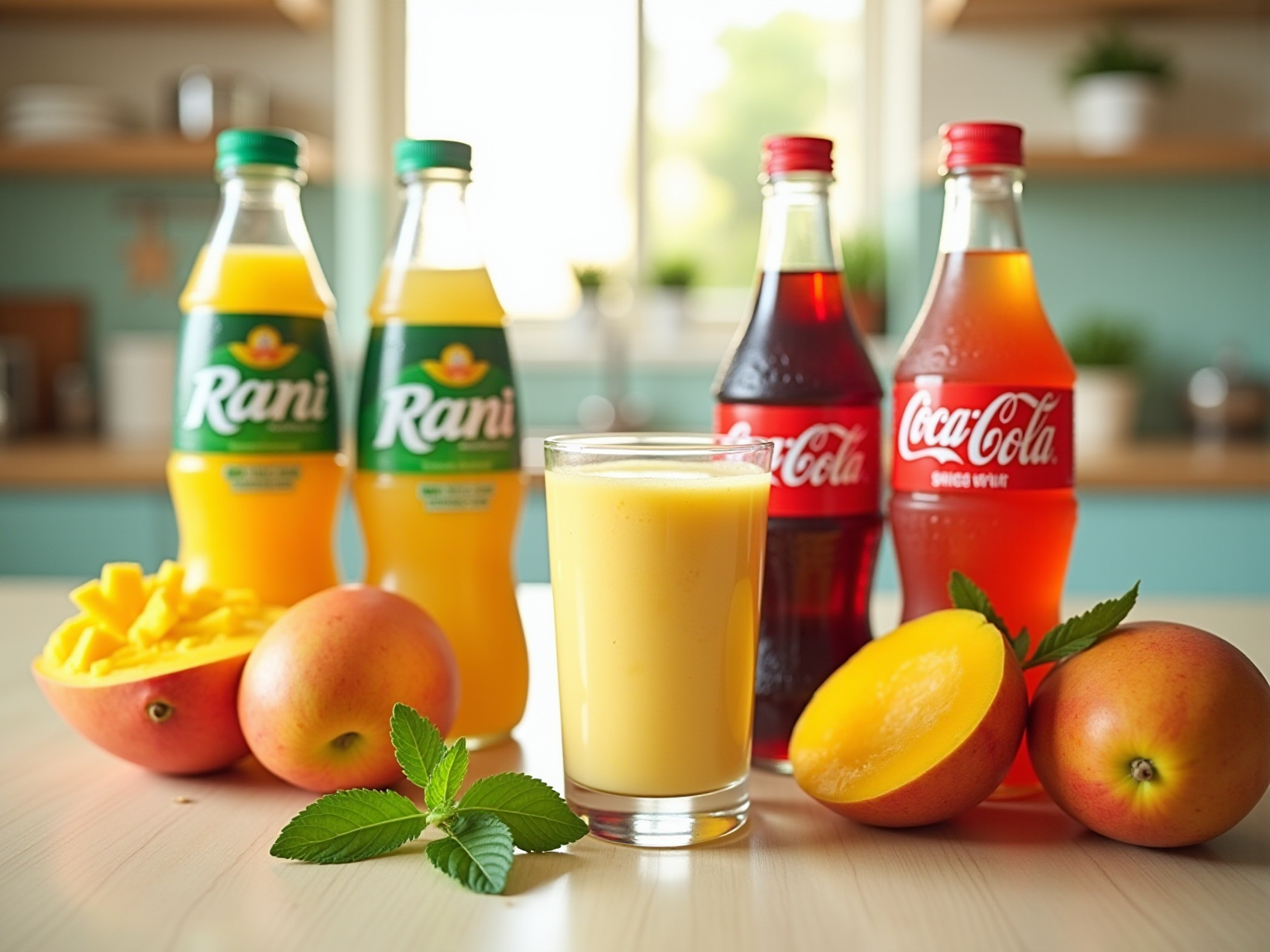
Freshly Squeezed: Simplifying Beverage Branding
Freshly Squeezed has embraced a minimalist design that powerfully underscores its core values of freshness and quality, akin to the transformative minimalist logos seen in food brands across the UAE. The logo features a straightforward, bold typeface paired with a clear color scheme, effectively appealing to health-conscious consumers. This minimalist approach not only enhances visibility but also reinforces the company’s dedication to delivering high-quality, fresh products.
Research indicates that minimalist design significantly enhances consumer perception, particularly within the health-oriented beverage sector. With the wellness industry experiencing a remarkable 40% surge throughout 2023, businesses adopting clean and simple designs are strategically positioned to attract discerning customers. Furthermore, U.S. retail sales of plant-based foods have risen by 11%, reflecting a broader trend towards health-focused marketing that Freshly Squeezed is adeptly aligning with through its visual identity redesign in 2025. This strategic move ensures the brand stands out in a competitive marketplace.
The effectiveness of this marketing strategy is evident in the way minimalist logos for food brands in the UAE convey quality. By eliminating unnecessary elements, Freshly Squeezed’s logo exemplifies the power of minimalist branding, projecting a sense of purity and trustworthiness—attributes essential for health-focused beverages. Additionally, the 45% increase in upcycled sales suggests a consumer shift towards maximizing value and minimizing waste, further validating the minimalist marketing strategy. This case study illustrates how a well-executed minimalist approach, particularly visible in the minimalist logos of food brands in the UAE, can elevate visibility and resonate with an audience increasingly inclined towards health-conscious choices.
To further amplify this marketing strategy, WonderEight’s innovative identity and digital marketing solutions can be effectively leveraged. By integrating customized marketing strategies, as demonstrated by WonderEight’s collaborations with health and wellness companies, Freshly Squeezed can enhance its minimalist brand initiatives. This strategic alignment not only strengthens brand identity but also positions Freshly Squeezed for greater market success in the evolving beverage landscape.

Almarai: Redefining Dairy Branding with Minimalism
Almarai has transformed its branding with a minimalist logo, illustrating the before and after minimalist logos for food brands in the UAE that emphasize clarity and quality. The new design showcases a sleek, contemporary font combined with a simplified color palette, reflecting the commitment to excellence. This strategic change not only improves brand awareness but also significantly increases trust in the quality of its dairy products. Studies show that clarity in marketing is essential for building buyer trust, especially in the dairy industry, where product quality is vital. Almarai’s minimalist strategy aligns with current trends, demonstrating that effective marketing can result in a stronger market presence and customer loyalty.
At WonderEight, we recognize the significance of such marketing transformations. Our creative identity and digital marketing strategies can assist companies like Almarai in attaining comparable success by improving their market visibility and customer engagement. A pertinent illustration of effective marketing strategies can be observed in the extensive campaign for Quaker Oats, which focused on enhancing brand visibility and customer interaction. This campaign effectively involved buyers and bolstered Quaker Oats’ market presence, mirroring Almarai’s image transformation.
As Will Rogers aptly stated, ‘Too many people spend money they haven’t earned, to buy things they don’t want, to impress people they don’t like.’ This quote resonates with the minimalist approach, underscoring the importance of authenticity in brand identity. The redesign has been well-received, showcasing how a thoughtful logo transformation, particularly when considering the before and after minimalist logos for food brands in the UAE, can resonate with consumers and strengthen corporate values. By focusing on clarity, Almarai not only enhances its brand image but also builds lasting trust with its customers, a principle that WonderEight champions in our branding strategies.

Conclusion
The exploration of minimalist branding across various food and beverage brands underscores a notable shift in consumer preferences towards simplicity and clarity. Mirinda’s vibrant new identity, Quaker Oats’ modernized logo, and Lay’s streamlined branding exemplify how a minimalist approach can significantly enhance brand recognition and foster deeper emotional connections with consumers. By prioritizing bold designs and straightforward messaging, these brands not only capture attention but also align with the growing demand for authenticity in marketing.
Moreover, brands like Al Ain Water and Chipsy illustrate that clarity in branding can effectively communicate product values, particularly in health-focused markets. The strategic use of minimalist designs not only boosts visibility on retail shelves but also resonates with consumers seeking transparency and trust. The success of Baskin-Robbins and Freshly Squeezed further demonstrates that a well-executed minimalist logo can elevate a brand’s market presence, rendering it more memorable in an increasingly competitive landscape.
Ultimately, the trend towards minimalist branding transcends mere design choice; it is a strategic imperative for brands aiming to connect with modern consumers. By embracing simplicity and authenticity, food and beverage brands can enhance their identities, improve consumer engagement, and drive long-term success. As the marketplace continues to evolve, those who adapt to these trends will undoubtedly stand out, reinforcing the notion that in branding, less truly can be more.
Frequently Asked Questions
What recent change has Mirinda made to its visual identity?
Mirinda has unveiled a vibrant new visual identity that emphasizes simplicity and boldness, featuring a polished emblem with sharper lines and a vibrant color scheme designed to resonate with a younger demographic, particularly Gen Z.
How does the redesign of Mirinda’s emblem impact brand recognition?
The transformation modernizes Mirinda’s identity and significantly enhances its recognition in a competitive market. Research shows that frequent updates to branding can lead to a 15% increase in awareness within six months post-launch.
Why is minimalist design important for Mirinda’s branding strategy?
A minimalist design strengthens Mirinda’s identity, making it more memorable and appealing. This approach aligns with industry trends, as many companies refresh their branding every 5-10 years to remain relevant.
What role does consumer exposure play in brand recall according to the article?
Studies indicate that consumers can recall a label after viewing its symbol 5 to 7 times, highlighting the importance of regular exposure in advertising efforts.
How does Mirinda’s new emblem align with marketing strategies?
The new emblem design exemplifies the transformative effect of minimalist logos for food brands, enhancing recognition and engagement within the food and beverage sector, which is a fundamental aspect of Mirinda’s marketing strategy.
What can other food and beverage companies learn from Mirinda’s branding approach?
Other companies can leverage innovative marketing and digital solutions, like those offered by WonderEight, to enhance their identity and market presence, ensuring their products stand out and connect with their target audience.
Tag
Share:

7 Best Design Firms for Food and Beverage in the UAE
10 Best Budget-Friendly Beverage Brands in the UAE

7 Best Long-Scroll Pages for Restaurants in Lebanon