Digital Branding Strategies
10 Stunning Visual Hierarchy Examples to Inspire Your Design
Overview
This article delves into remarkable examples of visual hierarchy in design, aiming to inspire effective creation. A well-structured visual hierarchy is paramount; it significantly enhances user experience and engagement by strategically guiding attention to key elements through the thoughtful use of size, color, and layout.
Successful case studies from renowned brands such as Apple and Dropbox illustrate these principles in action, demonstrating how visual hierarchy can transform user interaction.
Brand Managers must recognize the critical role that visual hierarchy plays in their strategies, as it not only captivates audiences but also drives desired actions.
Introduction
In the dynamic realm of design, visual hierarchy emerges as a cornerstone of effective communication, adeptly guiding users through content with clarity and purpose. This principle transcends mere aesthetics; it fundamentally shapes user interactions and influences perceptions, ultimately driving engagement and satisfaction.
By skillfully manipulating elements such as size, color, and spacing, designers can forge pathways that direct the viewer’s eye to the most critical information. As digital landscapes continue to evolve, understanding and applying visual hierarchy becomes increasingly essential for brands striving to capture attention and cultivate loyalty.
This article delves into the fundamental principles of visual hierarchy, explores its significance across various design formats, and highlights successful case studies that illustrate its transformative power in both web and graphic design.
Understanding Visual Hierarchy: A Foundation for Design
Visual hierarchy represents the strategic organization of visual elements, fundamentally conveying their relative significance and effectively guiding individuals through content. This principle is essential in both web and graphic design, as it profoundly influences interaction and perception. By adeptly manipulating size, color, contrast, and spacing, designers can construct a pathway that directs the viewer’s attention to the most critical information first.
The impact of graphical order on participant involvement is substantial. Recent statistics reveal that establishing effective graphical arrangement can lead to a significant decline in drop-off rates, with some organizations reporting a remarkable 46% reduction among their clients. Heather McKee, a behavioral scientist, observed, “By implementing targeted nudges based on proactive interventions, we reduced drop-off rates for 450,000 clients belonging to USA’s oldest debt consolidation organizations by 46%.”
This underscores the necessity of prioritizing clarity to enhance engagement and satisfaction.
In terms of navigation, visual hierarchy plays a pivotal role. It aids individuals in intuitively grasping the content structure, simplifying the process of locating essential information. By applying principles such as proximity and closure—key components of Gestalt theory—designers can create interfaces that are not only aesthetically pleasing but also intuitive and user-friendly.
A case study titled ‘Gestalt Principles in UX’ exemplifies how the application of these principles can significantly enhance user experience, making interfaces more intuitive and easier to navigate.
Numerous websites that prioritize user experience provide successful visual hierarchy examples, ensuring that critical elements remain easily accessible and recognizable. Expert opinions emphasize that a well-executed hierarchy is crucial for effective website creation in 2025. As digital landscapes evolve, the importance of crafting visuals that are both aesthetically pleasing and strategically sound cannot be overstated.
Current trends highlight the need for creations that cater to diverse demographics, balancing aesthetic appeal with accessibility to ensure functionality for all users.
Case studies further illustrate the effectiveness of visual hierarchy in graphical arrangement. Projects that have successfully implemented these principles demonstrate enhanced experiences, leading to increased engagement and satisfaction. As brands navigate the complexities of digital marketing, understanding and implementing visual order will continue to be a vital component of effective strategies.
WonderEight distinguishes itself by merging creativity with technology, as evidenced by client success stories such as the brand identity uplift for Castania and the digital campaign for Motorola, showcasing their effectiveness in achieving measurable outcomes for their clients.
The Importance of Visual Hierarchy in Effective Design
Visual structure plays an essential role in effective creation, significantly enhancing user experience by making content more accessible and engaging. When individuals can easily identify the most important elements on a page, their likelihood of interacting positively with the content increases. An effectively organized graphical structure not only enhances readability but also contributes to achieving greater conversion rates and a more enjoyable experience for visitors.
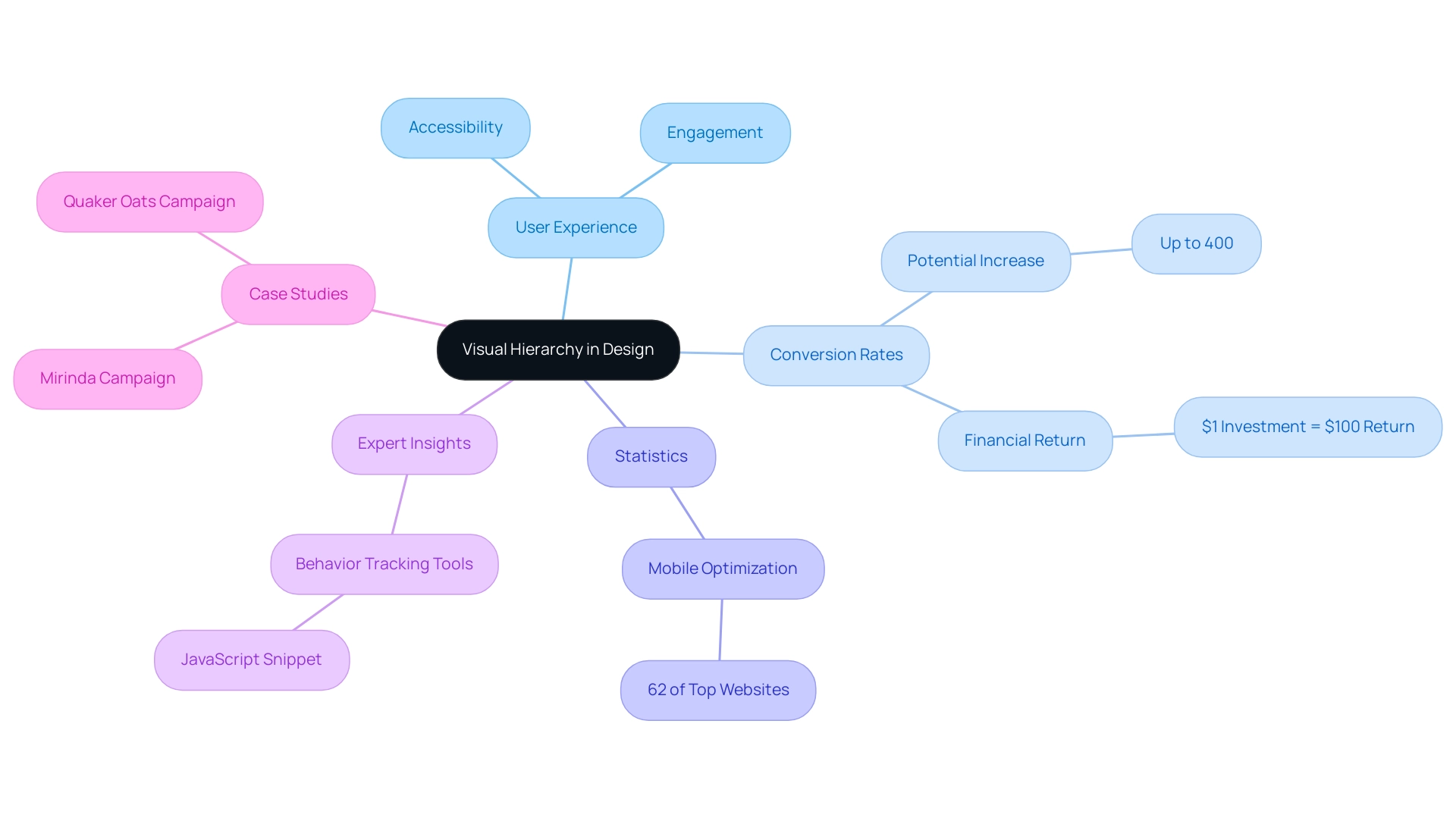
Research indicates that approximately 62% of leading websites on Google are optimized for mobile, underscoring the importance of graphical organization in responsive layouts. This optimization is vital, as a seamless user experience (UX) can potentially elevate conversion rates by up to 400%. According to a comprehensive Forrester Research study, investing merely $1 in UX can yield an impressive return of $100, highlighting the financial advantages of prioritizing elements that effectively direct attention.
Creatives who emphasize visual hierarchy can craft intuitive interfaces that guide individuals seamlessly through their journey. This approach not only boosts audience engagement but also fosters a deeper connection with the brand. Notable case studies, such as the comprehensive campaigns developed for Miranda and Quaker Oats, illustrate how impactful design can resonate with audiences, resulting in increased brand engagement and market presence.
These campaigns not only enhanced brand visibility but also led to measurable growth in customer engagement and sales, demonstrating the effectiveness of graphical organization in driving business outcomes.
Moreover, expert insights reveal that graphic organization directly influences engagement metrics. Designers can significantly improve the experience for individuals by strategically placing elements, utilizing size, color, and spacing as visual hierarchy examples. For instance, sites that successfully implement design structures often see enhanced conversion rates, as individuals are more likely to respond to calls to action when they are distinctly defined and aesthetically separated.
Additionally, establishing tools for tracking behavior typically involves embedding JavaScript code on the site for data gathering, a pragmatic step for brand managers aiming to enhance their layouts.
As we look ahead to 2025, the advantages of graphical organization in layouts remain crucial, with statistics indicating that effective graphical strategies can lead to significant improvements in user experience and conversion rates. By understanding and implementing the principles of graphic organization, brands can create engaging layouts that not only attract individuals but also convert them into loyal clients.
Key Principles of Visual Hierarchy to Consider
Fundamental concepts of visual hierarchy are essential for effective creation, directing individuals’ focus and enhancing their experience. These principles include:
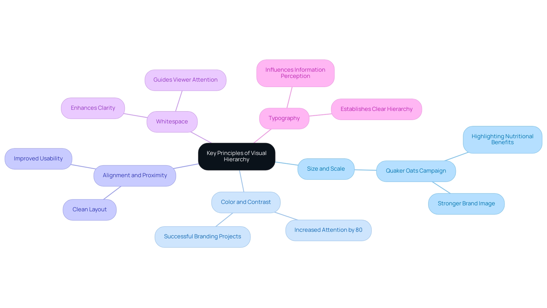
- Size and Scale: Larger elements naturally draw more attention, making size a powerful tool for emphasizing critical information. For instance, in a recent campaign for Quaker Oats, WonderEight strategically utilized size to highlight nutritional benefits, resulting in a stronger brand image and increased consumer trust.
This aligns with the understanding that designers must learn about relatively small numbers of people in the 21st century, emphasizing the importance of tailoring designs to specific audiences.
- Color and Contrast: High contrast between elements can significantly direct the viewer’s eye to key areas. By using color strategically, designers can highlight important content, as seen in various successful branding projects. Statistics indicate that effective use of color can increase attention by up to 80%, underscoring its impact on engagement.
- Alignment and Proximity: Grouping related items together and aligning them creates a clean layout, helping individuals understand the relationships between elements. This principle not only enhances aesthetic appeal but also improves usability, making it easier for users to navigate content.
- Whitespace: Adequate spacing around elements enhances clarity and focus, preventing overcrowding. Whitespace is not merely empty space; it plays a crucial role in guiding the viewer’s attention and improving overall comprehension.
- Typography: Utilizing different font sizes and weights establishes a clear hierarchy within text, guiding readers through the content. Effective typography can significantly influence how information is perceived, making it a vital aspect of design hierarchy.
As Jacob Cohen warns, while these principles are essential, they should not be taken too rigidly; they serve as guidelines rather than mandates. Integrating these principles into creation not only boosts aesthetic attraction but also enhances functionality, serving as visual hierarchy examples that ensure the intended message resonates with the audience. WonderEight’s unique approach, blending creativity with technology, exemplifies how these principles can lead to successful outcomes, as demonstrated by the brand identity uplift for Castania and the digital campaign for Motorola.
Comprehending and utilizing these techniques can result in more effective communication and audience engagement.
Stunning Visual Hierarchy Examples in Web Design
Effective visual hierarchy examples in web design are crucial for directing attention and enhancing overall engagement. Notable examples include:
- Apple’s Homepage: The strategic use of large, high-quality images paired with minimal text effectively directs visitors’ focus to featured products. This approach not only showcases the brand’s offerings but also simplifies the decision-making process for visitors.
- Dropbox: This platform exemplifies clarity with its prominent call-to-action buttons, which are designed to stand out. By making the sign-up and login options easily accessible, Dropbox ensures that individuals can navigate the site effortlessly, leading to higher conversion rates.
- Airbnb: The layout of Airbnb’s website emphasizes content created by individuals, featuring large images and testimonials that build trust and foster engagement. This graphical structure not only emphasizes the experiences of former guests but also motivates prospective individuals to investigate more.
These visual hierarchy examples highlight the significance of graphical arrangement in establishing intuitive navigation and captivating content. Statistics indicate that websites utilizing effective graphical structure can greatly enhance visitor engagement; for example, Orah saw an impressive 63.27% rise in demo requests after refining their homepage layout to more effectively convey their offerings.
In 2025, successful web layouts continue to employ visual hierarchy examples, with expert opinions emphasizing their importance in improving visitor experience. By prioritizing elements that guide users through the content, brands can achieve measurable outcomes. A pertinent example is WonderEight’s customized marketing approach for Quaker Oats, where graphical organization principles were utilized to improve brand recognition and customer interaction, illustrating the impact of strategic planning.
Moreover, brand managers ought to take into account the expenditure necessary for efficient website creation, as usual renovation expenses vary from $5,000 to $75,000. This context is crucial for grasping the importance of investing in graphical organization. As Tom Shalin observed, effective web creation and SEO are essential for attaining business success, emphasizing the significance of these principles in contemporary web development.
Overall, the incorporation of visual structure not only enhances aesthetics but also boosts performance metrics, making it a crucial aspect for modern web development.
Inspiring Visual Hierarchy Examples in Graphic Design
Visual hierarchy examples are pivotal in graphic composition, manifesting in various formats to enhance communication and engagement. Consider the following key examples:
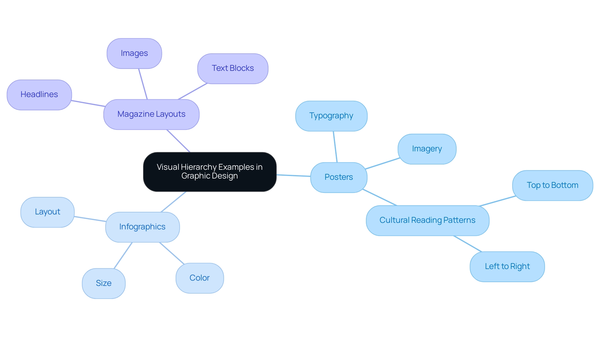
- Posters: The effective use of typography and imagery is essential for swift message conveyance. Movie posters, for instance, often feature bold titles and striking visuals that immediately capture attention, ensuring that the core message is communicated at a glance. In Western cultures, reading patterns typically follow a top-to-bottom and left-to-right approach, making it vital for designers to structure information accordingly.
- Infographics: These tools leverage size, color, and layout to present complex information clearly and engagingly. By guiding viewers through the data, infographics can significantly improve user engagement; studies show that visitors spend approximately 2.6 seconds scanning a website before focusing on a specific section. This underscores the need for an intuitive layout, particularly in infographics, where clarity is paramount.
- Magazine Layouts: The strategic arrangement of headlines, images, and text blocks creates a seamless flow that leads readers through the content effortlessly. This layout not only enhances readability but also keeps the audience engaged. A significant instance is the extensive campaign for Quaker Oats, where WonderEight utilized design structure to enhance brand engagement and market reach, leading to heightened consumer awareness.
These instances serve as visual hierarchy examples that demonstrate how layout can amplify the impact of graphic projects, making information more approachable and captivating for the audience. As Anik Jain, a prominent graphic designer, notes, ‘You can create contrast by dominating colors, sizes, and fonts to bring more depth to your creation.’ This principle is vital in ensuring that the most important elements stand out, guiding the viewer’s attention where it matters most.
Moreover, client success narratives, such as the brand identity enhancement for Castania, illustrate how effective arrangement contributes to significant creative results.
Using Color and Contrast to Enhance Visual Hierarchy
Color and contrast are essential elements in establishing compelling visual hierarchy, enabling designers to effectively guide audience attention and enhance engagement. By employing contrasting colors, designers can strategically highlight critical components, such as call-to-action buttons and key headlines. For instance:
- High Contrast: Utilizing dark text on a light background, or vice versa, significantly improves readability and directs focus. Research indicates that high contrast can increase attention by up to 80%, making it a vital consideration in design. Moreover, participants completed ten training trials before the actual experiment, underscoring the importance of preparation in understanding engagement.
- Color Psychology: The emotional impact of colors plays a crucial role in user perception. For example, red is often associated with urgency and can prompt immediate action, while blue evokes feelings of trust and reliability. As Wael M. S. Yafooz, Associate Professor of Computer Technology, states, “The selection of colors must align with the brand message and resonate with the intended audience.” Designers must choose colors that not only reflect their brand message but also connect with their audience.
Incorporating these principles allows designers to create visually appealing and effective designs. Notable case studies demonstrate the successful application of color psychology; a recent campaign for a leading beverage brand utilized vibrant colors to evoke excitement and drive consumer engagement, resulting in a 25% increase in click-through rates. Furthermore, the brand identity uplift for Castania and the digital campaign for Motorola illustrate measurable outcomes related to effective color and contrast strategies.
Expert opinions further underscore the importance of color and contrast in visual hierarchy. Designers emphasize that a well-thought-out color scheme enhances user experience by making navigation intuitive and content more digestible. Statistics indicate that layouts with effective color contrast can enhance readability by as much as 40%, reinforcing the significance of these elements in contemporary practices.
The findings from the ADAN component analysis reveal significant main effects of lateralization and valence, indicating that attentional shifts were influenced by the emotional context of the cues. This reinforces the critical role of color choices in design.
By strategically applying color and contrast, designers not only enhance aesthetic order but also create a more engaging and effective experience, ultimately driving better business results.
Typography’s Role in Creating Effective Visual Hierarchy
Typography serves as a fundamental element in establishing visual hierarchy, dictating the order and importance of information presented to individuals. Key considerations include:
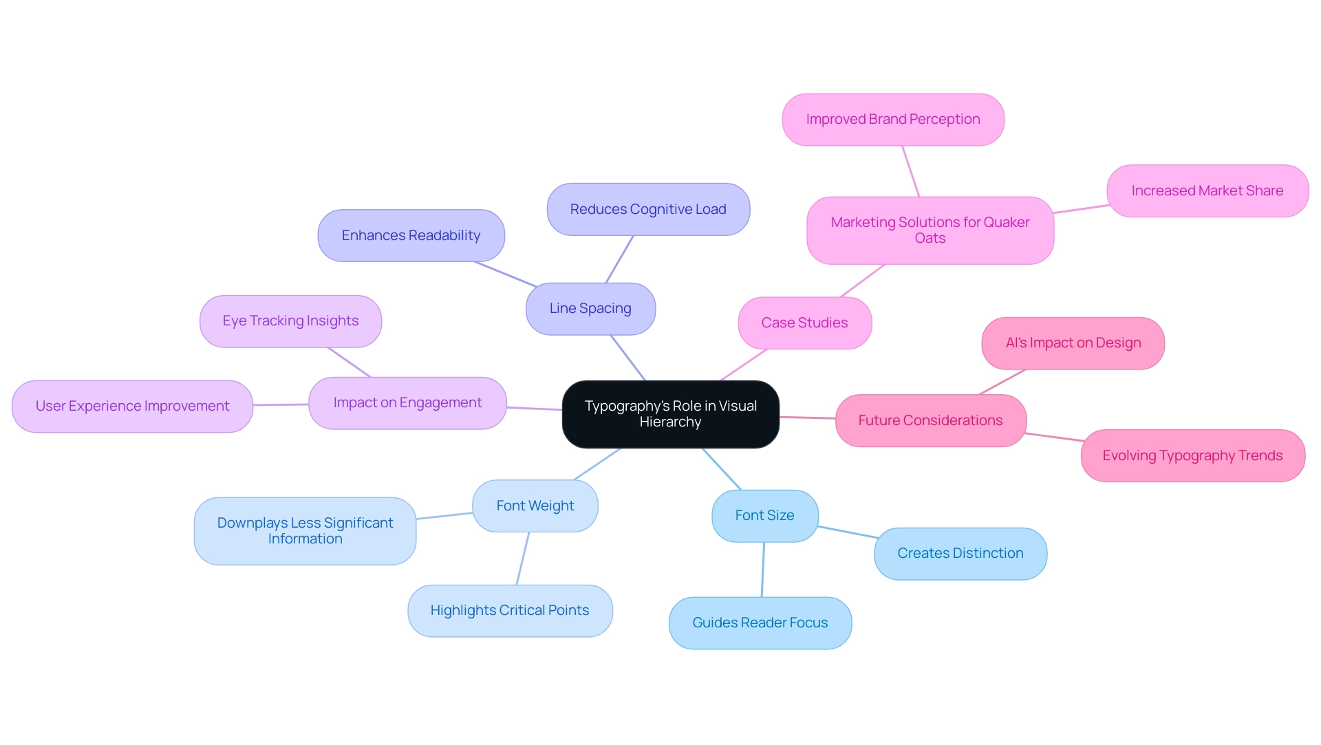
- Font Size: Utilizing larger fonts for headings and smaller fonts for body text creates a distinct separation between various levels of information, effectively guiding the reader’s focus. Research indicates that 61.5% of website designers are now employing expressive typography, underscoring its growing importance in design.
- Font Weight: The strategic use of bold fonts can highlight critical points, while lighter weights serve to downplay less significant information. This approach not only enhances clarity but also directs attention where it is most needed.
- Line Spacing: Sufficient spacing between lines is crucial for readability, enabling individuals to navigate through text with ease. Proper line spacing significantly enhances engagement, reducing cognitive load and facilitating smoother reading experiences.
Eye tracking data has revealed differences in fixations and reading patterns, illustrating how typography impacts engagement and reading behavior. As we look to 2025, the significance of typography in visual hierarchy continues to evolve, with professionals increasingly acknowledging its influence on user experience. Ryan Lege, a Principal Lecturer responsible for ICT, asserts that “all educators would gain from contemplating how typography and layout can positively improve the material perceived by learners.”
This perspective highlights the broader implications of typography beyond just design professionals. Case studies have demonstrated that effective typography can enhance brand perception and engagement, as evidenced by WonderEight’s customized marketing solutions for Quaker Oats, which showcased innovative branding strategies. By carefully choosing and organizing typography, designers can create visual hierarchy examples that not only improve readability but also enhance the overall experience, ultimately guiding individuals through the content in a significant manner. Furthermore, as web creators express varied levels of concern regarding AI’s impact on job security, the evolving landscape of creation and typography remains influenced by technological advancements.
Common Mistakes to Avoid in Visual Hierarchy Design
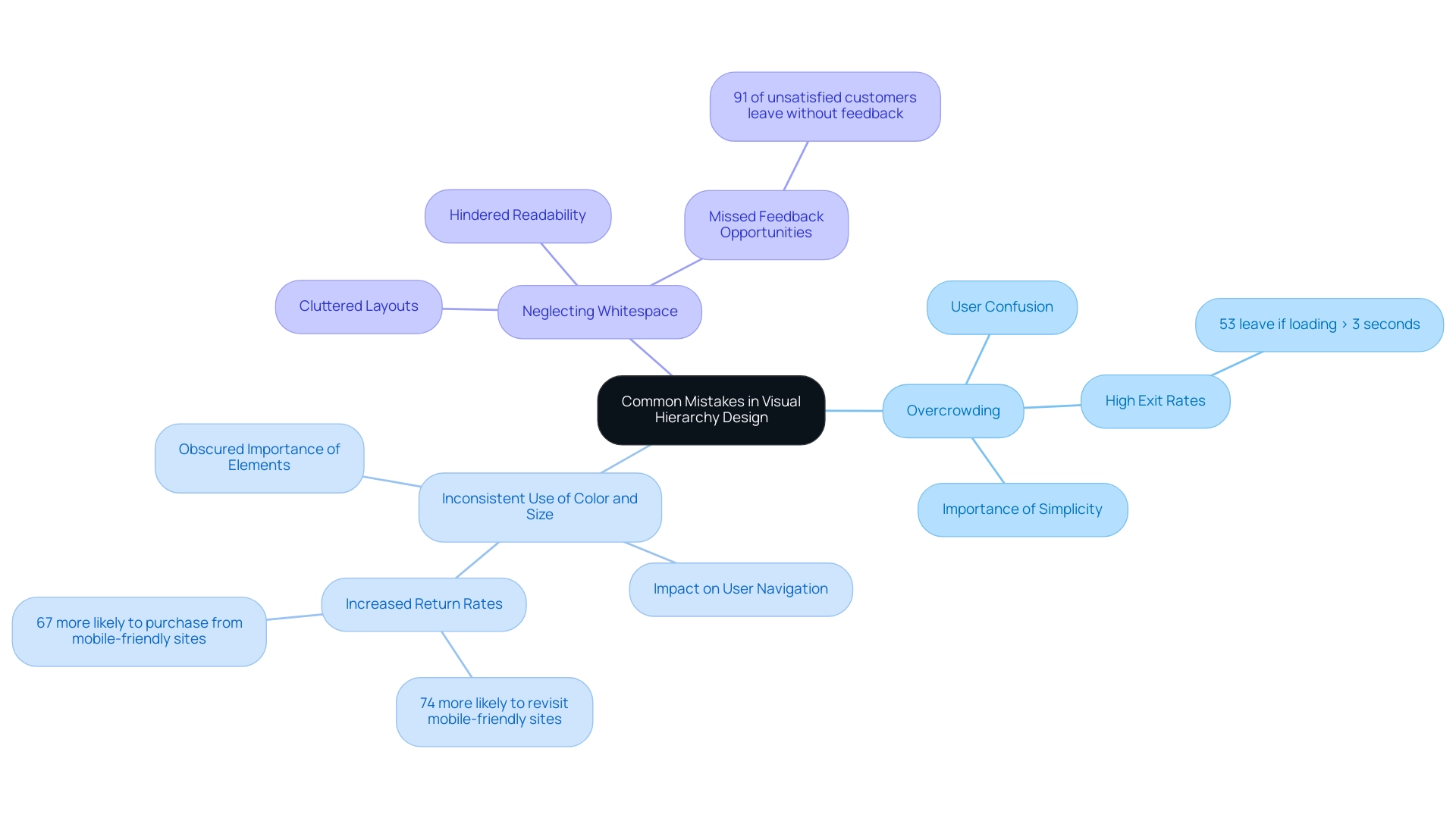
Frequent errors in visual hierarchy can significantly undermine the user experience. Designers must be vigilant in avoiding key pitfalls:
- Overcrowding: An excessive number of elements can overwhelm users, leading to confusion and frustration. Simplicity and clarity are paramount; layouts should guide individuals intuitively through content without unnecessary distractions. Studies indicate that 53% of mobile site visitors exit a webpage if it takes longer than three seconds to load, underscoring the importance of effective layout in retaining visitors.
- Inconsistent Use of Color and Size: Inconsistencies in color and size can obscure the importance of various elements. A cohesive visual language enables users to quickly identify focal points and navigate the interface effectively. Furthermore, 74% of individuals are more inclined to revisit a mobile-friendly site, and 67% are more likely to purchase a product or service from such a site, reinforcing the critical role of mobile-friendly layouts in visual hierarchy.
- Neglecting Whitespace: Often overlooked, whitespace plays a crucial role in design. Insufficient whitespace can lead to cluttered layouts that hinder readability. Proper use of whitespace creates breathing space, allowing individuals to focus on key information without feeling overwhelmed. Notably, 91% of unsatisfied customers do not voice their complaints but leave without feedback, highlighting the need for proactive measures to address experience issues.
Awareness of these common mistakes is essential for designers aiming to create effective visual hierarchy examples. For instance, enhancing the user experience by just 5% can yield an impressive 25% increase in profit. In a mobile-centric market, 85% of individuals expect a mobile experience that matches the quality of desktop browsing.
This expectation underscores the necessity for clear and well-organized layouts that cater to user needs, as illustrated in the case study titled ‘User Expectations for Mobile Experience.’
By steering clear of these pitfalls, designers can significantly enhance user engagement and satisfaction, ultimately leading to improved business outcomes, as evidenced by successful visual hierarchy examples.
Applying Visual Hierarchy Principles in Your Own Designs
To effectively apply visual hierarchy principles in your creations, it is essential to follow these steps:
- Identify Key Messages: Begin by pinpointing the most critical information that requires emphasis. This clarity will guide your creative choices through the utilization of visual hierarchy examples.
- Use Size and Color Strategically: Leverage size and color to draw attention to key elements. For instance, visual hierarchy examples such as larger text or vibrant colors create contrast, making important information stand out.
- Organize Content Logically: Structure your content in a way that naturally guides the viewer’s eye. Achieve this through alignment and spacing, as illustrated by visual hierarchy examples, ensuring an intuitive flow of information.
- Test and Iterate: Gather feedback on your creations to identify areas for enhancement. Iteration is crucial; research indicates that designs undergoing multiple rounds of testing significantly improve clarity and engagement. Notably, the F pattern is often employed on websites with text-heavy content, serving as a visual hierarchy example that underscores the importance of layout in directing user attention.
Incorporating these principles not only elevates the aesthetic appeal of your work but also fosters more engaging user experiences. For instance, WonderEight’s extensive campaign for Quaker Oats effectively employed design structure to rejuvenate the brand’s image, resulting in enhanced consumer interaction and brand perception. Similarly, the brand identity enhancement for Castania demonstrated how strategic visual choices yield quantifiable results. Moreover, the digital campaign for Motorola showcased the successful application of graphic organization principles, further illustrating their effectiveness in aesthetics.
As Prof. Alan Dix, a specialist in human-computer interaction, emphasizes, alignment is a crucial tool in graphic composition, highlighting the significance of these principles in developing effective branding. It is also vital to recognize dark patterns—manipulative techniques that misguide individuals into unintended actions—as they sharply contrast with the objectives of layout organization. By applying these strategies in your projects throughout 2025, you can ensure that your key messages resonate powerfully with your audience.
Key Takeaways and Next Steps in Visual Hierarchy Design
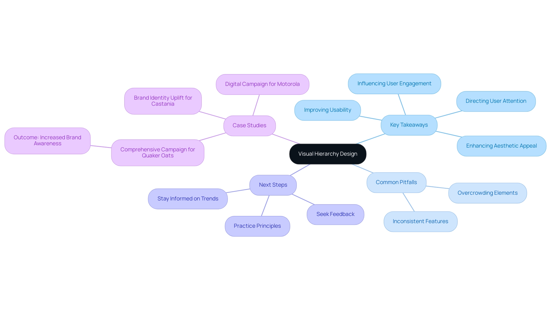
Key takeaways from this discussion on visual hierarchy are vital for any designer aiming to enhance usability and engagement:
- Visual hierarchy is essential for directing user attention and improving overall usability. An effective graphical arrangement not only elevates the aesthetic appeal of a design but also significantly influences user engagement and retention. Fundamental principles of visual hierarchy, including size, color, contrast, alignment, and typography, work in concert to provide a structured and intuitive experience for users, simplifying their navigation through content.
- Creators must be vigilant about common pitfalls, such as overcrowding elements and maintaining inconsistent features, which can obscure the intended message and confuse users.
To further refine their skills in visual hierarchy, designers should consider these strategic next steps:
- Actively practice these principles in their projects, experimenting with various layouts and styles to discern what resonates most effectively with their audience.
- Seek constructive feedback from peers and mentors to pinpoint areas for improvement and refine their approach.
- Stay informed about emerging trends and methodologies in aesthetics to continuously enhance their understanding of graphical organization.
By emphasizing layout structure and utilizing visual hierarchy principles, designers can create more impactful and engaging designs that not only attract interest but also foster a stronger connection with users. Successful projects, such as the comprehensive campaign for Quaker Oats, exemplify how effective design structure can enhance brand recognition and consumer engagement. Similarly, the brand identity enhancement for Castania and the digital initiative for Motorola demonstrate that implementing design prioritization principles can improve user experience and involvement, ultimately leading to superior outcomes.
As industry experts assert, mastering design hierarchy and learning from visual hierarchy principles is a crucial competency that can significantly elevate branding efforts in 2025 and beyond. As Samantha Lile articulates, “Visual-hierarchy principles are some of the most effective strategies for emphasizing elements of a design and clarifying a visual message.
Conclusion
Visual hierarchy is a fundamental principle that shapes effective design across various platforms, enhancing user engagement and communication. By strategically employing elements such as size, color, contrast, and typography, designers can create intuitive pathways that guide users to critical information. The significance of visual hierarchy is profound; it not only improves the aesthetic appeal of a design but also significantly boosts usability and retention rates.
Key principles, including the effective use of whitespace and alignment, are crucial for ensuring that content remains easily navigable and accessible. Successful case studies, such as those of Quaker Oats and Motorola, exemplify the transformative power of visual hierarchy in real-world applications, demonstrating how thoughtful design choices can yield measurable business outcomes. Furthermore, avoiding common pitfalls like overcrowding and inconsistent design elements is vital for maintaining clarity and effectiveness in communication.
As the digital landscape continues to evolve, embracing and mastering visual hierarchy principles will be essential for designers aiming to create compelling and successful projects. By actively practicing these strategies, seeking feedback, and staying informed about emerging trends, designers can enhance their skills and deliver impactful designs that resonate with users. Ultimately, prioritizing visual hierarchy transcends mere aesthetics; it is about forging stronger connections with audiences and driving meaningful engagement in an increasingly competitive marketplace.
Frequently Asked Questions
What is visual hierarchy?
Visual hierarchy is the strategic organization of visual elements that conveys their relative significance and guides individuals through content. It is crucial in web and graphic design as it influences interaction and perception.
How does visual hierarchy impact user engagement?
Effective visual hierarchy can significantly reduce drop-off rates, with some organizations reporting a 46% decrease in client drop-off through targeted design interventions. This emphasizes the importance of clarity in enhancing engagement and satisfaction.
What role does visual hierarchy play in navigation?
Visual hierarchy helps users intuitively understand content structure, making it easier to locate essential information. By applying principles like proximity and closure, designers can create user-friendly interfaces.
What are some key principles of visual hierarchy?
Key principles include: 1. Size and Scale: Larger elements attract more attention. 2. Color and Contrast: High contrast directs focus to important areas. 3. Alignment and Proximity: Grouping related items enhances usability. 4. Whitespace: Adequate spacing improves clarity and focus. 5. Typography: Different font sizes and weights establish a clear hierarchy within text.
How does visual hierarchy affect conversion rates?
A well-organized graphical structure enhances readability and can lead to higher conversion rates. Research indicates that optimizing for user experience can elevate conversion rates by up to 400%.
What are some examples of successful visual hierarchy implementation?
Case studies, such as campaigns for Quaker Oats and Miranda, demonstrate how effective design can enhance brand engagement and market presence, resulting in measurable growth in customer interaction and sales.
Why is understanding visual hierarchy important for brands?
As digital landscapes evolve, understanding and implementing visual order is vital for creating engaging layouts that attract users and convert them into loyal clients. Effective graphical strategies are crucial for improving user experience and business outcomes.
What should designers consider when applying visual hierarchy principles?
Designers should integrate visual hierarchy principles as guidelines rather than strict rules, ensuring that designs are tailored to specific audiences while enhancing both aesthetic appeal and functionality.


