General
10 Best Fonts for Food and Beverage Style Guides in the UAE
Overview
This article examines the critical role of fonts in food and beverage style guides within the UAE, underscoring their significance in branding and consumer perception. By exploring various typefaces, including Bodoni, Helvetica, and Montserrat, it demonstrates how these fonts not only enhance visual identity but also improve marketing effectiveness. These typefaces align with consumer expectations and foster trust, making them indispensable tools for Brand Managers seeking to establish a compelling brand presence.
Introduction
In the vibrant world of food and beverage branding, typography stands as a crucial element, serving as a visual language that articulates a brand’s identity and values. With the industry’s evolution, brands are increasingly embracing distinct typefaces to forge memorable impressions and cultivate consumer trust.
From the timeless elegance of Bodoni to the modern clarity of Helvetica, each font contributes its unique character, shaping perceptions and influencing purchasing decisions. This exploration delves into the pivotal role of typography in branding strategies, illustrating how various typefaces can elevate brand narratives and enhance market presence in a competitive landscape.
By examining popular fonts and their applications, brands can uncover effective ways to articulate their message and connect with their audience.
WonderEight: Comprehensive Branding Solutions for Food and Beverage Style Guides
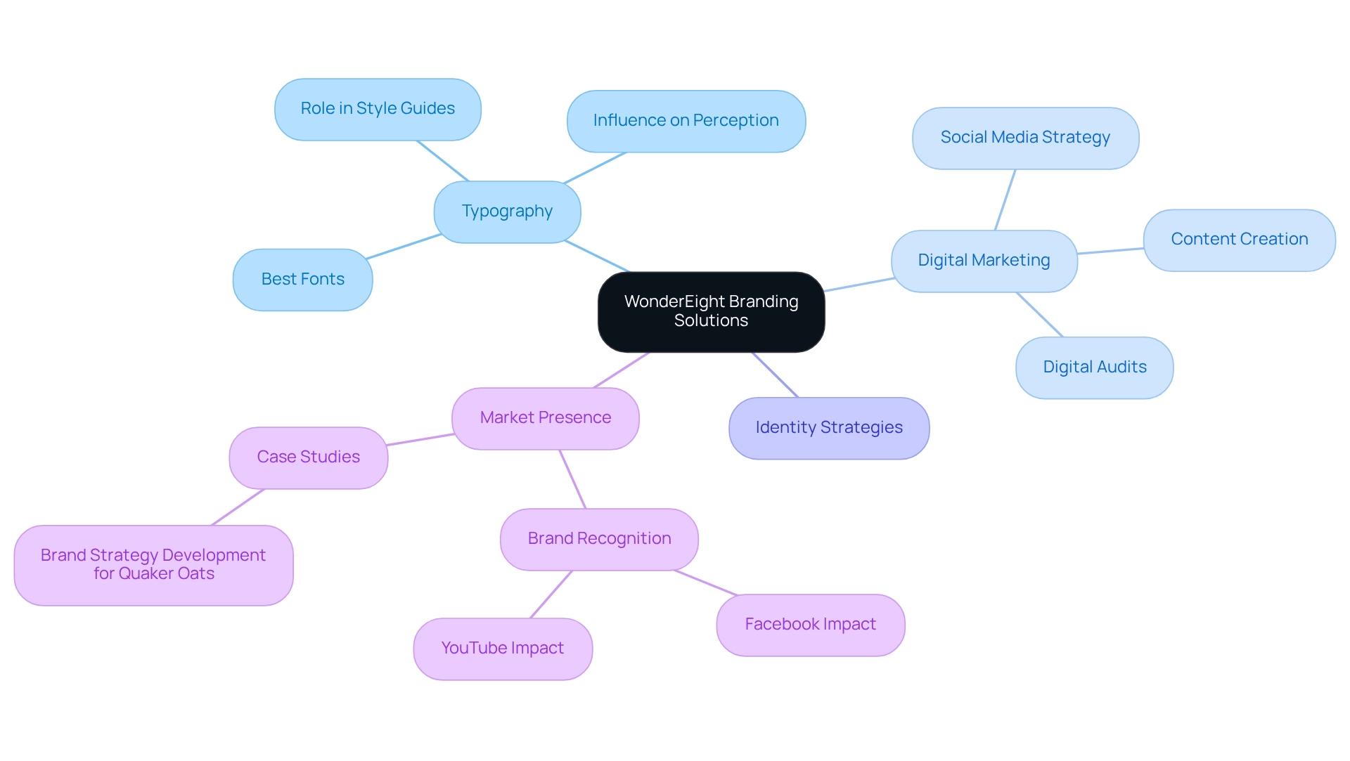
WonderEight distinguishes itself as a leading marketing and digital agency, dedicated to developing impactful identity strategies, including the best fonts for food and beverage style guides in the UAE. With a robust global footprint, the agency leverages creative design and technology to deliver comprehensive solutions, including identity assessments, strategy development, digital evaluations, and e-commerce solutions. This multifaceted approach ensures that culinary and beverage companies can effectively convey their identity through meticulously chosen typography, including the best fonts for food and beverage style guides in the UAE, which is an essential element in style guides. Typography significantly influences perception, making it a vital component in the identity development process. By 2025, effective marketing strategies will increasingly depend on the visual language that typography offers, enhancing both recognition and engagement. Notably, Facebook plays a pivotal role in product recognition, with 79% of users acknowledging its impact. This underscores the necessity for beverage and culinary companies to cultivate a strong online presence. Furthermore, with over 80 million small enterprises utilizing Facebook monthly, the competition for attention is fierce, highlighting the importance of effective marketing strategies.
WonderEight’s extensive digital and technology solutions—encompassing social media strategy, content creation, media planning, and digital audits—demonstrate their capacity to craft tailored identity strategies that resonate with target demographics. This results in a more substantial market presence and clearer messaging. By focusing on the nuances of typography and its role in style guides, WonderEight empowers companies in the culinary and beverage sectors to utilize the best fonts for food and beverage style guides in the UAE, creating memorable and effective marketing campaigns that stand out in a competitive landscape. As typography specialist Abe Rubarts notes, understanding the impact of typography is essential for crafting engaging narratives for a brand. Additionally, organizing information on packaging necessitates a balance of critical details, from headlines to footnotes, ensuring clarity and effectiveness in communication. This comprehensive approach to marketing positions WonderEight as a leader in the culinary and beverage industry.
Bodoni: Timeless Elegance for Food and Beverage Branding
Bodoni, a distinguished serif typeface, is celebrated for its striking contrast and geometric forms, making it one of the best fonts for food and beverage style guides in the UAE, especially among luxury culinary brands. Its timeless sophistication is particularly suited for packaging and marketing efforts that seek to convey a sense of premium quality. As we move into 2025, the trend of utilizing Bodoni in luxury culinary marketing continues to gain traction, with prominent names from WonderEight’s portfolio, such as CheeseButta, Teta Foods, and Kickin’ Cajun & Backyard BBQ, harnessing its aesthetic appeal to elevate their visual identity. This trend is noteworthy as it aligns with the growing consumer demand for brands that embody authenticity and sophistication.
Research reveals that 74% of shoppers place their trust in brands that uphold honesty and transparency in product labeling, highlighting the critical role of a robust visual identity in fostering trust among consumers. The application of Bodoni not only enhances the visual allure of packaging but also positively influences buyer perception, as its classic elegance contributes to a premium appearance that engenders trust. Experts advocate for the use of serif fonts in high-end dining branding, with Diptanshu Mishra from UG 24 urging local restaurants to explore diverse menu designs, positing that the right typography can profoundly affect customer behavior.
Successful branding initiatives, such as the comprehensive campaign for Quaker Oats, exemplify how Bodoni can be seamlessly integrated into a wider marketing strategy. This campaign, which leveraged both traditional and digital channels, resulted in a significant increase in brand awareness and consumer engagement. As luxury culinary labels increasingly adopt Bodoni, its influence in shaping premium identities becomes more pronounced, solidifying its position among the best fonts for food and beverage style guides in the UAE.

Helvetica: Modern Clarity for Contemporary Food Brands
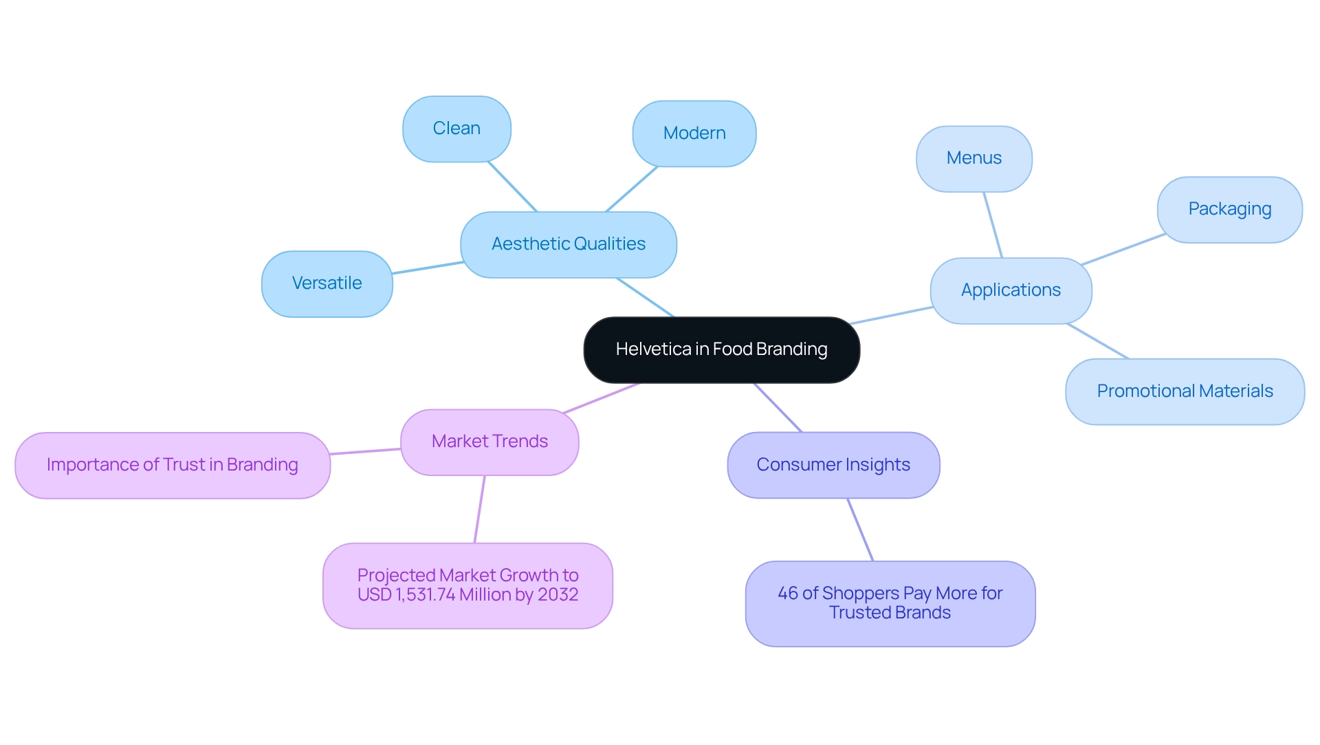
Helvetica, a renowned sans-serif font, epitomizes a clean and modern aesthetic that is particularly suited for contemporary culinary enterprises. Its versatility facilitates seamless integration across various mediums, such as menus, packaging, and promotional materials. Notably, companies like Nestlé have adeptly utilized Helvetica to project trustworthiness and professionalism, establishing it as a preferred choice within the beverage and culinary industries.
As we move into 2025, the trend favoring sans-serif fonts remains dominant in the culinary marketing arena, with Helvetica at the forefront. Its incorporation in packaging not only enhances visual appeal but also fosters consumer confidence; research indicates that 46% of shoppers are willing to pay a premium for products they trust. This statistic highlights the critical role of clarity and consistency in branding, a strength that Helvetica consistently delivers.
A multitude of modern culinary brands have embraced Helvetica in their packaging designs, leveraging its contemporary essence to forge a strong identity. Designers frequently underscore Helvetica’s efficacy in packaging, citing its capacity to convey reliability and clarity. For instance, one designer remarked, “Helvetica’s clean lines and simplicity render it a perfect option for culinary companies seeking to convey quality and trust.”
With the font and typeface industry projected to reach USD 1,531.74 million by 2032, exhibiting a CAGR of 3.85%, the relevance of Helvetica in culinary branding is poised to escalate further. Expert insights suggest that implementing the best fonts for food and beverage style guides in the UAE, like Helvetica, can significantly enhance identity clarity, making it an indispensable component. Furthermore, as TINT observes, “Facebook is the leading overall platform for research on companies,” underscoring the necessity of establishing a trustworthy presence in today’s digital landscape.
Garamond: Classic Sophistication for Premium Branding
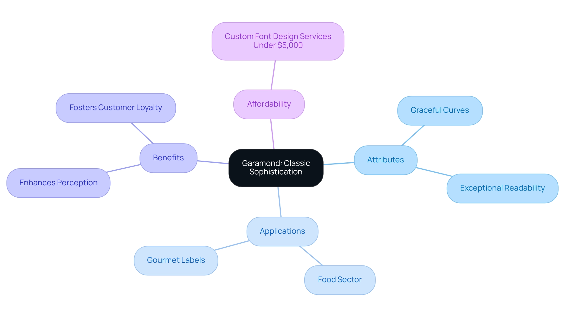
Garamond, a timeless serif typeface, embodies classic sophistication, which is why it is considered one of the best fonts for food and beverage style guides in the UAE for premium culinary products. Its graceful curves and exceptional readability lend themselves well to both print and digital mediums. Upscale dining establishments and gourmet labels frequently utilize Garamond, one of the best fonts for food and beverage style guides in the UAE, to express their commitment to quality and tradition, effectively strengthening their narratives.
In 2025, the strategic use of Garamond in marketing has been shown to significantly enhance perception, particularly in the food sector, where elegance and authenticity are paramount, highlighting it as one of the best fonts for food and beverage style guides in the UAE. Studies indicate that custom font design services can be accessed for under $5,000, rendering it an accessible investment for premium companies seeking to elevate their identity. This affordability enables companies to adopt Garamond without significant financial strain, thereby enhancing their visual identity and market presence.
Expert opinions emphasize that the appropriate typography is not merely a design aspect but a potent communication instrument that fosters customer loyalty. As marketing experts observe, aligning messaging with customer values is vital for cultivating enduring relationships—a principle that Garamond exemplifies through its timeless allure, making it one of the best fonts for food and beverage style guides in the UAE.
Successful applications of Garamond in gourmet cuisine promotion illustrate its effectiveness in establishing a perception of quality. Brands that utilize this font often report improved audience engagement and a stronger emotional connection with their viewers. As the culinary and beverage landscape continues to evolve, Garamond remains a reliable option for companies aiming to convey elegance and dependability in their visual identity, adapting to shifting market dynamics and buyer preferences.
Futura: Innovative Design for Modern Food Brands
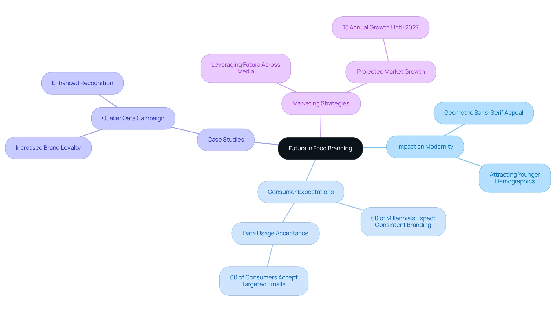
Futura, a geometric sans-serif typeface, is considered one of the best fonts for food and beverage style guides in the UAE, standing as a beacon of modernity and innovation for culinary companies eager to project a contemporary image. Its clean lines and bold presence resonate with younger shoppers, who increasingly demand that brands maintain a consistent and appealing aesthetic across all platforms. Notable companies like Domino’s Pizza and Nike have effectively utilized Futura in their marketing strategies, demonstrating its capacity to attract a trend-aware audience.
As we look ahead to 2025, the importance of Futura in culinary identity continues to ascend, with data revealing that 60% of millennials expect a uniform identity across all channels. This trend underscores the critical nature of selecting the right typeface to enhance appeal, particularly as dietary preferences shift toward healthier and more diverse options. Furthermore, the global marketing sector is projected to expand by 13% annually until 2027, highlighting the intensifying competition among product labels to capture consumer interest.
Case studies reveal that brands incorporating Futura into their promotional strategies have witnessed significant improvements in engagement and loyalty. For instance, a comprehensive campaign for Quaker Oats, which emphasized a compelling identity and customer connection through the use of Futura, resulted in heightened recognition and loyalty. This illustrates how the strategic implementation of Futura, recognized as one of the best fonts for food and beverage style guides in the UAE, can yield measurable outcomes in the competitive food and beverage sector, especially as companies adapt their marketing strategies to align with evolving consumer preferences. As the landscape of food marketing evolves, the impact of geometric sans-serif fonts like Futura on attracting younger demographics remains paramount. To harness its full potential, brands should contemplate how Futura can be leveraged across various media formats, including digital content creation and targeted media purchasing strategies. This approach ensures that the company’s visual identity is communicated consistently, thereby enhancing market presence and consumer engagement.
Montserrat: Versatile Readability for Food and Beverage Style Guides
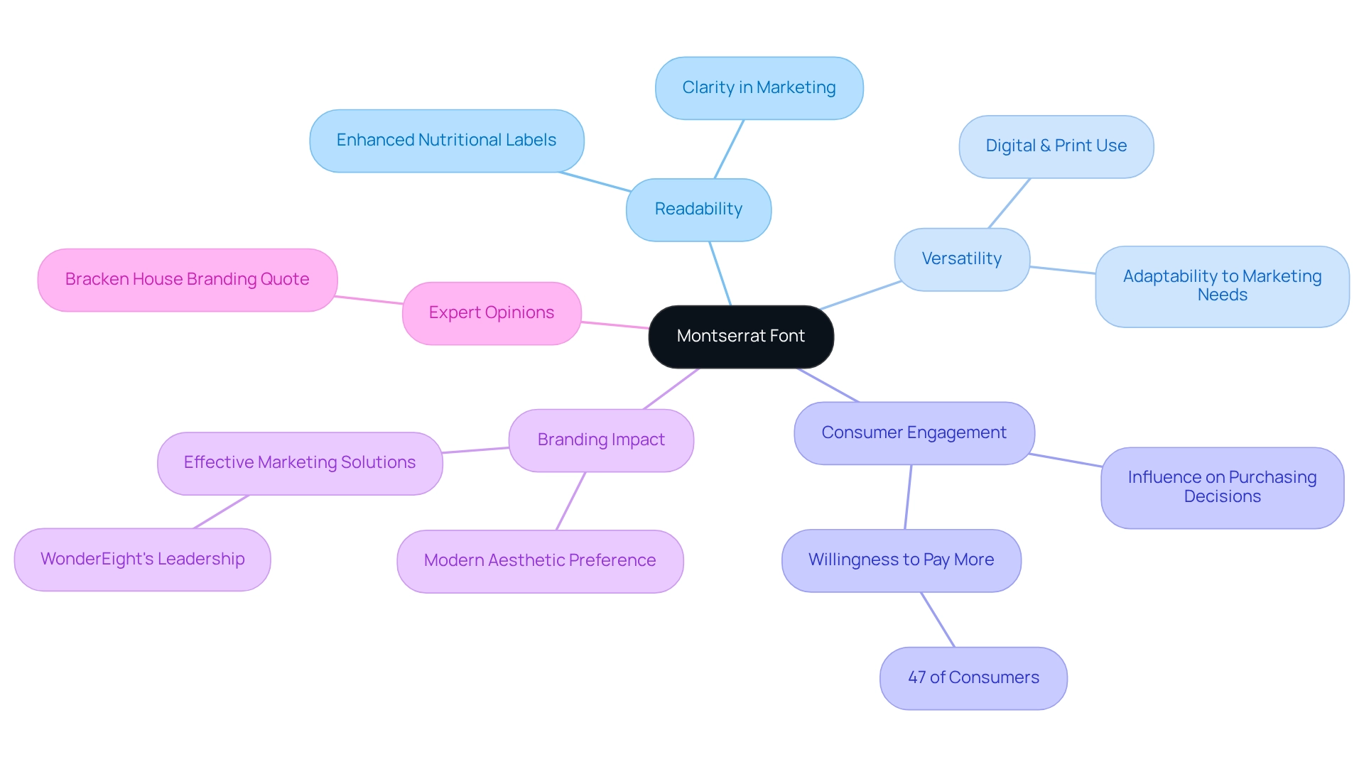
Montserrat is considered one of the best fonts for food and beverage style guides in the UAE, as it is a highly versatile sans-serif typeface known for its readability. Its contemporary design is adept for both digital and print formats, enabling companies to maintain a cohesive identity across diverse platforms. Notably, successful culinary brands have embraced Montserrat for their menus, packaging, and promotional materials, ensuring their messaging is both clear and engaging.
Research indicates that engagement with product labels significantly influences purchasing decisions, underscoring the necessity of clarity in marketing. A study focusing on nutritional labels revealed that enhanced readability fosters more informed choices at the point of purchase. This aligns with the emerging trend where 47 percent of consumers express a willingness to pay up to 5 percent more for sustainable packaging, highlighting the imperative for effective design in food marketing. Typography, particularly that offered by Montserrat, plays a crucial role in this context, as it assists companies in conveying their commitment to sustainability through clear and engaging labels.
The versatility of the Montserrat font allows it to adapt seamlessly to various marketing needs, ranging from sophisticated packaging to eye-catching promotional materials. Its current usage statistics highlight the best fonts for food and beverage style guides in the UAE, reflecting a strong preference among brands pursuing a modern aesthetic. Branding experts advocate for the use of Montserrat, emphasizing that typography is vital in ensuring product labels communicate essential information without causing confusion. As Bracken House Branding states, “Typography helps you ensure your product labels give consumers the exact information they need without confusing them.” This positions Montserrat as not only a stylish choice but also one of the best fonts for food and beverage style guides in the UAE for companies looking to enhance their market presence.
Playfair Display: Stylish Serif for Upscale Food Branding
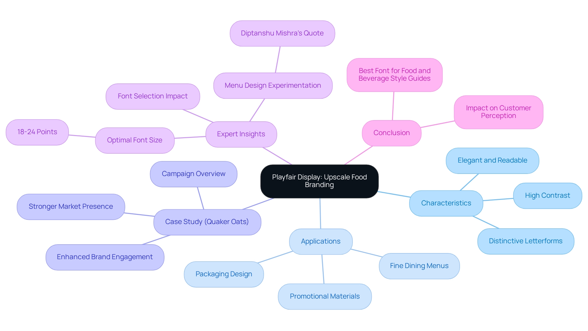
Playfair Display stands as a sophisticated serif typeface that masterfully merges elegance with contemporary readability, establishing itself as an optimal choice for high-end food labels. Its high contrast and distinctive letterforms not only augment the visual allure of menus and packaging but also evoke a luxurious ambiance that resonates with discerning customers. In 2025, the adoption of Playfair Display in fine dining has notably increased, with numerous companies harnessing its stylish characteristics to elevate their brand identity.
The font’s capacity to cultivate a luxurious atmosphere is particularly evident in its application across various fine dining establishments. A compelling campaign for Quaker Oats exemplified how the integration of Playfair Display into their marketing strategy—especially in menu design and promotional materials—significantly enhanced brand engagement and market presence. This case study illustrates the effectiveness of stylish serif fonts, which are among the best fonts for food and beverage style guides in the UAE, in shaping customer perception, particularly within the beverage and culinary sectors.
Expert insights underscore that the selection of the right font can dramatically enrich the dining experience and bolster customer retention. As Diptanshu Mishra articulates, “Local restaurants should experiment with different menu designs to determine which elements are most effective in influencing customer behavior.” The optimal font size for headers and categories, generally ranging from 18 to 24 points, guarantees that the text remains both legible and aesthetically pleasing, further contributing to the overall ambiance.
In conclusion, the impact of elegant serif typefaces like Playfair Display on customer perception in fine dining is substantial, highlighting its status as one of the best fonts for food and beverage style guides in the UAE’s competitive hospitality sector.
Raleway: Elegant Modernity for Food and Beverage Brands
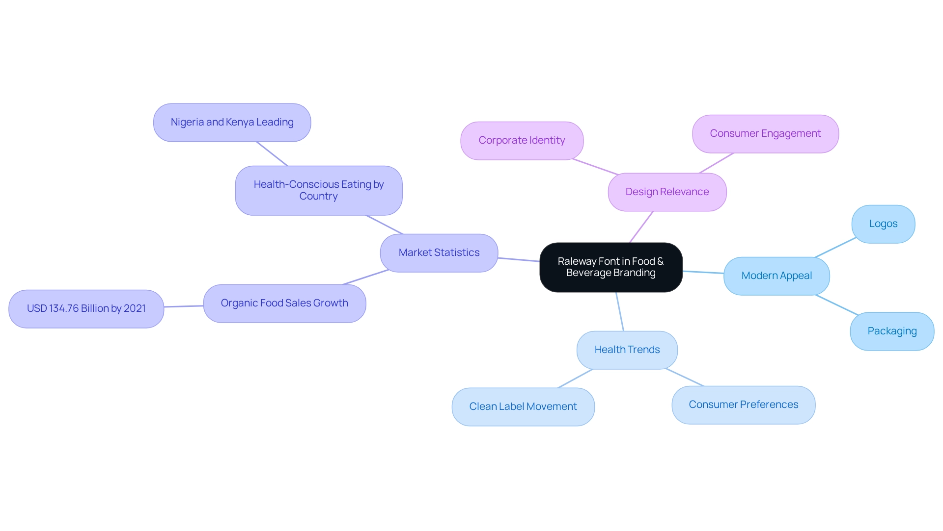
Raleway is considered one of the best fonts for food and beverage style guides in the UAE, seamlessly infusing a modern touch into culinary and beverage branding. Its clean lines and refined shapes position it as an ideal choice for diverse applications, ranging from logos to packaging. In the health food sector, numerous brands leverage Raleway to convey freshness and quality, effectively resonating with health-conscious consumers. As of early 2024, a significant share of consumers globally is actively striving to eat healthily, with countries like Nigeria and Kenya at the forefront of this trend. This shift underscores the necessity for branding that embodies transparency and quality, aligning with the clean label movement that emphasizes fewer ingredients and the absence of artificial additives. Raleway visually encapsulates these values, making it a fitting option for companies aiming to convey authenticity and healthfulness.
The appeal of Raleway is further substantiated by its effective application across various health-related enterprises, which have adopted it to enhance their market visibility. For instance, companies utilizing Raleway have reported positive responses from consumers, coinciding with the broader trend of rising organic produce sales, which reached USD 134.76 billion by 2021. These brands have capitalized on this growth by employing Raleway to forge a modern identity that resonates with today’s discerning shoppers. As the food and beverage sector evolves, understanding the shifting demands of consumers will be essential for sustaining growth and relevance in this competitive landscape. Designers note that contemporary sans-serif typefaces like Raleway are among the best fonts for food and beverage style guides in the UAE, which are crucial for crafting a corporate identity that connects with health-aware audiences, particularly as marketing strategies evolve to reflect changing dietary practices. In 2025 and beyond, the selection of font will play a pivotal role in shaping brand identity and enhancing customer engagement.
Oswald: Bold Impact for Standout Food Branding
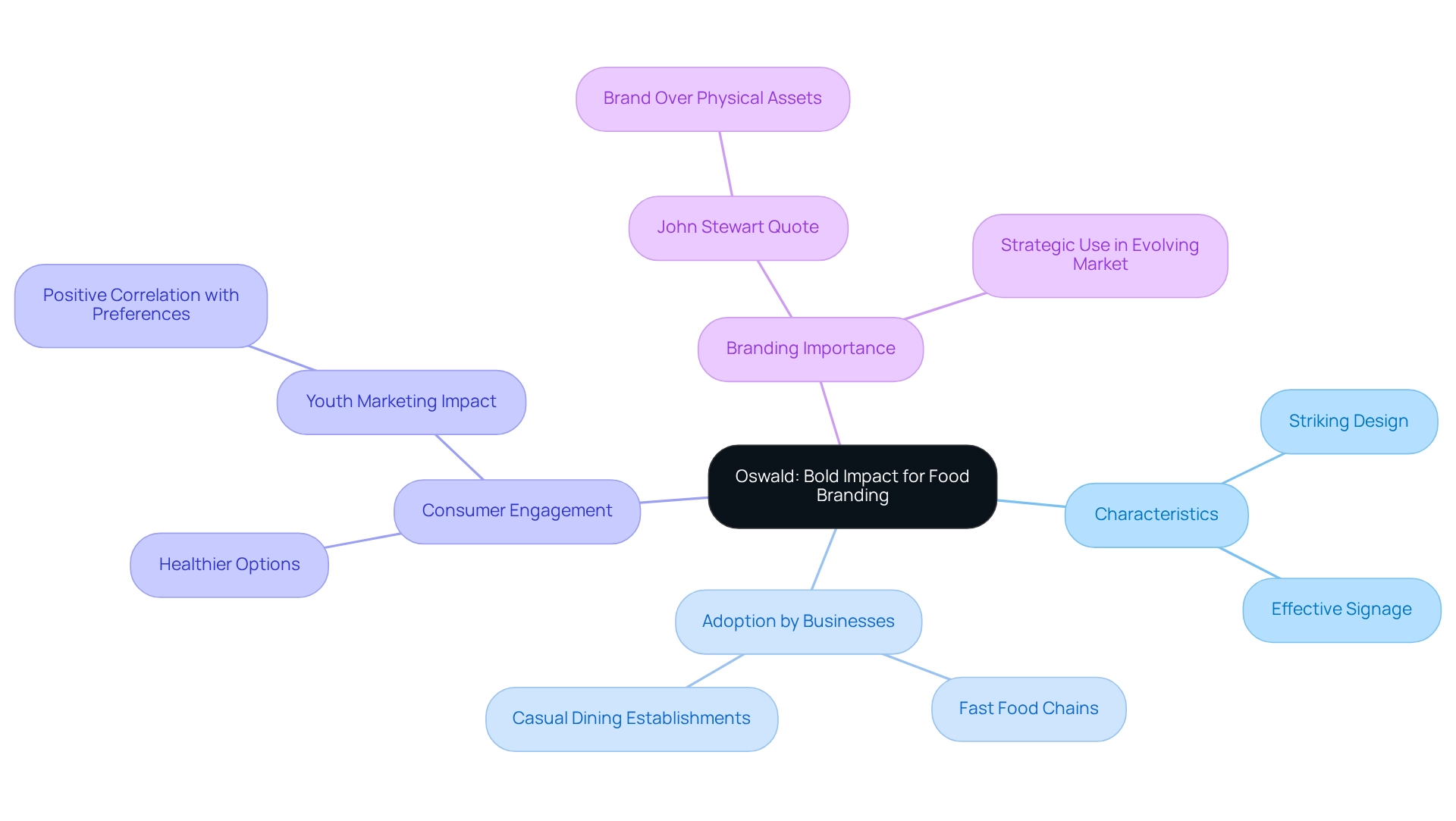
Oswald is a striking sans-serif typeface that exudes boldness, making it one of the best fonts for food and beverage style guides in the UAE, ideal for food branding that demands attention. Its condensed design facilitates impactful headlines and signage, enabling companies to effectively engage consumers. Fast-food chains and casual dining establishments have successfully adopted Oswald to cultivate a vibrant and energetic company identity.
As eating habits shift towards healthier options and diverse cuisines, the necessity for companies to communicate effectively through their visual identity becomes paramount. Notably, studies indicate that the use of bold fonts like Oswald significantly enhances consumer attention, thereby strengthening recognition and preference.
A case study titled ‘Impact of Fast Food Marketing on Youth’ reveals a consistent positive correlation between exposure to fast food marketing and product preferences among youth, highlighting the critical importance of effective marketing strategies. Marketers must consider target audience preferences when selecting fonts that enhance identity, as this alignment can drive engagement.
As John Stewart, former chairman of Quaker Oats Ltd., famously stated, “If the business were to be split up, I’d take the brand, the logo, the goodwill and you could keep all the bricks and sand—I’d be better off than you.” This underscores the essential role of branding in the culinary sector.
As the dining and beverage sector continues to evolve, especially in response to shifting customer tastes and preferences, the strategic use of Oswald, recognized as one of the best fonts for food and beverage style guides in the UAE, proves to be a potent tool for attracting public interest and enhancing engagement.
Lora: Warmth and Approachability for Food and Beverage Style Guides
Lora is a modern serif font that embodies warmth and friendliness, which is why it is considered one of the best fonts for food and beverage style guides in the UAE. Its moderate contrast and excellent readability ensure it performs well in both body text and headings. Numerous companies in the comfort cuisine sector utilize Lora, considered one of the best fonts for food and beverage style guides in the UAE, to foster a friendly environment that resonates with their audience, significantly enhancing customer involvement.
Research indicates that the best fonts for food and beverage style guides in the UAE, particularly warm serif fonts like Lora, can bolster consumer trust and connection, leading to improved perceptions of the company. Notable examples include effective marketing initiatives, such as the strategy development for Quaker Oats, where Lora was employed to evoke feelings of comfort and familiarity, which also illustrates the best fonts for food and beverage style guides in the UAE, perfectly aligning with the emotional appeal of comfort food.
As professional Caroline Baker states, “With a strategic approach to font selection, organizations can establish a distinctive presence and enhance user experience, contributing to increased credibility and audience engagement.”
At WonderEight, we have effectively utilized the Lora typeface in various projects, including the identity enhancement for Castania, underscoring our expertise in crafting impactful marketing strategies. The strategic application of Lora, which is considered one of the best fonts for food and beverage style guides in the UAE, not only elevates the visual identity of companies but also nurtures a deeper connection with consumers, ultimately driving engagement and loyalty.
We encourage brand managers to explore how the Lora typeface can enhance their branding efforts, leveraging our innovative solutions to achieve success.
Conclusion
The exploration of typography in food and beverage branding underscores its profound impact on consumer perception and brand identity. The elegant curves of Bodoni and the modern clarity of Helvetica exemplify how each typeface plays a crucial role in enhancing brand narratives and fostering consumer trust. Various case studies demonstrate that the strategic use of typography can significantly influence brand recognition, engagement, and loyalty, establishing it as an indispensable element of effective branding strategies.
In a competitive market, brands must be deliberate in their font selections, ensuring alignment with their core values and target demographics. The emergence of versatile fonts like Montserrat and Raleway reflects the prevailing trend towards clarity and modernity, catering to an increasingly discerning consumer base. Conversely, classic fonts such as Garamond and Playfair Display continue to convey sophistication and quality, essential attributes for premium branding.
Ultimately, the significance of typography in the food and beverage sector is paramount. It transcends mere design; it serves as a powerful communication tool that shapes consumer experiences and drives purchasing decisions. As brands adapt to evolving consumer preferences and market dynamics, the thoughtful application of typography will remain a cornerstone of successful branding efforts, ensuring that they resonate with audiences and distinguish themselves in a crowded marketplace.
Frequently Asked Questions
What is WonderEight and what services does it offer?
WonderEight is a leading marketing and digital agency that specializes in developing impactful identity strategies for culinary and beverage companies. Its services include identity assessments, strategy development, digital evaluations, and e-commerce solutions.
How does typography influence branding in the food and beverage industry?
Typography significantly influences perception and is a vital component in the identity development process. It enhances recognition and engagement, making it essential for culinary and beverage companies to convey their identity effectively.
What role does Facebook play in product recognition?
Facebook plays a pivotal role in product recognition, with 79% of users acknowledging its impact. This highlights the necessity for beverage and culinary companies to establish a strong online presence.
Why is Bodoni considered one of the best fonts for food and beverage style guides in the UAE?
Bodoni is celebrated for its striking contrast and geometric forms, which convey timeless sophistication and premium quality, making it particularly suited for luxury culinary branding.
How does Bodoni affect consumer trust and perception?
The use of Bodoni enhances the visual allure of packaging and positively influences buyer perception, contributing to a premium appearance that engenders trust among consumers.
What trends are emerging in culinary marketing regarding font usage?
The trend of utilizing Bodoni in luxury culinary marketing is gaining traction, with brands increasingly adopting it to align with consumer demand for authenticity and sophistication.
What is the significance of Helvetica in culinary branding?
Helvetica epitomizes a clean and modern aesthetic, making it a preferred choice for contemporary culinary enterprises. Its versatility enhances visual appeal and fosters consumer confidence.
What statistics support the effectiveness of Helvetica in branding?
Research indicates that 46% of shoppers are willing to pay a premium for products they trust, highlighting the critical role of clarity and consistency in branding that Helvetica provides.
What future trends are anticipated for the font and typeface industry?
The font and typeface industry is projected to reach USD 1,531.74 million by 2032, indicating an increasing relevance of fonts like Helvetica in culinary branding.
How can companies leverage typography to enhance their identity?
By implementing the best fonts for food and beverage style guides, companies can significantly enhance identity clarity and create memorable marketing campaigns that resonate with their target demographics.


